Xiaobai Interior Design Alliance

The Red House Of Heartbeat
The owner of this case, Mr. Wang, and our cooperation, can be said to be the most hassle-free renovation owners experience on the net ~ because of work and special epidemic influence, the whole renovation owners are in Japan, the whole project from the beginning to the final landing, are operated by us to implement. In the project communication group and Mr. Wang report progress on time, construction details and subsequent main material furniture products are by us to help owners select samples, photo feedback, owners remote to confirm the final product, and finally this home after landing, get Mr. Wang family’s praise, thanks to trust, deep white whole case hosting mode can ensure that the physical as seen in the picture, and save time and effort ~ absolutely the decoration white must choose mode ~.
They are very concerned about the comfort of the dining room and bathroom, and prefer the simple Scandinavian and Japanese style, which makes them very receptive to design. Therefore, our case meets the special needs of the design, but also added a special texture tone, fully open design, this small home with a usable area of only 70 square meters of extraordinary texture, impressive.
01.
Common Area
Public Area
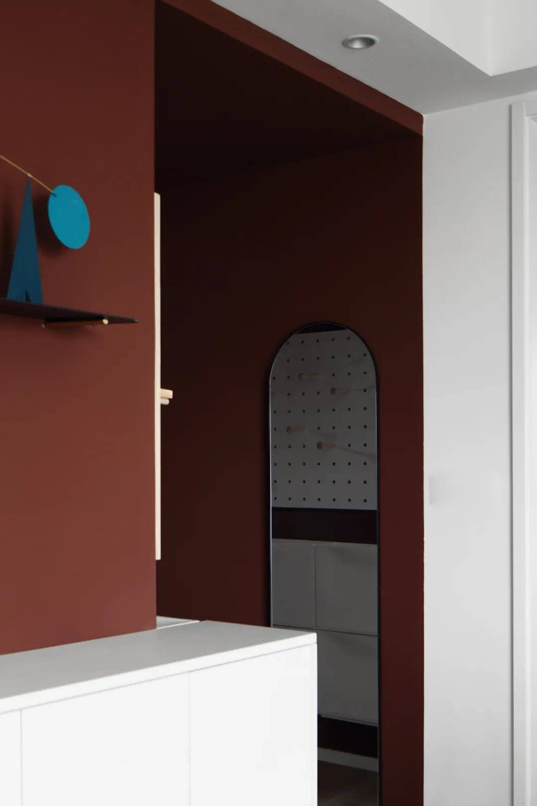
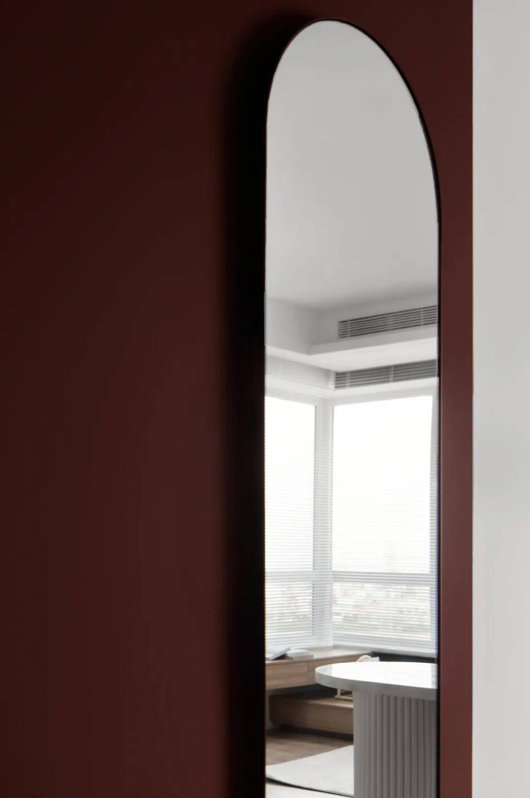
entrance hall
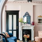
Red is the color of passion.
Low-saturation red brings texture and vitality to the space.
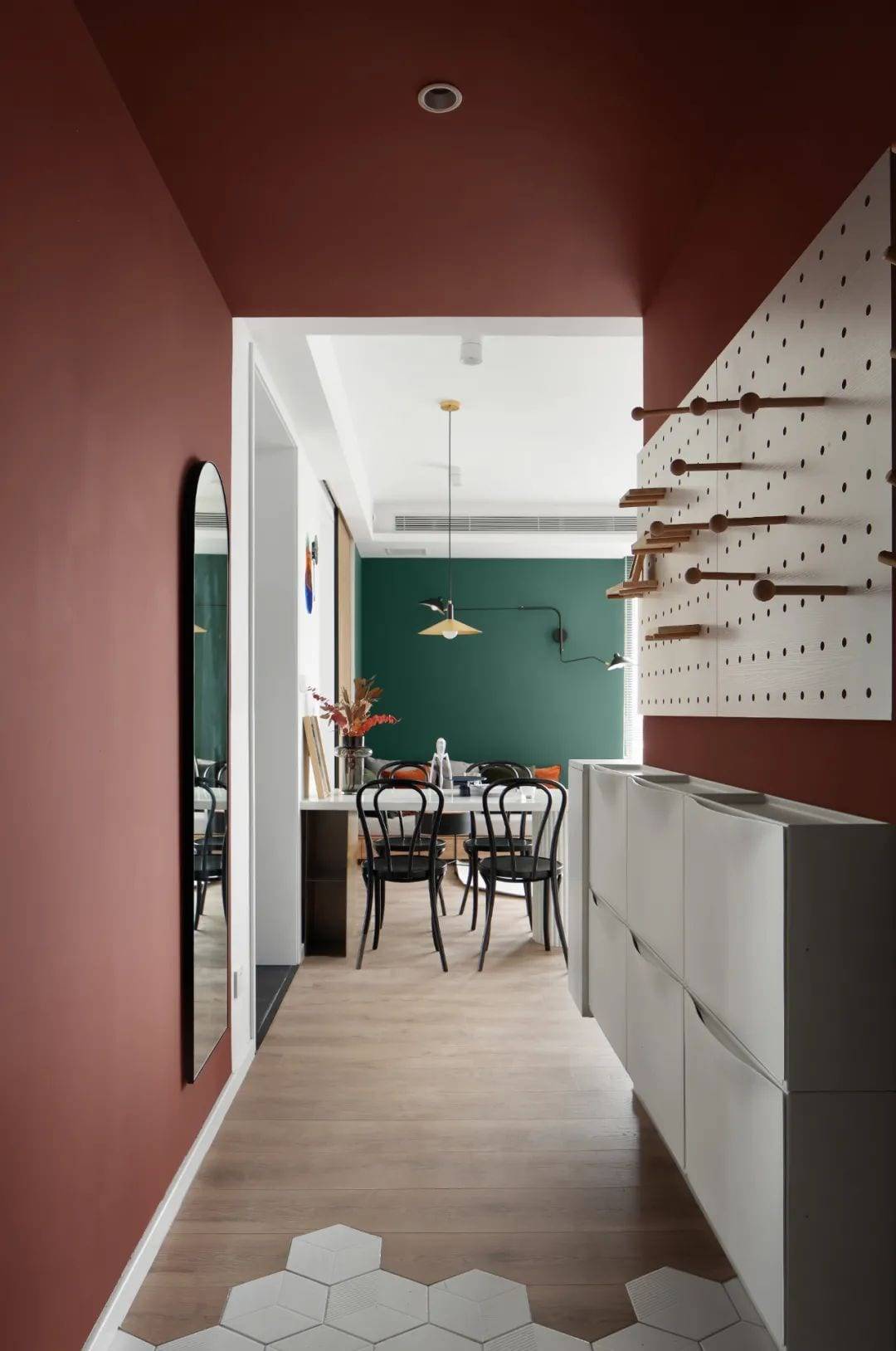
Perspective of entry
Hovering shoe cabinets and holey panels
Simple elements meet the storage needs of a family of three
Red walls, irregular hexagonal tiles, wooden floor
As materials change, the space becomes more interesting to explore.
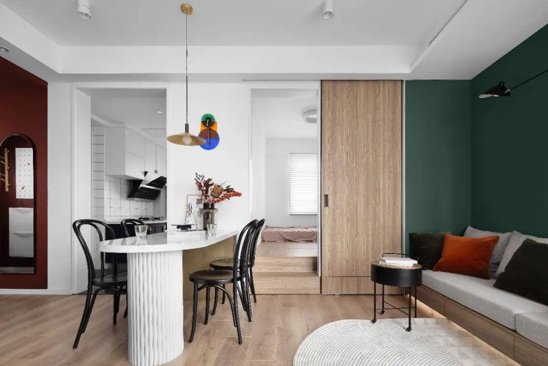
Enter the dining room
Fully open public areas can be seen
The dining room is at the midpoint between the living room and the kitchen.
A curved dining table
From a special order. Perfect fit.
Dark green walls with large wood floors
Comfortable, great color scheme
Let the whole space
Open another possibility of living beautifully
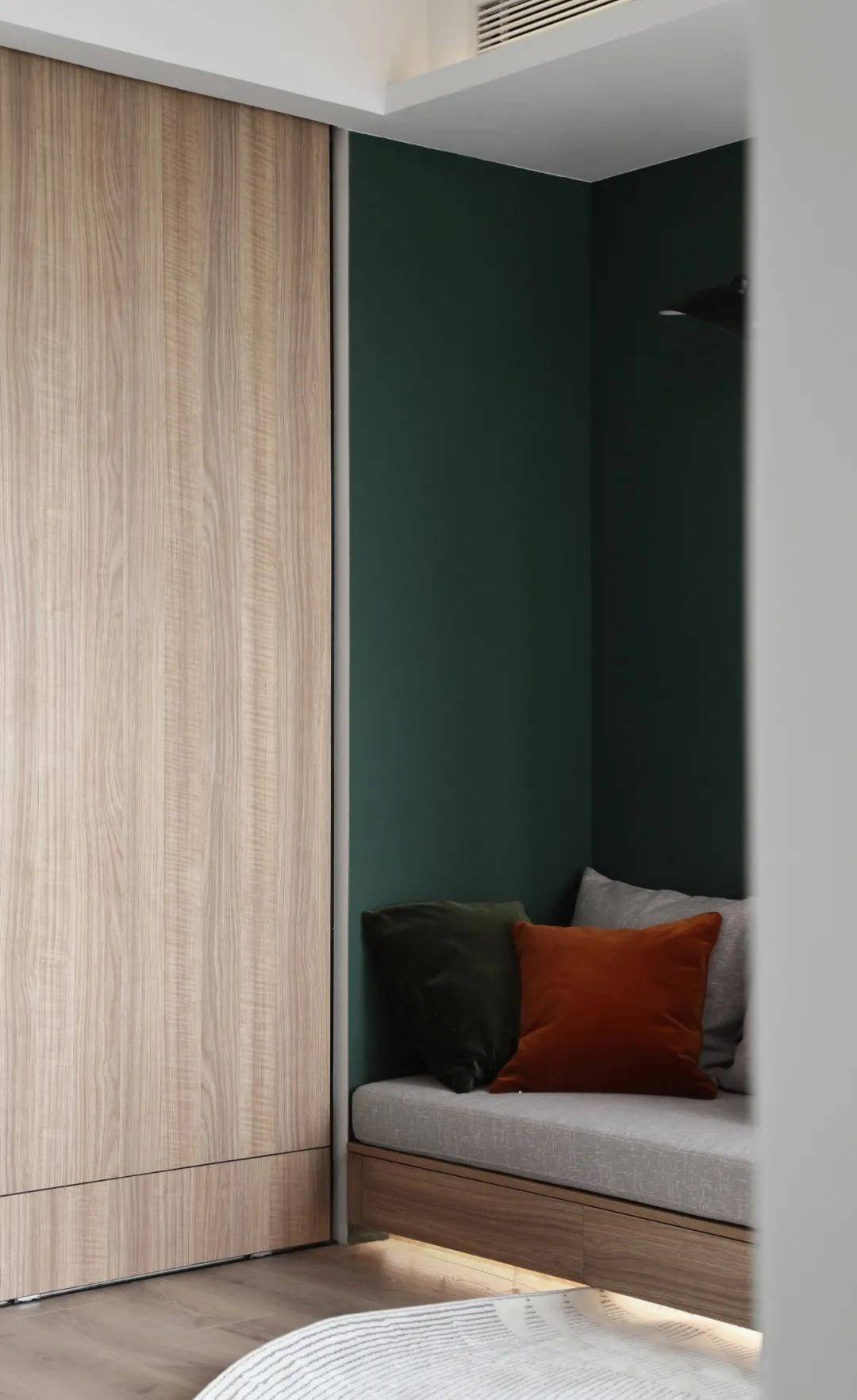
The need for social interaction in the living room
By going here.
The original living room was aligned vertically. The space was underutilized.
The designer has expanded the living room by half by reconfiguring the space to optimize it.
Socialize, relax, dine and read all in one.

Large areas of color are often excluded from use
Here we use a new layout, lighting and materials.
Reintegration and use
Textured colors give the space a unique soul
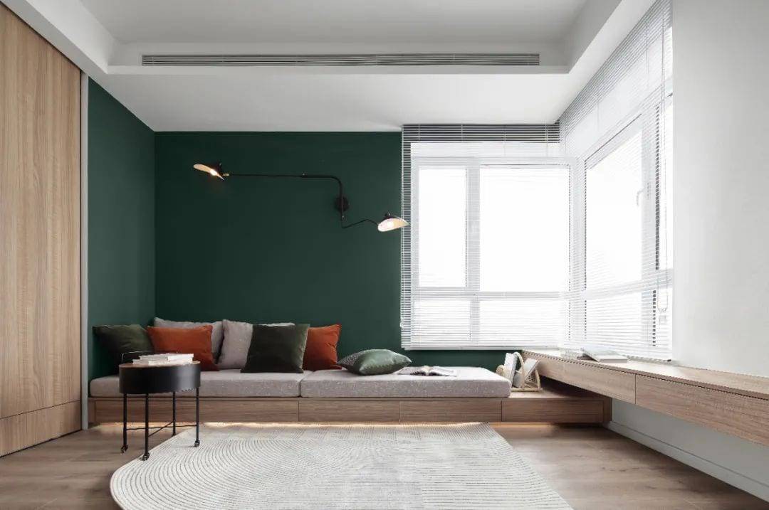
In sunny areas, the Venetian blinds can draw light into the room.
A set of storage cabinets extending along the wall
It can also be used as a living room storage and display area.
multipurpose
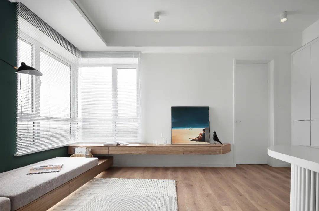
The wood’s texture is warm and embracing in its own way.
And light strips and carpet sets.
There is a soft change in the spatial hierarchy
Pure white walls are no longer monotonous, they’re a comfortable visual white space.
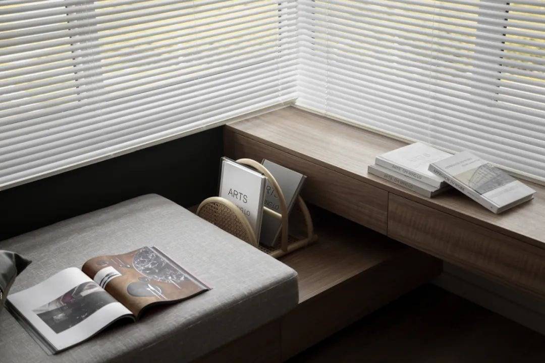
Versatile design
Fully meet the needs of different scenarios

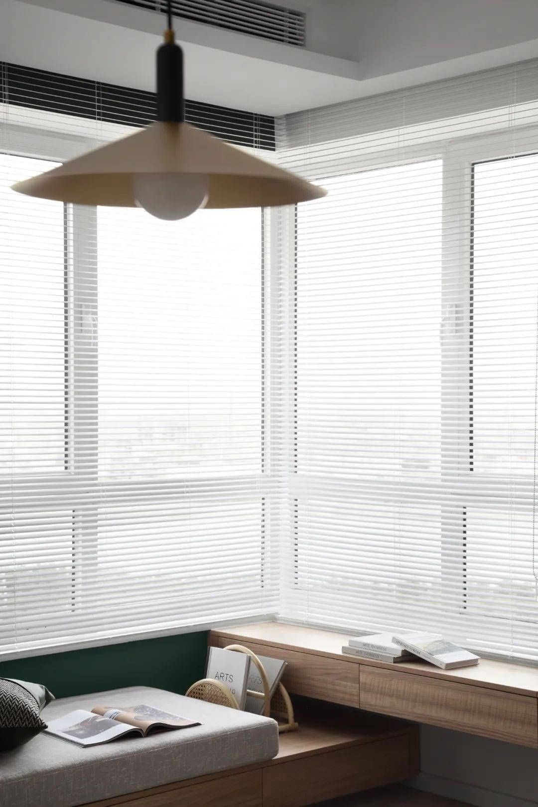
Work nights, get up early in the morning.
It’s much more comfortable and relaxing to work in a well-lit environment.
02.
Dining Area
Kitchen Area
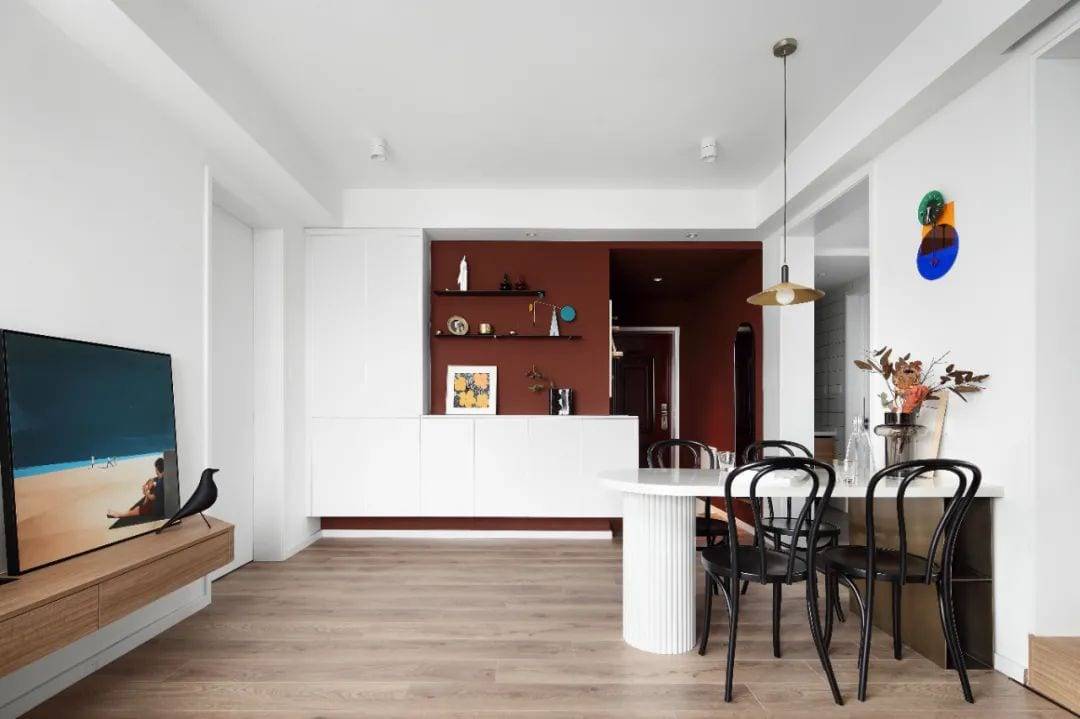
Dining room “small area with clever design”
Perfect use of an entry turning wall
The designer made a set of pure white body blocks for the sideboard.
With red walls, under color clash
There is no contradiction between beauty and practicality.
Homeowner places beloved ornaments one by one
The usual coffee, afternoon tea.
All have separate operating spaces
There’s so many ways to use limited space.
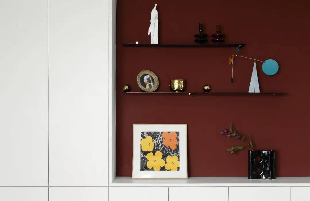
The lady of the house’s favorite ornaments and paintings can be safely displayed.
Extremely thin black partition finish reduces presence
Makes the whole space lighter.
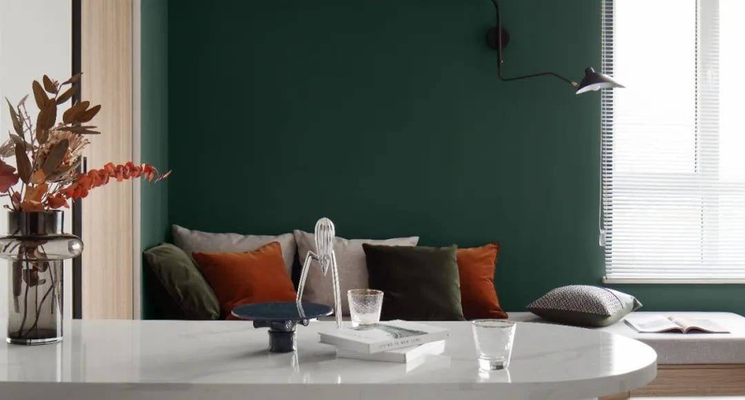
Marble countertops Curved corners
It’s safer for kids to use for a future family of three.
Mr. Wong’s family of two is about to welcome the third member of the family.
So the design takes into account the lifestyle of families with children.
It is necessary and desirable.
And from the dining room to the kitchen to the children’s room
It’s all the shortest distance.
Whether it’s cooking, eating or babysitting.
All can be taken care of quickly.
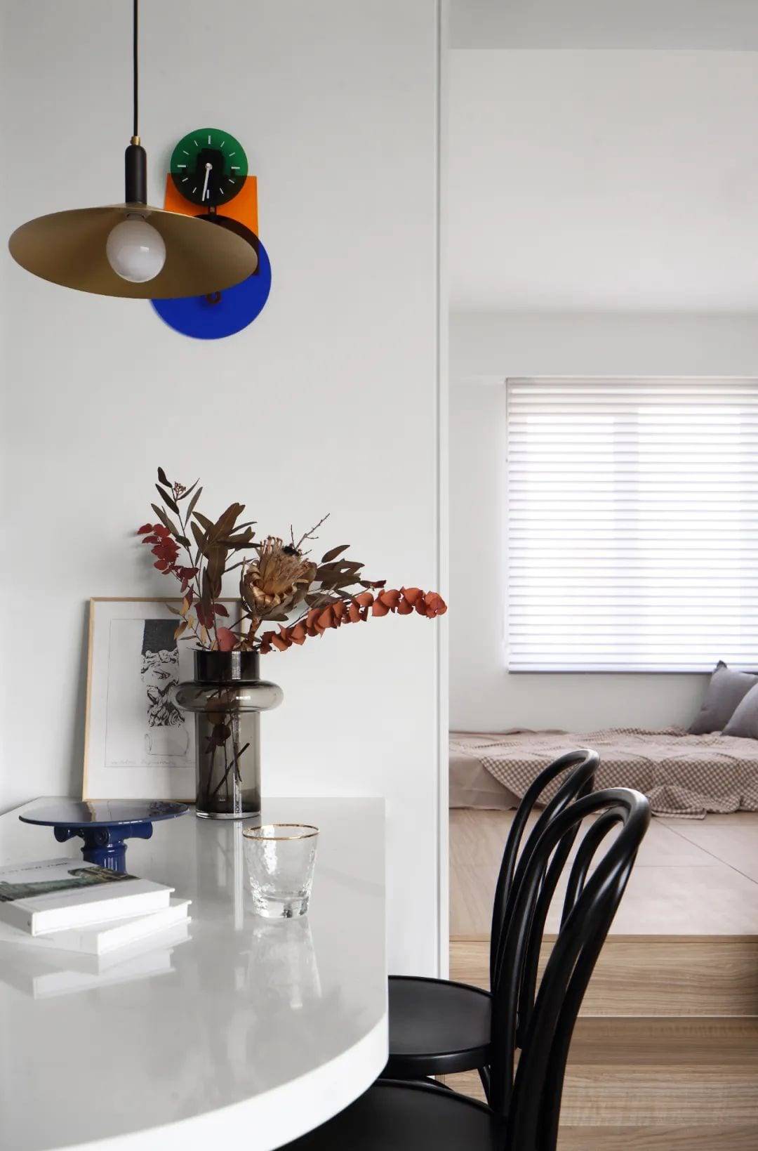
Sitting in the dining room, you can see the children’s room.
Steps and sliding doors here
It’s a flexible boundary for children’s rooms and common spaces
Quiet sleeping quarters for kids and a world of adults
This little door makes a natural division.
A child’s world is protected by an appropriate tenderness.
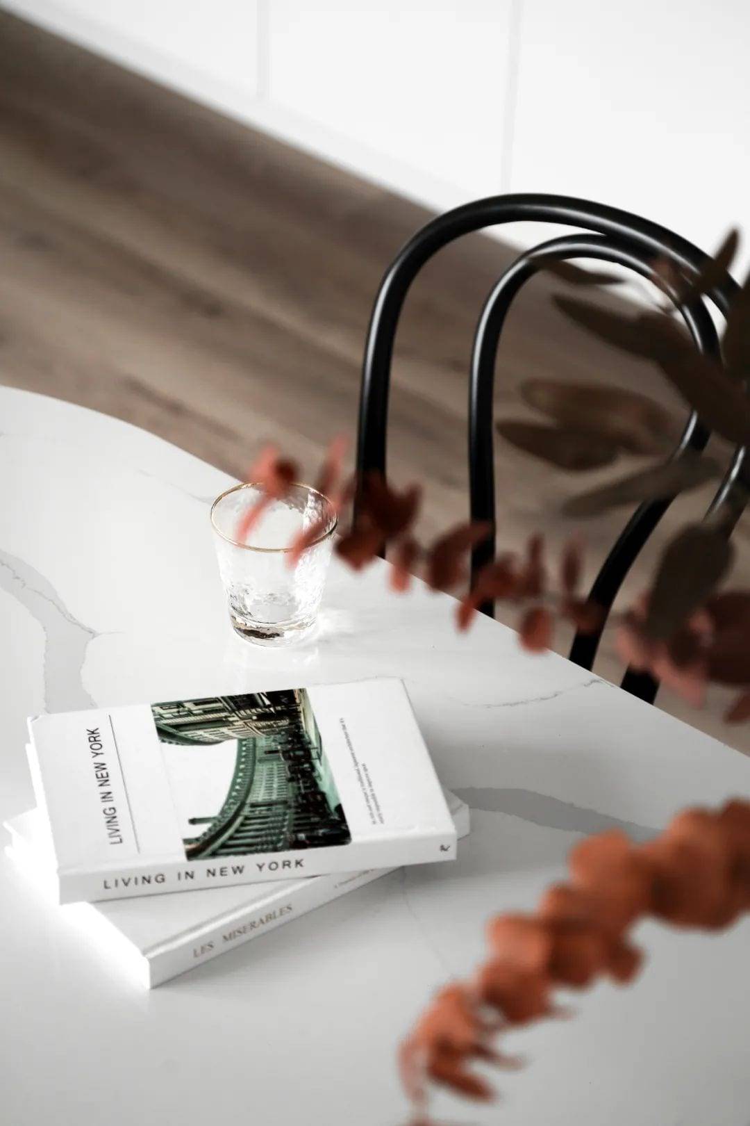
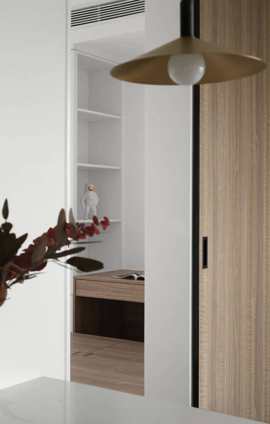
A simple marble table for three meals a day for the family.
A family gathering.
There’s light in the ordinary days.
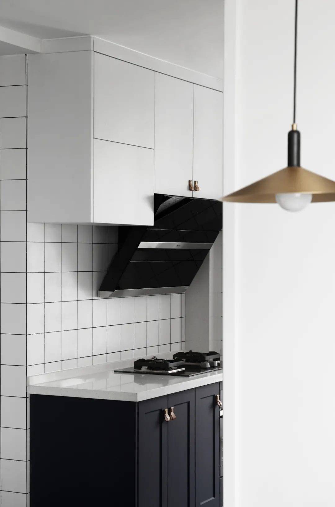
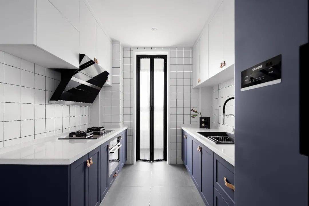
The original kitchen was a square layout.
Eliminate original backward facing
A symmetrical console was added to the space.
In the sliding door is a living balcony to dry clothes.
In the kitchen, there is a combination of overhead cabinets and floor storage.
Huge kitchen area storage
It’s a great way to store everything. It’s a big, flowing space.
03.
Private Areas
Private Area
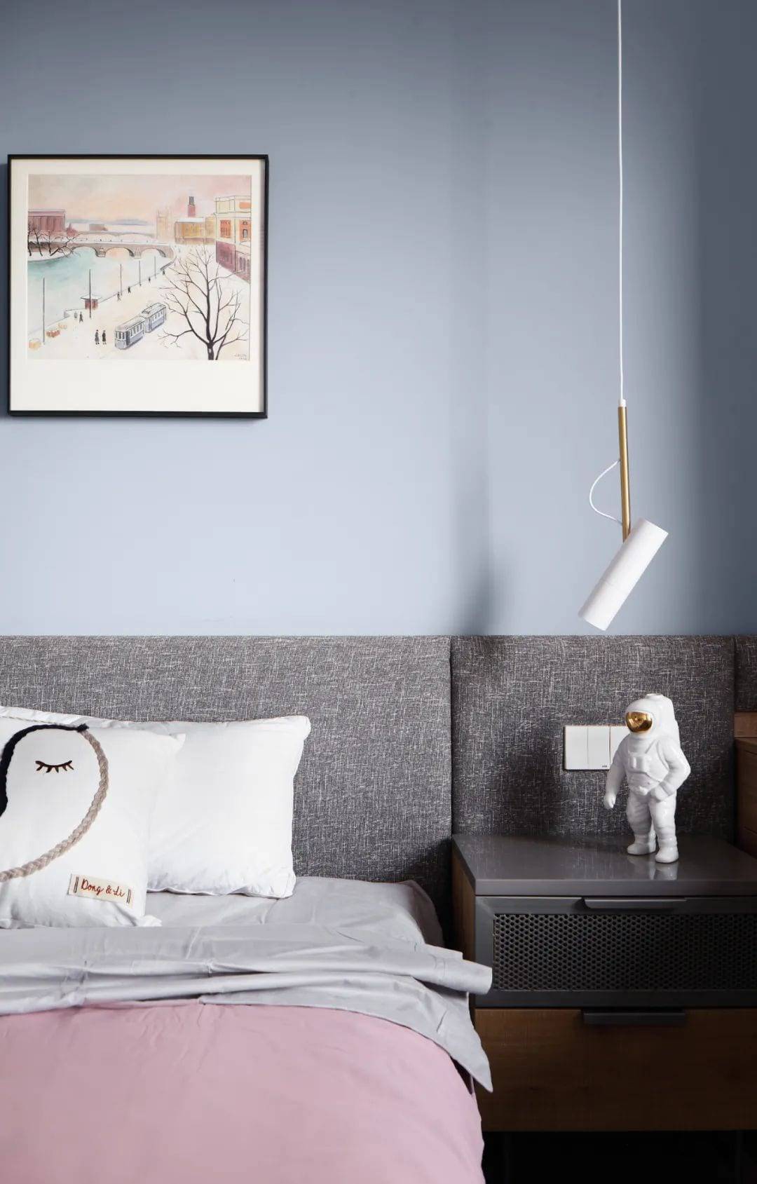
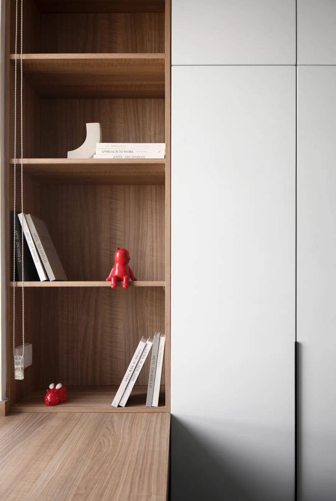
Not much room for change
With a fixed layout
Master bedroom focus on owner’s usage habits
Chandeliers for nighttime lighting at all times
The opposite desk and storage compartment insists on pragmatic details.
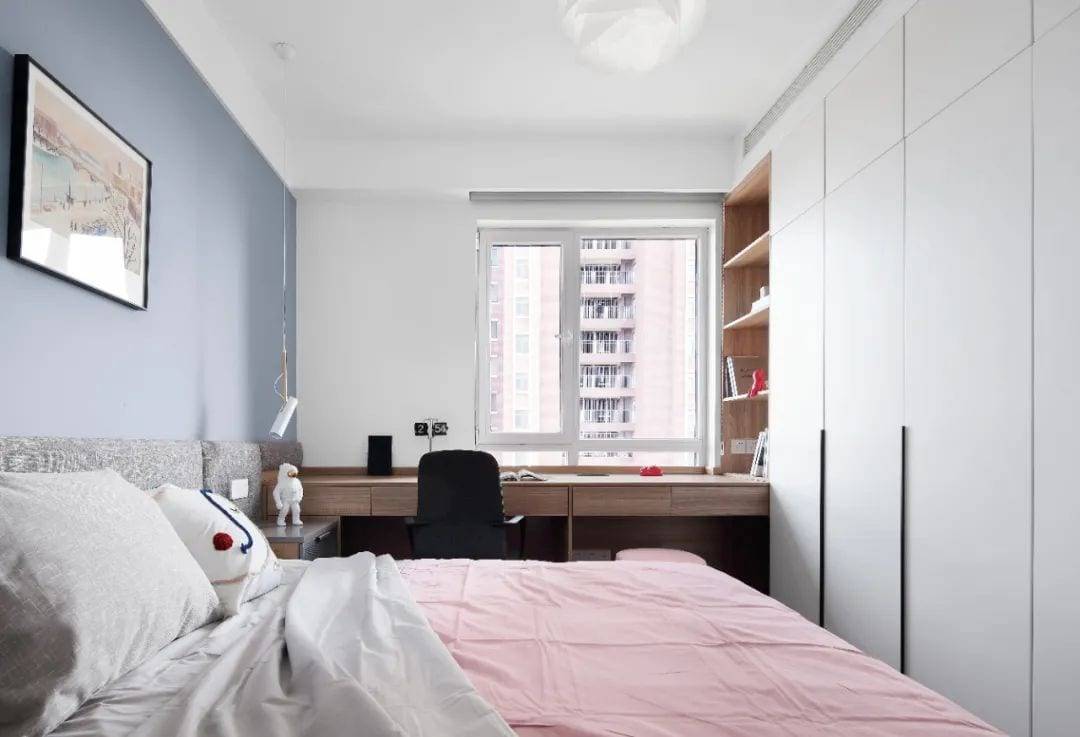
It’s a modest bedroom with a tightly woven wall of cabinets.
Realize the storage of male and female owners’ belongings
A simple large wardrobe with a perfectly fitting desk
Bedrooms need to be designed to meet function
Understatement and pragmatism
Make the entire space durable and classic
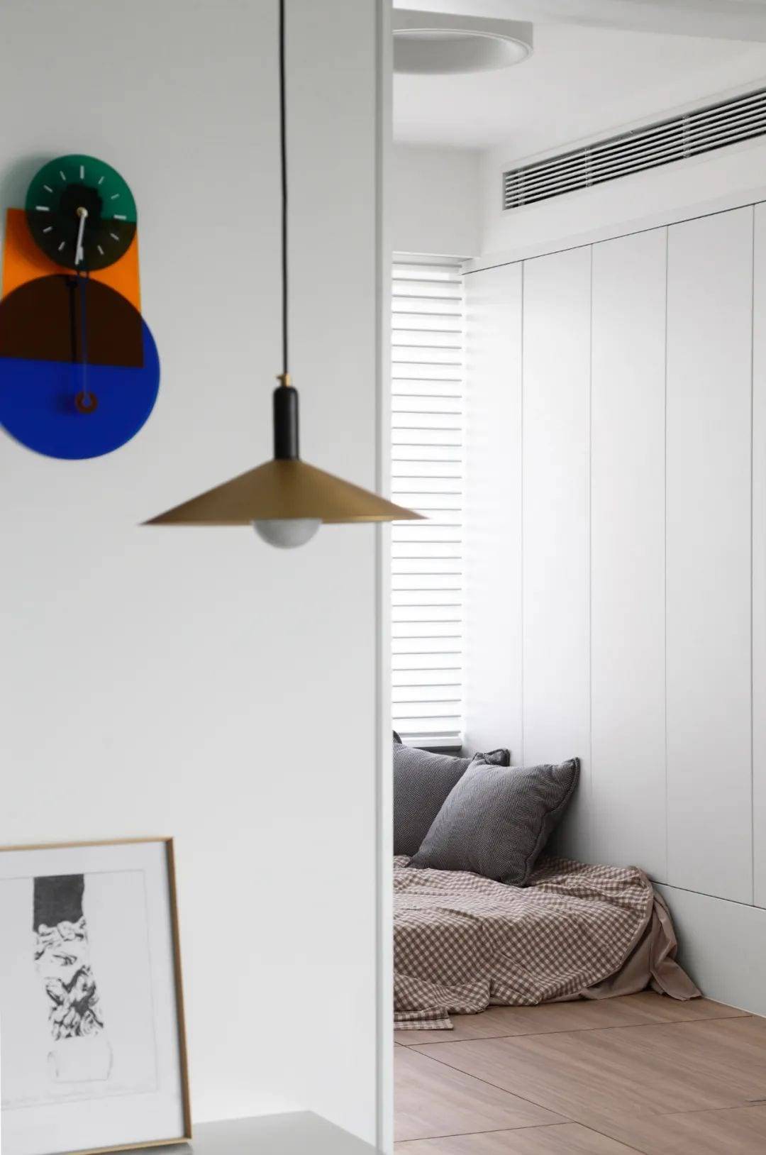
A space for children.
There should be no limit to what’s possible.
Wooden flooring throughout
Make the whole room a free space to play.
Climbing up and down, tossing and turning.
Tatami mats are designed to prevent children from falling out of bed and are safer to use.
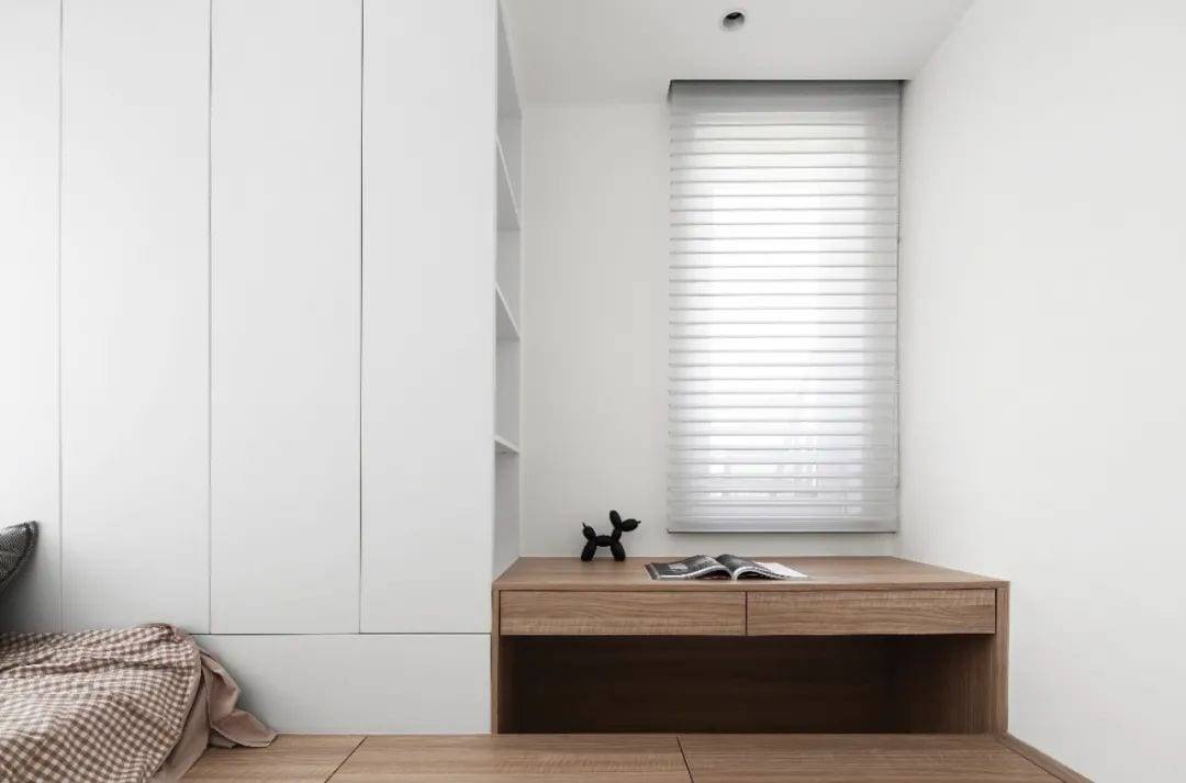
Even though the baby hasn’t been born yet.
But the desk must be a must.
There’s room to play, read and learn.
top-height bookcase
When the kid gets older, he’ll be able to stand up and pick up books.
Another way to access the bookcase
It’s kind of interesting.
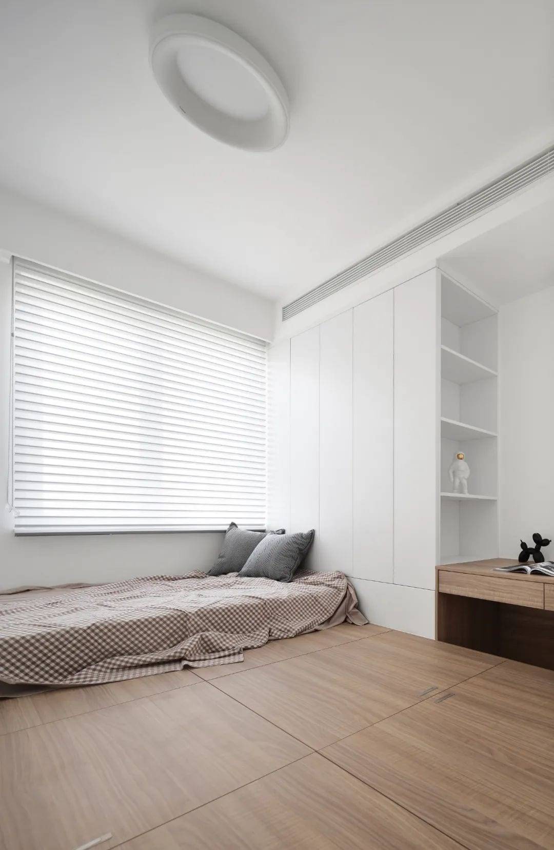
Open the blinds.
Bright sunshine into this cozy children’s room.
The owner’s child hasn’t been born yet.
Come in later.
Whether it’s sleeping with or babysitting.
The tatami mats are all a convenient enough option
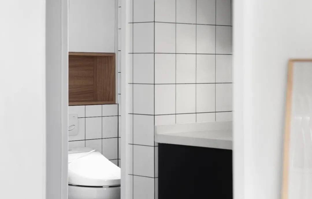
You can guess.
This bathroom is only three square meters.
And yet magically achieve a complete separation of the three?
The outside is the sink.
Open the door to the toilet and then the bathroom.
The owner’s family has lived in Japan for years.
I really like the design of Japanese bathrooms.
So we’re also using the triple separation in the design here.
Huge storage and complete triple separation
Synchronization of bathroom functions
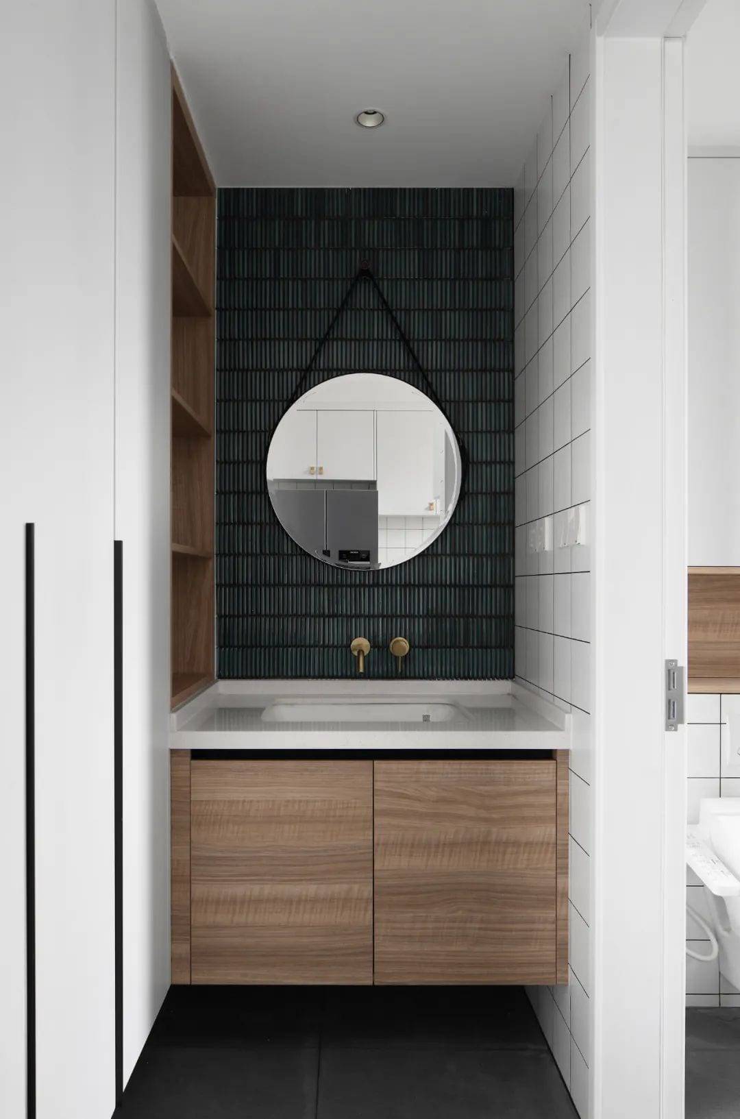
Restroom with limited space of 3m2
There’s plenty of storage as far as the eye can see.
The overhead cabinet on the left.
Wooden niches and cabinets under washbasins
Waterproof, corrosion-resistant and easy to clean
In the smallest detail.
A balance between practicality and aesthetics
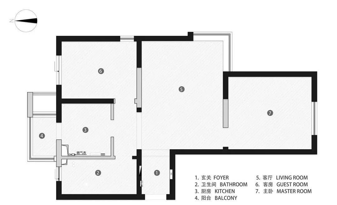
The original structure
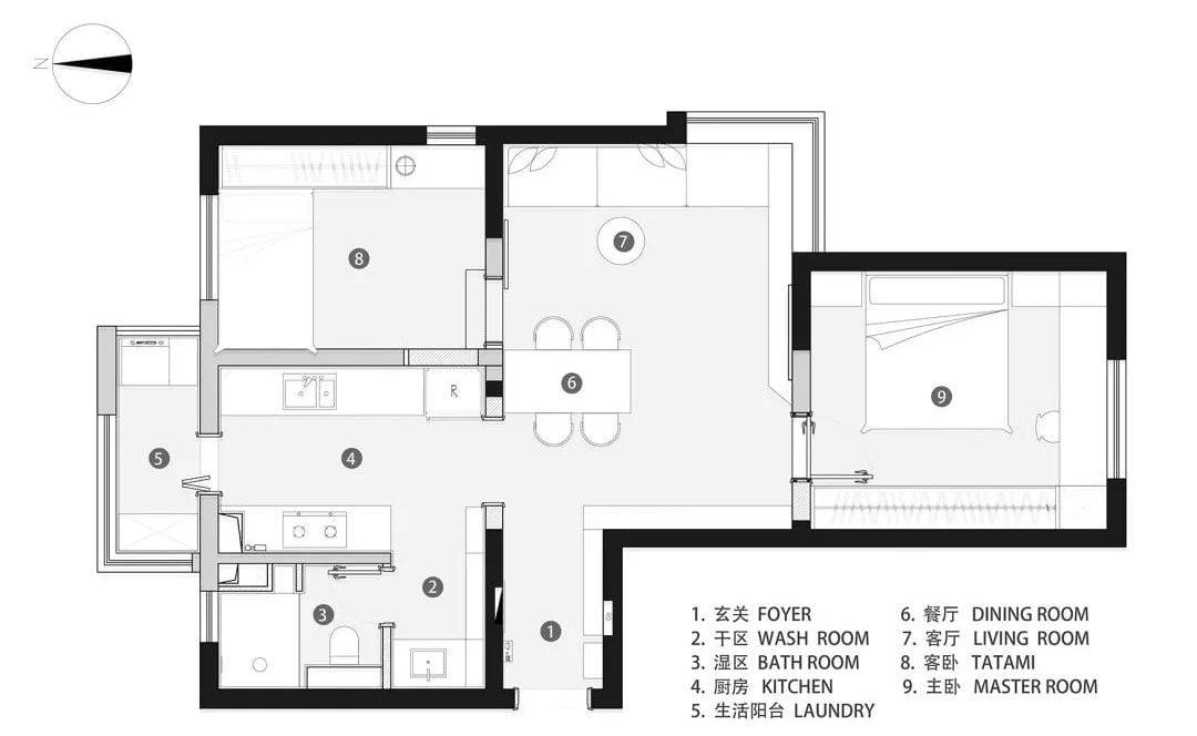
▲Layout Plan
“Home is where you really live.
We want it to have all the elements we like.
But not limited by style.
The process of designing and completing this home
It’s a process of learning about yourself and your life, little by little.
This is what we think of as home.
And I hope you like the house.”
CoordinatesLocation \ Tianjin Mayview Landmark Garden
Project \ flat house
Area \ 85m2
Design Team \ Deep White Design
Principal case designer \ Miss Yan
Soft furnishings Costume \ Don’t look back
Photography \ RICCI
 WOWOW Faucets


您好!Please sign in