Xiaoxin Bathroom Headlines
Interior design is often supported by the color to make it more tension, but in terms of bathroom space, the color scheme is more or less too conservative, although the use of black and white tone is classic, but over time it forms a monotonous visual effect, making it dull.
As a private bathroom space, should it have its own color? The answer is yes. In this issue, let’s talk about this topic.
P1
Orange
Orange, a representative of the bright school of color, has its own unique gentle atmosphere. Or dark or light, or bright or dark, each tone has its own unique gentle context, how not to let people intoxicated.
Blue + Orange
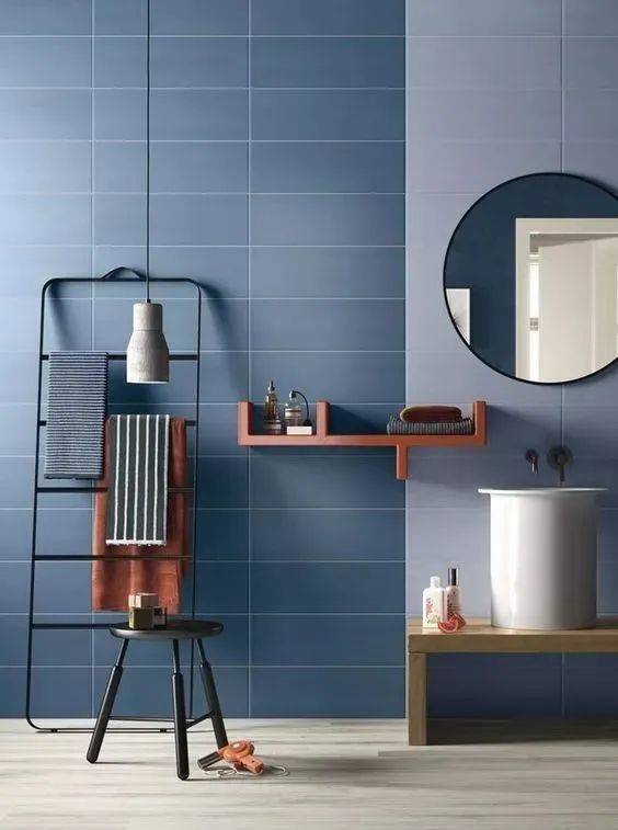
Blue, calm and deep, is suitable for filling the space on a large scale; orange is bright and vivid, and a little embellishment can bring out an unusual and energetic atmosphere; when the two meet, it creates a delightful space without any intention.
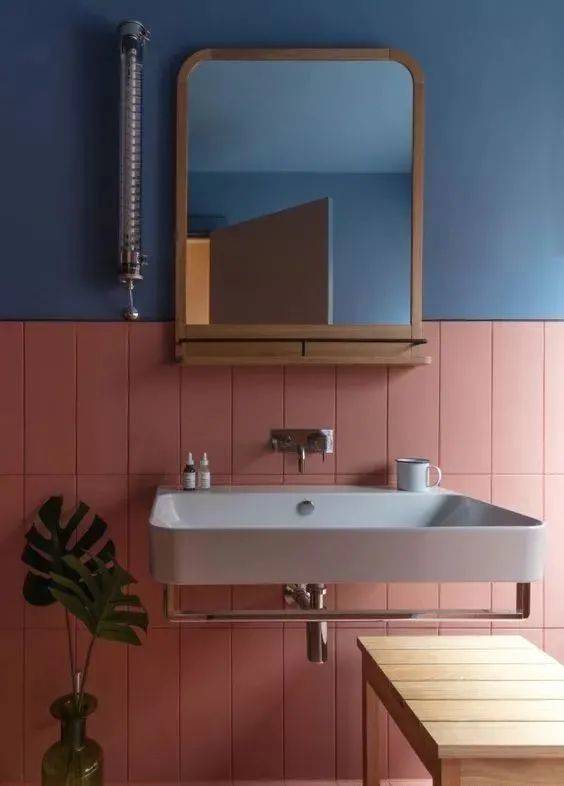
In the application, it is recommended to choose a combination of low-saturation blue and orange, which is not overly ostentatious but not too bright. The proportion of the division, the blue as the main tone, orange as the accent color, so in and out of the match more harmonious.
Grass green + coral orange
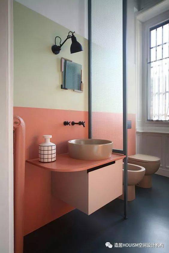
In the black and white color bathroom space, by the grass green + coral orange geometric color block for color filling, can make the bathroom bright and soft. The light and gentle color combination, the interpretation of the ultimate soft temperament style.
P2
Pink color
As a representative of romantic vision, the filling of pink color is always full of surprises. Light and light color, both elegant and romantic, with a girl-like innocence, choose it as the main color of the bathroom space, it is the wise thing to do.
Pink + white
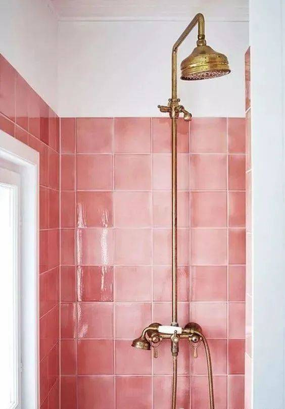
Warm tones of light pink + white to create the bathroom space, the overall tone is soft, full of girl’s youthful atmosphere and a sense of warmth. Slightly glossy pink tiles with pure white walls as a transition, so relaxed color with a calm state of mind, giving people the power of warmth.
Nude pink + dark green
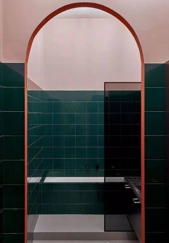
The color clash of nude pink + dark green is laid out in a ratio of three to two, bringing a beautiful vintage atmosphere. Two-thirds of the dark green base, adding one-third of the nude pink blend, strong color contrast produces excellent visual tension, making the entire bathroom space is very artistic.
Pink + black
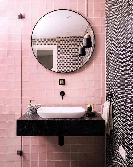
Black and pink with each other, although not as pure and bright as the white side, but more of a personalized color language. The two colors are attached to different materials above the tiles, splicing combination under the unexpected harmony. A room of pink, less of the original delicate, more of a flow of vivid and elegant restraint, which is only with the black collision to produce the color charm.
Pink + gray
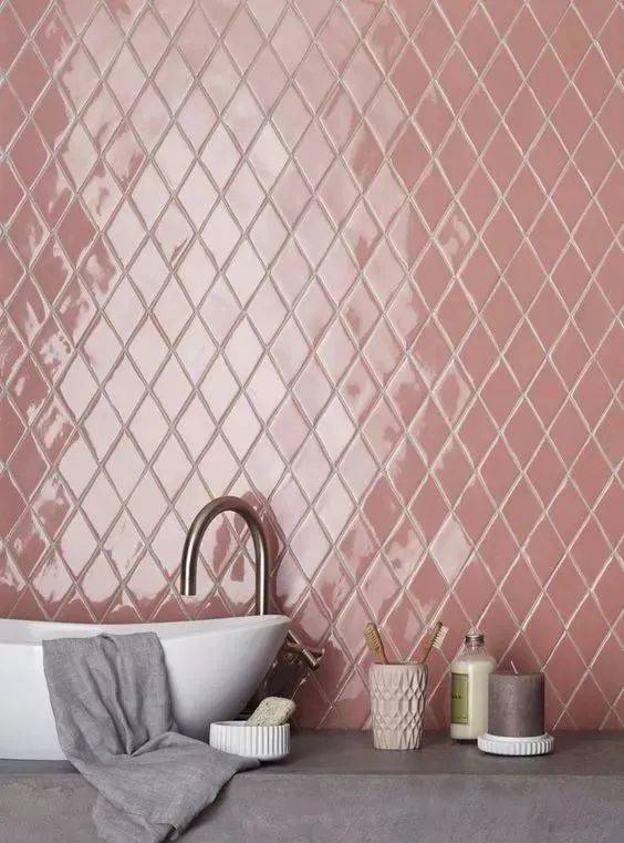
This is a fairly classic color combination, senior, elegant, romantic, which is the visual charm they present. Whether they are embellished with each other, or equal, they have a color charm that should not be underestimated.
P3
Green color scheme
Green, the most vital color in the palette, whether it is the use of a large area or localized embellishment, always by their own charm to bring out a self-contained visual impact, let people fall in love at first sight.
Green + wood color
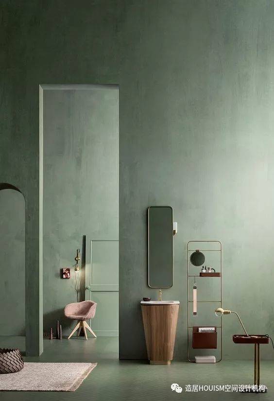
The green color is used as the main tone to spread the whole space, bringing out the natural atmosphere, and the wood-colored sink is used as an accent to deepen the overall flavor. Such a rustic and natural color presentation gives the whole space an unspeakable natural beauty.
Green + White
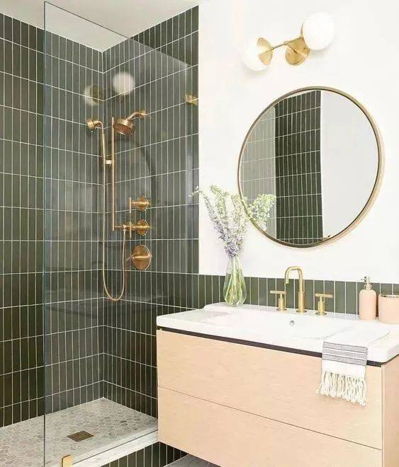
The meeting of green and white has a delightful stirring that seems to awaken the pure state of mind in the heart. The match between the two, not caring about the proportion, or for embellishment, or two and a half, is with the ultimate expression of tenderness, refreshing and charming.
Green + Black
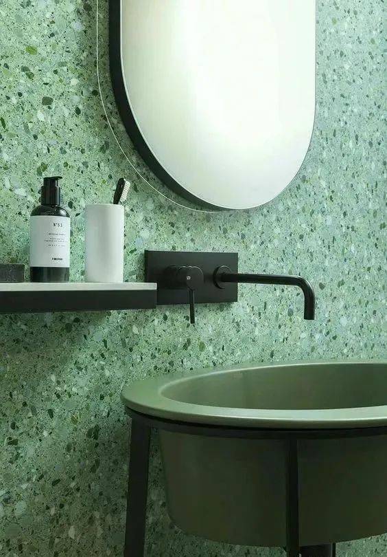
In this large green space, black has become the accent color between each other. Low-key and introverted without losing poise, the composition of a harmonious prelude, so that the whole space is filled with an infinite sense of high class.
P4
Red color
The hot red color, more often than not, appears as an accent color, but it does not mean that it cannot become the main color. Regardless of the ratio, it still has a fascinating visual perception.
Red + Gray
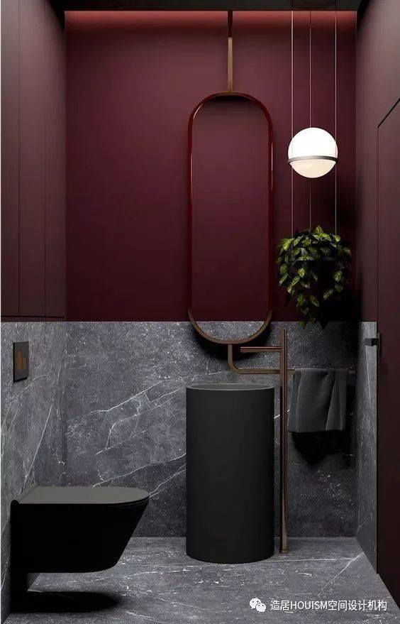
The heavy brick red is different from other dark colors, a neutral warm tone that can give the whole space a retro sense of time, with the same deep high grade gray, creating a deep and charming sense of high class.
Red + white
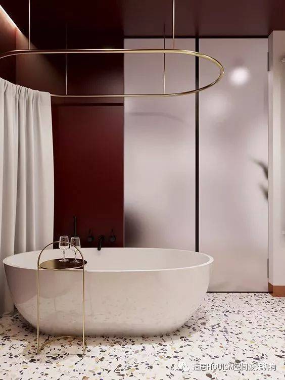
Among the red that occupies a large area, with the addition of white, highlighting a sense of delicate and elegant beauty. From red to white color transition, it is derived from the dynamic beauty of a gradient.
After reading these color schemes, is it found that the original bathroom space can also be so “colorful” it? Indeed, compared to the monotony of black and white gray, the use of so many colors for the bathroom space is built out of a comfortable sense of vision. Decent and not lose the senior, so that people are happy.
 WOWOW Faucets





您好!Please sign in