Hori-Zons Design Interior Design Alliance
The essence of architecture is space, and the essence of space is to serve people.
–John Portman
Art is the creative activity of leaving white space, which is also the case for painting, movies and interior space. With a white space, there is a meaning beyond the words and a message beyond the chord, so that things that are not present rely on the participation of imagination to appear in the intuitive, fully activate and awaken people’s imagination, and in the process of continuous deconstruction and reconstruction of space, to achieve a qualitative leap in the white space, the limited space will have unlimited possibilities.
01.
Ground Floor Study House

Kevin, a post-90s homeowner who pursues perfection in details, and the post-80s designer, who also pursues perfection in details, share the same high degree of design aesthetics, so they started to work together instantly. The master bedroom and study suite design was retained to ensure the comfort and practicality of the space, as it is positioned as a living space for one person. The second bedroom is turned into a multi-functional room, integrating bedroom, study and storage space, and is connected with the public space, making the original poorly lit passageway space to be supplemented by natural light, enhancing the overall indoor space permeability and brightness.
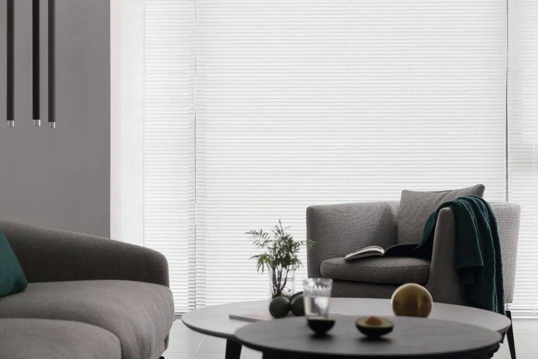
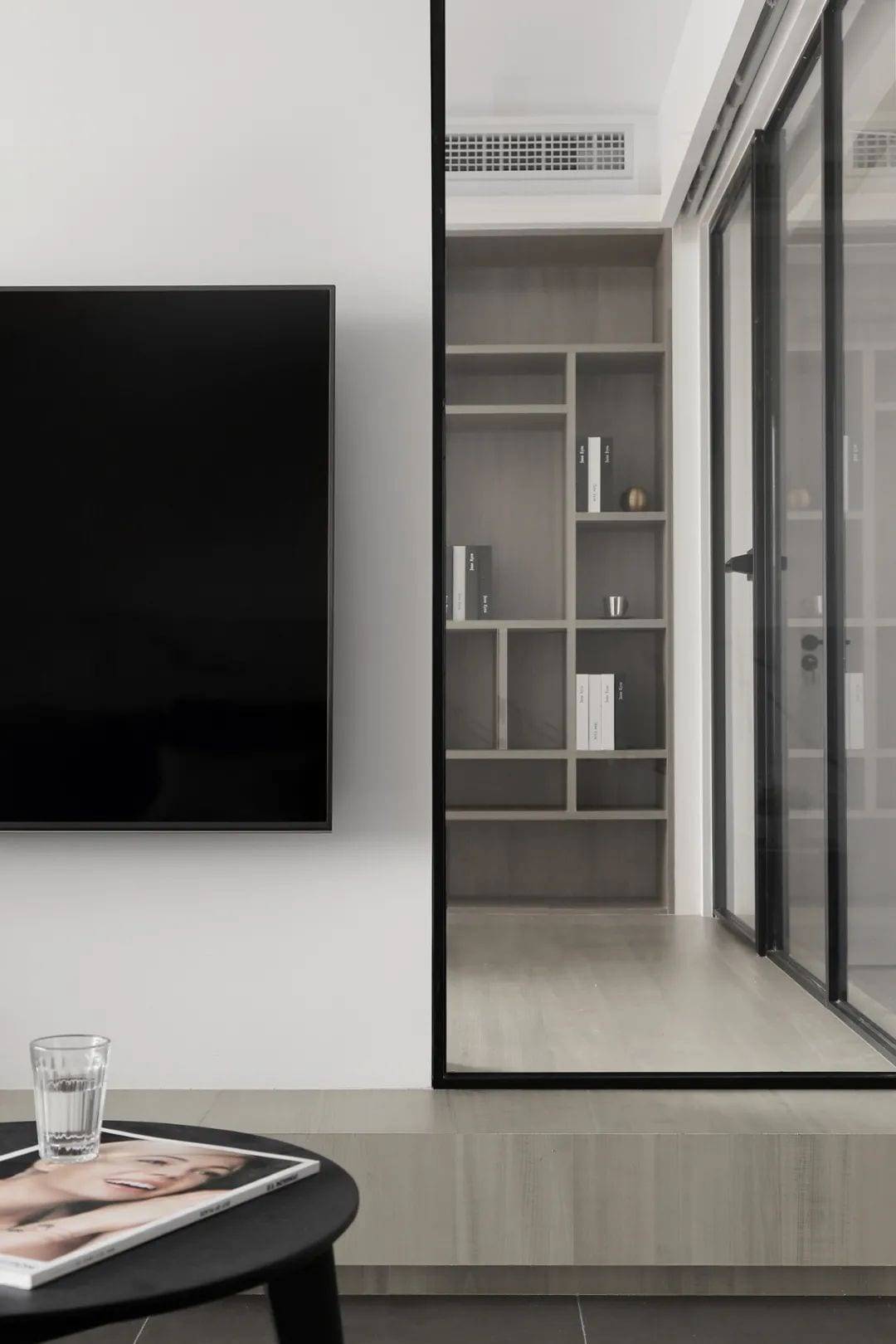
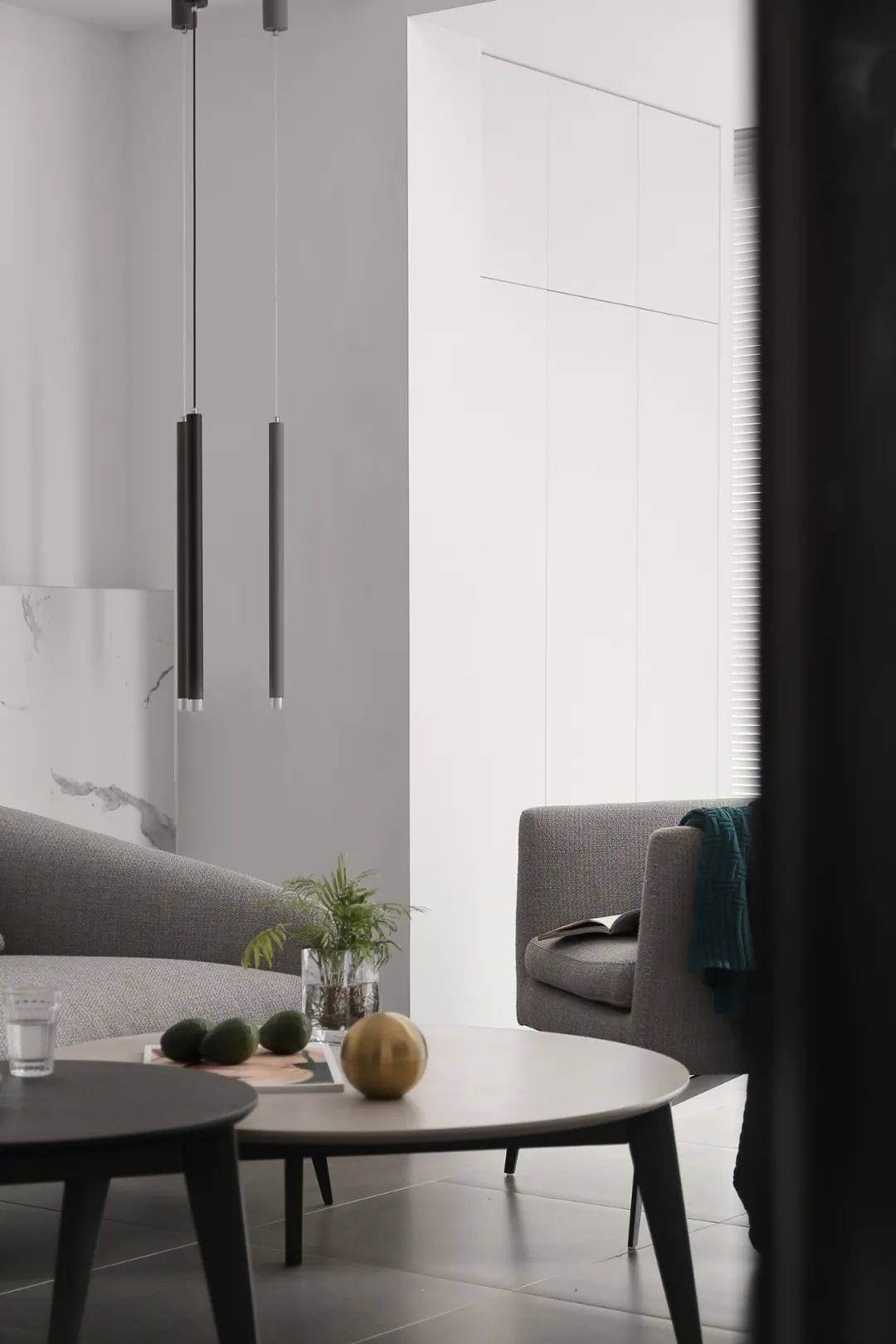
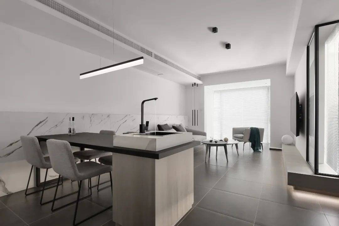
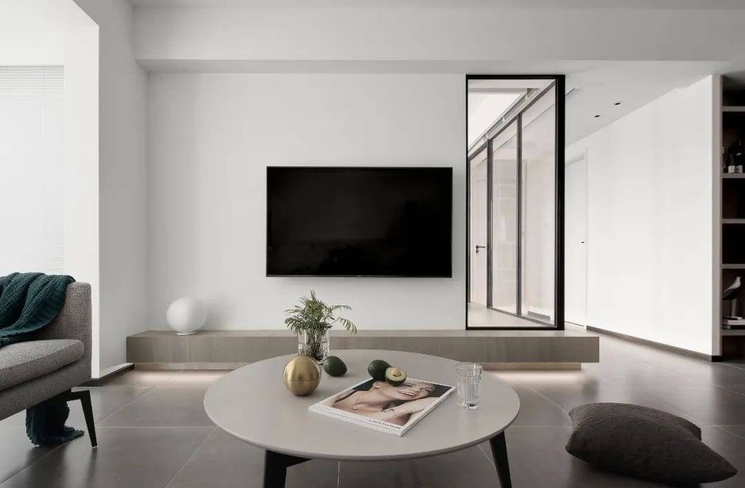
In addition to meeting all the functional needs of the owners, the black, white and gray tone carefully create a comfortable spiritual fortress, with white techniques to reduce the space and design language of impurities, so that the overall space is full of authentic natural atmosphere. The floor of the multifunction room extends to the TV backdrop, and the monotonous and boring solid wall division is broken with features and creativity. The two functional areas are divided by glass partition, but the permeability of glass connects the two independent spaces closely, and the vision is extended and penetrated. At the same time, natural light is introduced into the passageway space, which greatly increases the light flow in the indoor space. The design of concealed linear lights on the floor increases the sense of layering of space, and the light sense of suspension makes the space a little more soft.
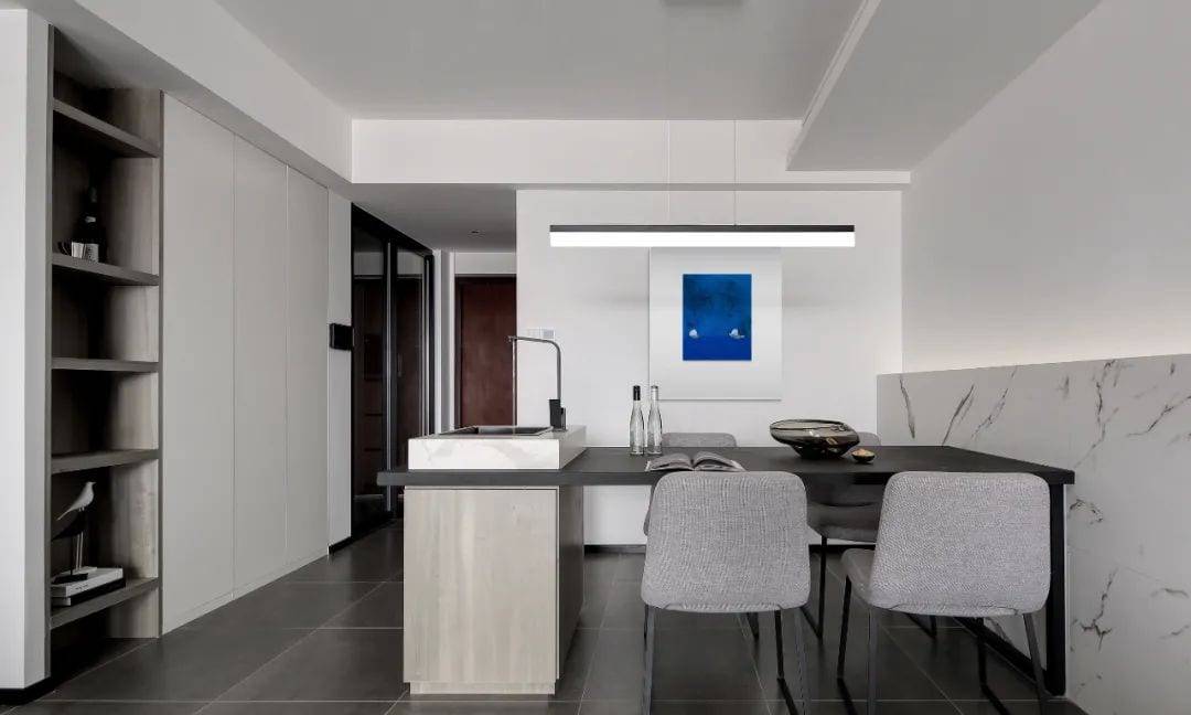
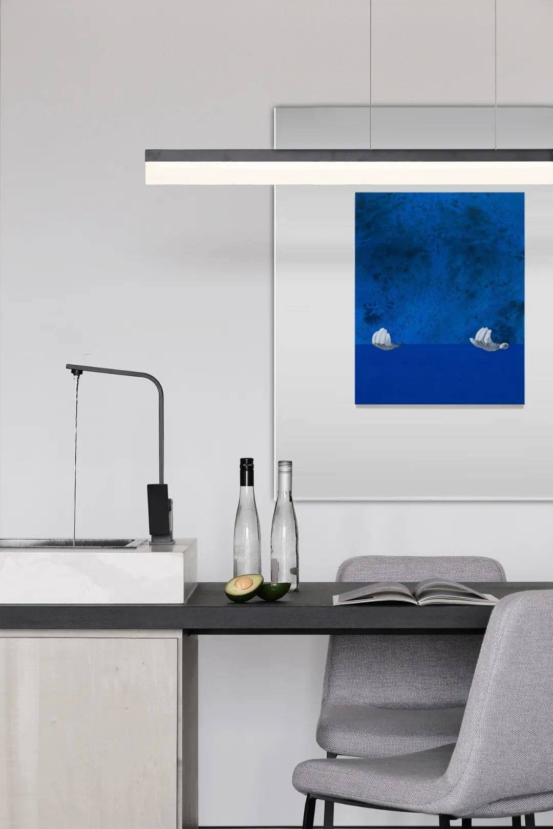
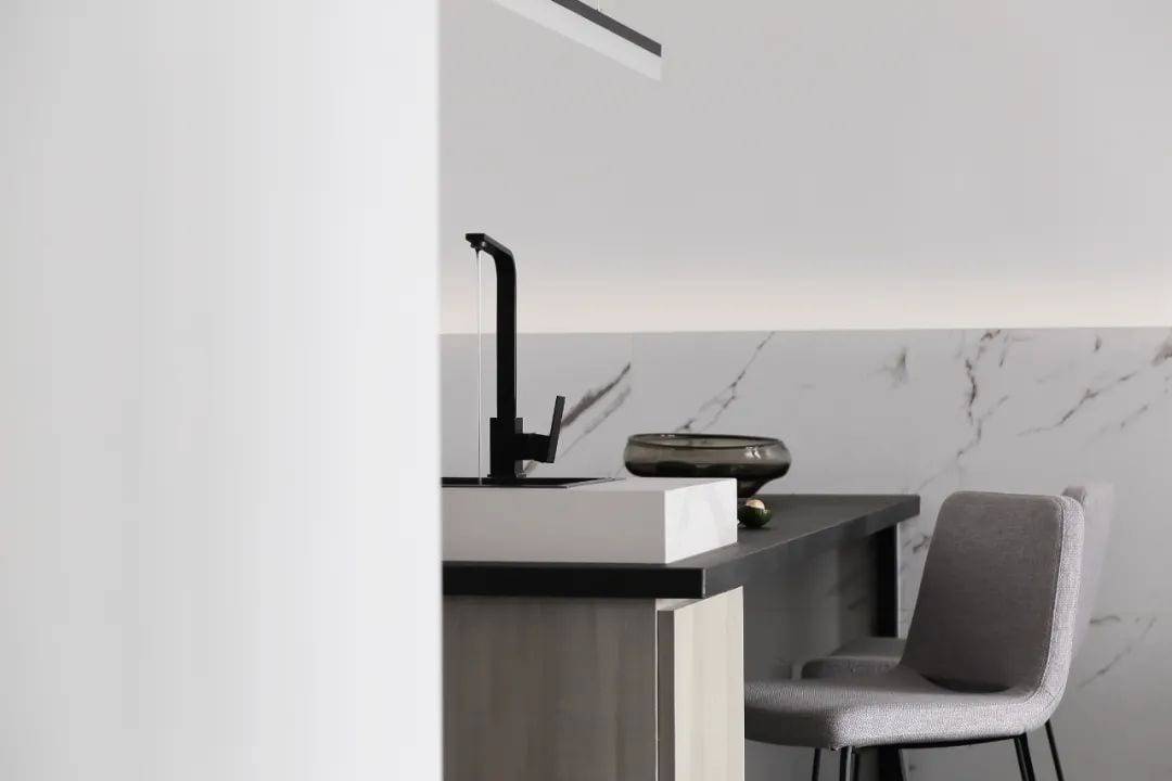
The drinking water and kitchen water are separated, and the island is reorganized with the dining table. The drinking water is set here, and the integrated dining island design instantly improves the quality of the 90 square meters space, and the owner gladly expresses his preference. The characteristics of rock slate countertop, such as high temperature resistance, no color penetration and anti-scratch, are favored by the minimalist style, and the combination of gray cloth dining chairs makes the cold and hard dining space more tender and mellow. No main lamp lighting design, see no light hidden light source can increase the level and rhythm of the space, lighting the aesthetic mood to create a comfortable and comfortable dining atmosphere.
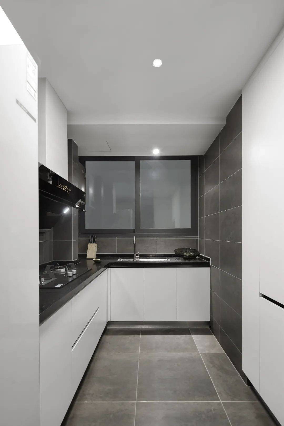
Dark gray space with pure white cabinet, waterproof plasterboard ceiling with hidden down light design, so that the kitchen space is more simple and generous.
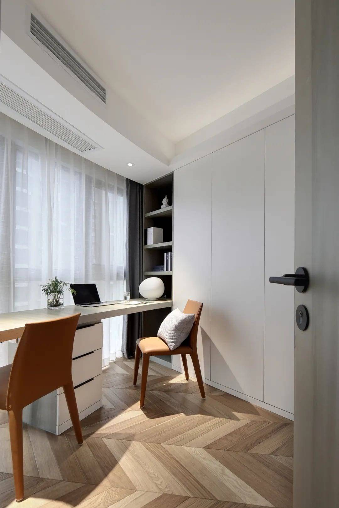
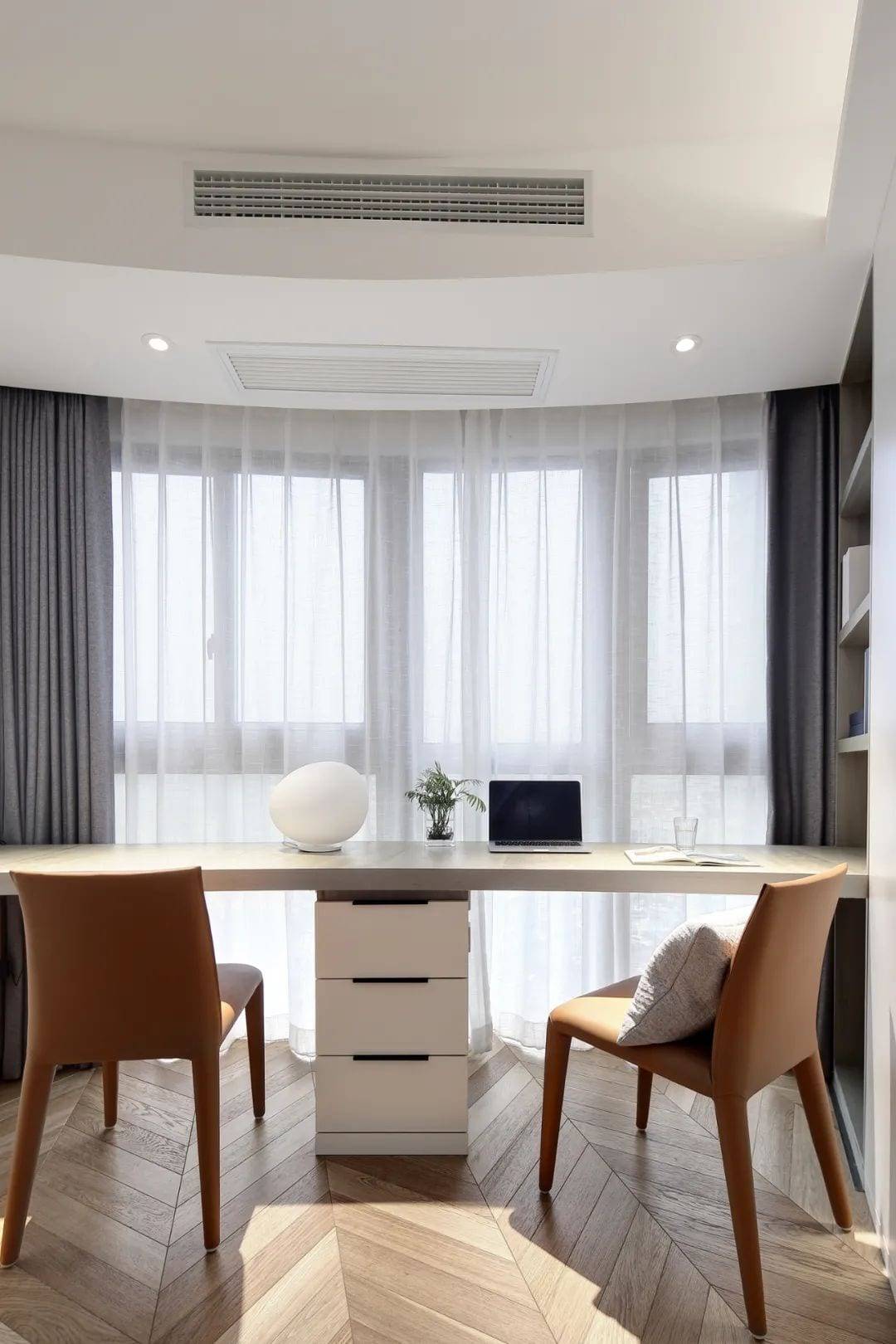
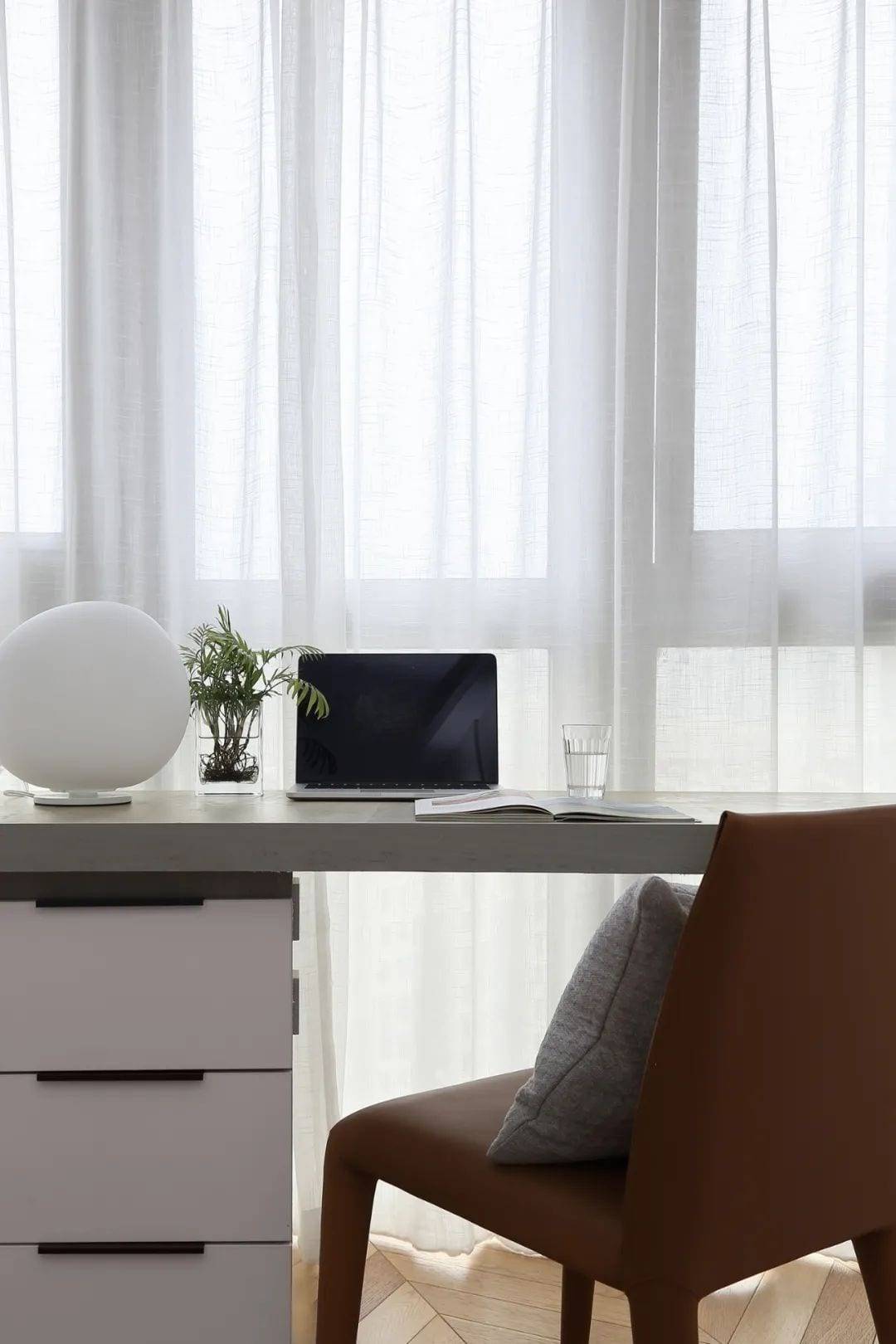
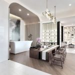
Using the original developer’s arc space, the desk and open bookshelves between the use of interspersed architectural design techniques, forming a desk + open bookshelves combination. The seamless transition with the storage cabinet is natural, and the functional division is reasonable and clear. Simple and sharp lines, Hermes Orange inherent sense of sophistication active study space, impactful visual performance weakened the cold sense of space.
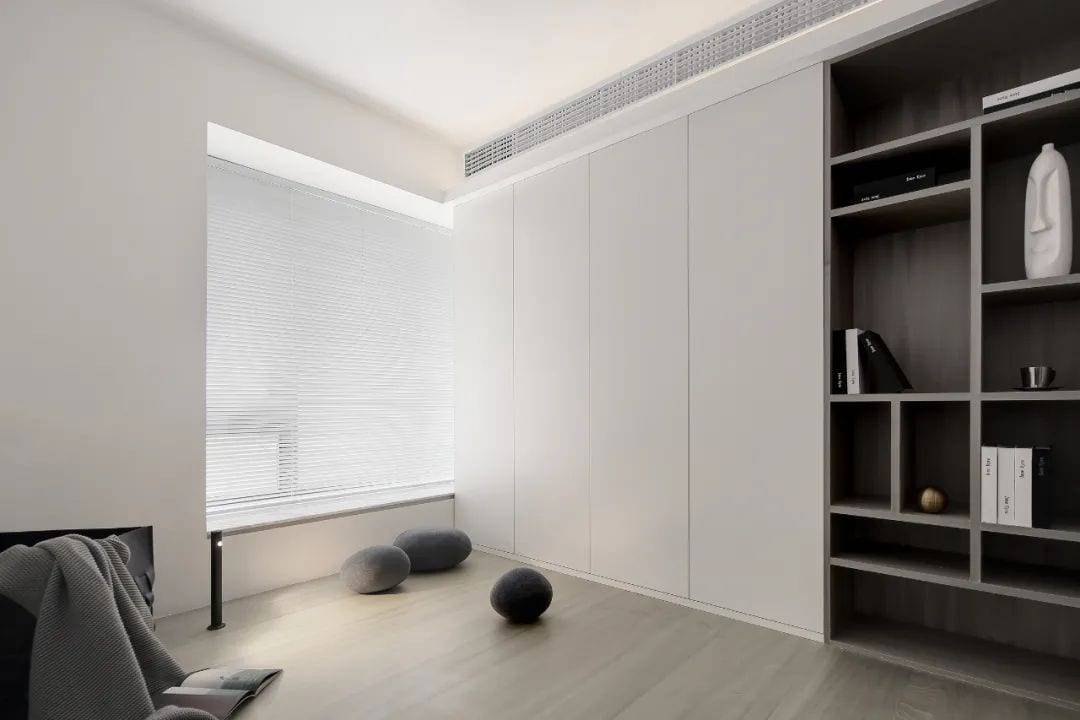
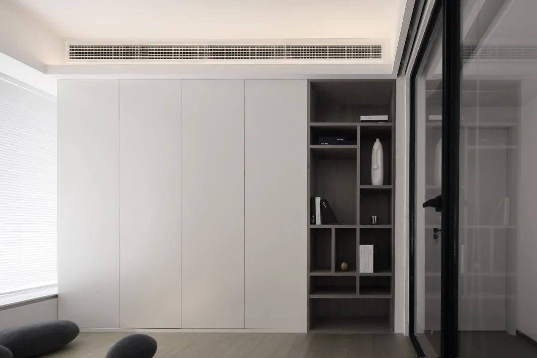
Like the blinds of light and shade, sunlight just right. The sunlight through the blinds cascading on the floor, different angles, different time, the interweaving of light and shadow, warm and comfortable, virtually become the best decoration of the space. On a sunny day, hold a favorite magazine and books sitting on the floor, accompanied by a quiet reading, tired of lying down with clothes and a little rest, give a complete release of the heart, so that the tired soul to relax and heal.
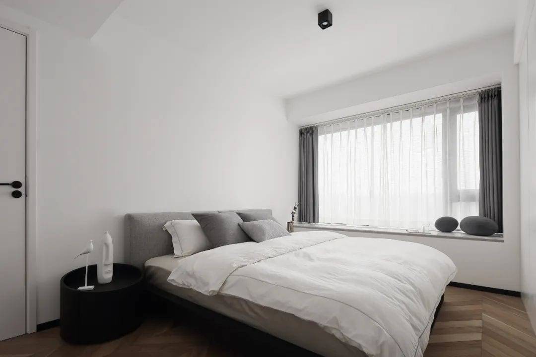
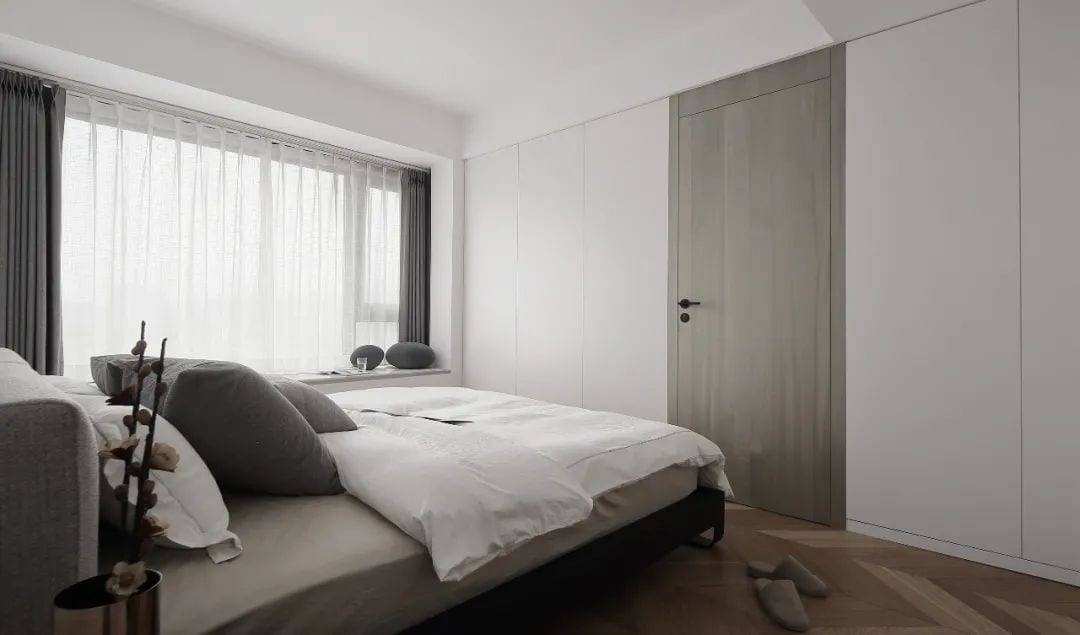
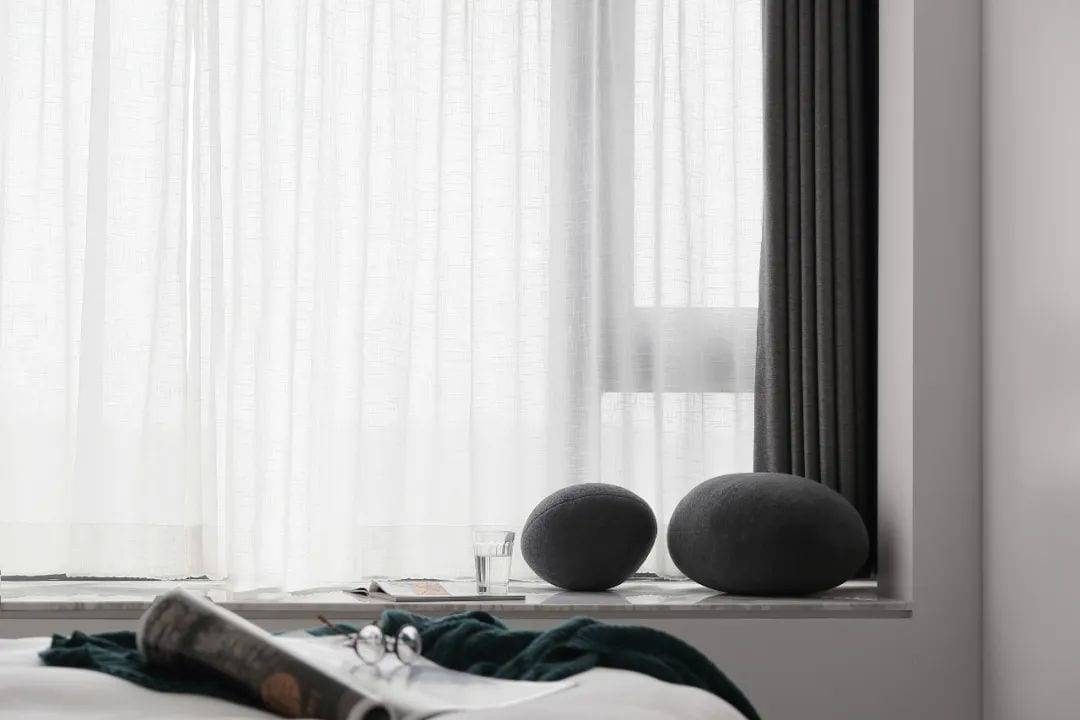
The master bedroom continues the minimalist design language of the overall space, in addition to the gray and white wood color scheme is impetuous, to retain a refreshing quiet. The hidden door to the study is designed to be integrated with the bedroom storage cabinet, and the tulip wood veneer on the invisible door forms a sharp contrast with the white cabinet door to ensure functional use without losing visual beauty, simplicity and interesting space. Abandoning the traditional hanging edge design of the window stone, the door adopts the sewing method in architectural design, and the processing of small details creates a light and delicate visual aesthetic.
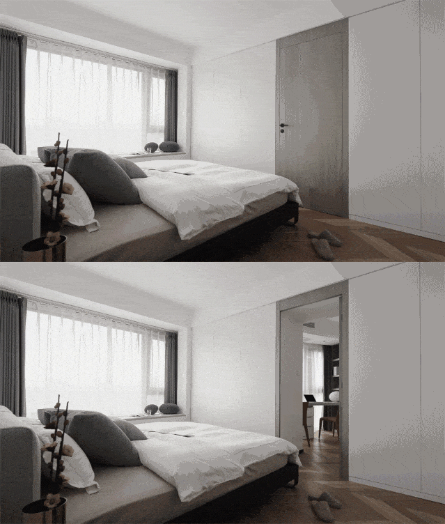
When the invisible door is made, the door cover protrudes out of the cabinet body by 2 centimeters, and the cabinet door closes just at the same level, which achieves the minimalist style of simple but not simple artistic temperament as far as possible, and creates a visual effect of space integration.
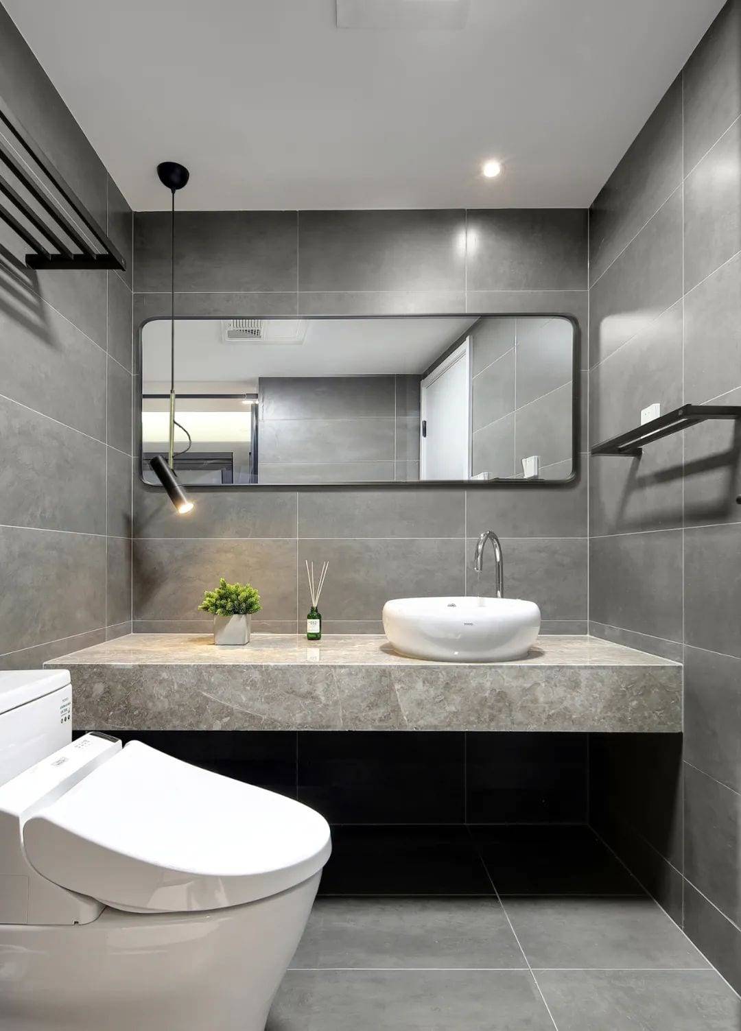
The design of the overhanging basin cabinet, as the face value of the bathroom, to reduce the annoying health corners. In the design sense of the linear chandelier poly light source light backdrop, bathroom space more fashionable and atmosphere.
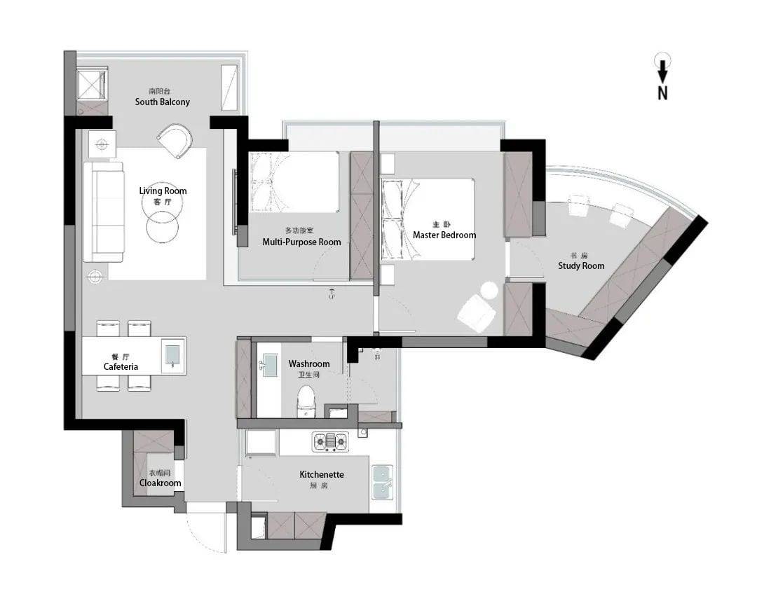
▲Floor plan
02.
Study Room
Form is derived from function.
–American architect Sullivan
The most beautiful thing in the world is all the senses given by nature. It is the valley of clouds and smoke in the distance, or the greenery flowing in front of the sky; it is the vast ocean, or the warm and unrestrained light and shadow ……. The fast pace of urban life makes more and more people yearn for nature and purity, permeable sunlight, natural light scenery, light and elegant colors, and enjoy the ease and comfort of embracing nature in every inch.
At the beginning of 2018, when first approached by the owner Barry, the young couple’s wedding house still had about a year to go before it was officially delivered, so priority was given to the renovation of the parents’ residence in Sunny Fairview Court, which led to the original work “Harmony Wind” of Huizhu Design 2018, which is still quite popular among the public, even though two years have passed. In view of the pleasant cooperation of the first time, the design of the young couple’s wedding house also came to fruition, and now the design of the second project is finally settled and photographed in real life. At first sight, we fell in love at first sight, and it was a pleasure to see you again.
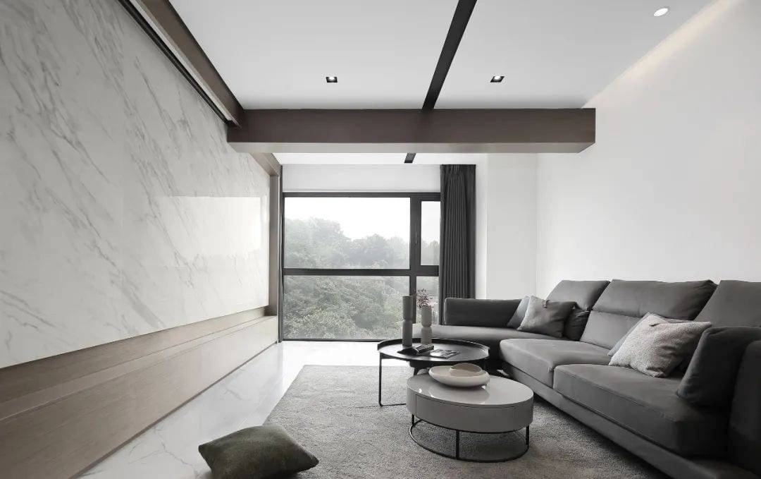

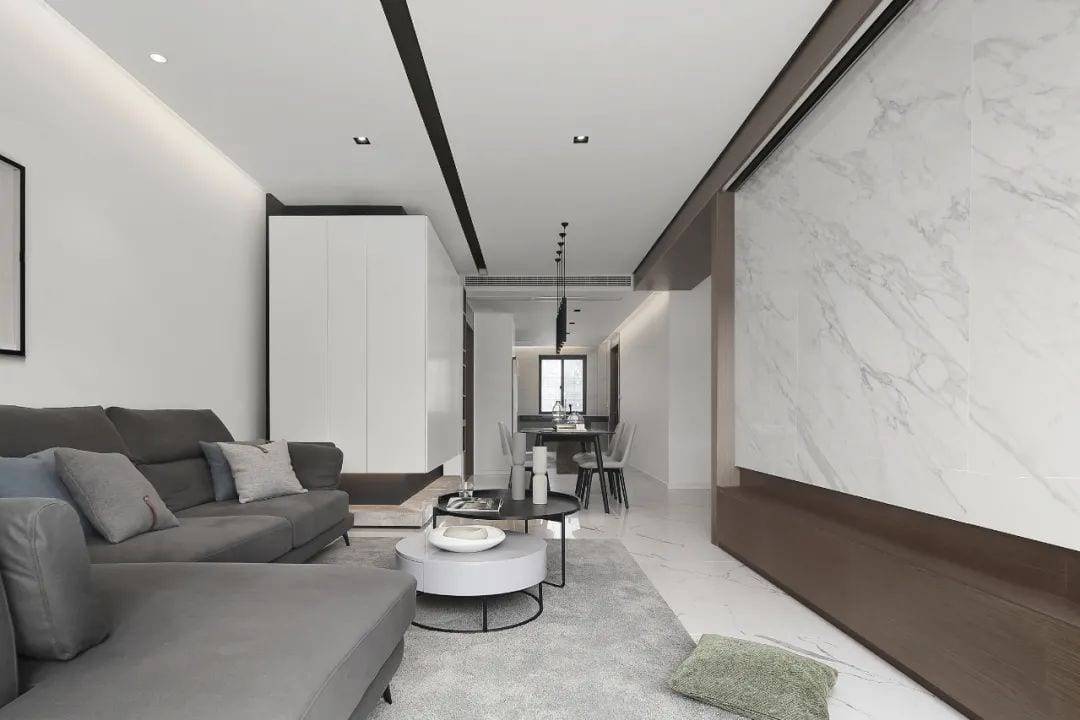
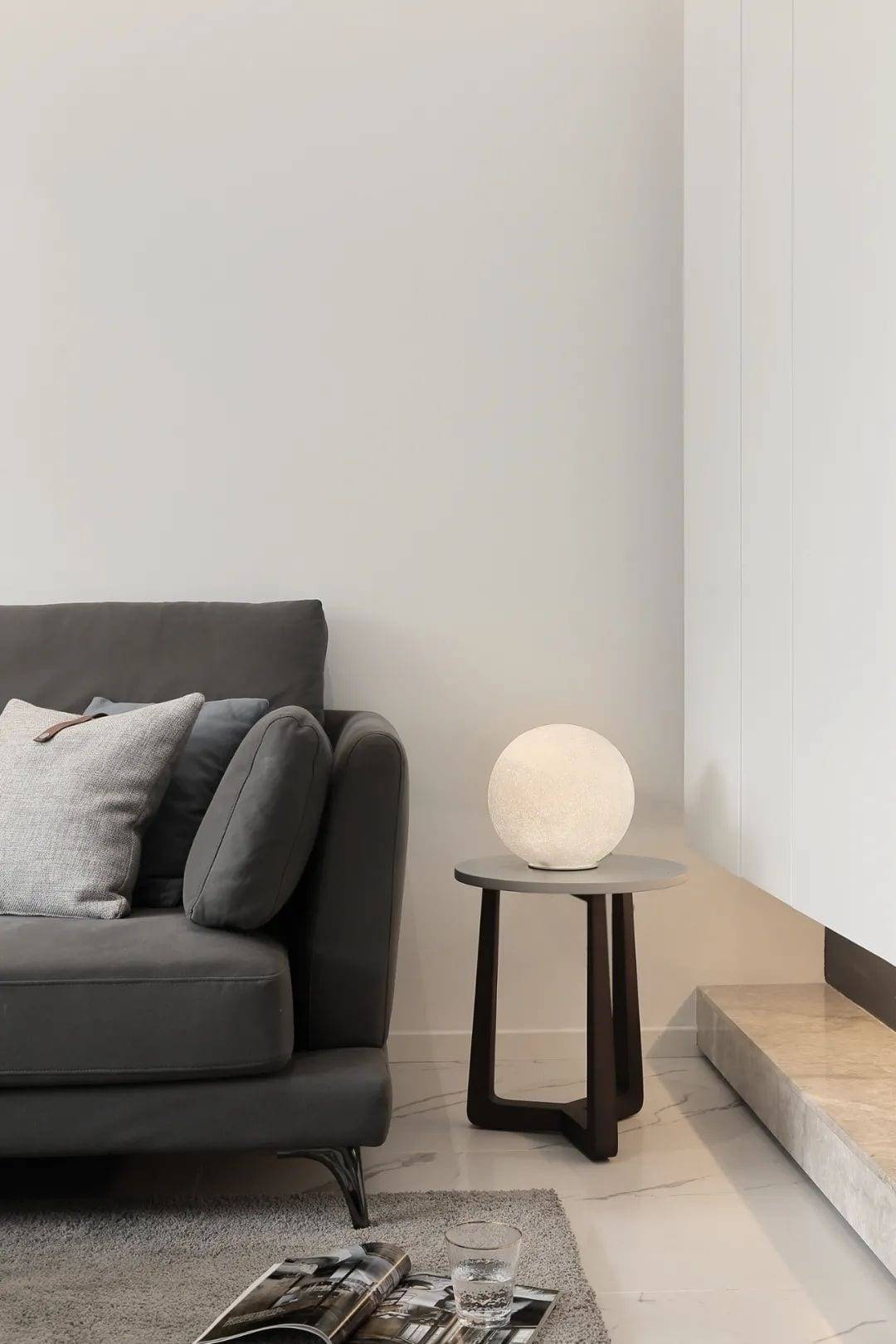
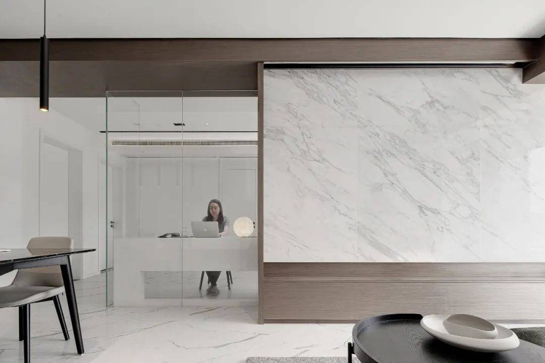
Bringing the outdoors indoors, the light of nature becomes the centerpiece of the home. In the quiet shade of the trees, time flows freely, and the changing of seasons, days and nights are different again, creating a visual effect of a sky garden. Between the glass partition and the TV background, the change and contrast of materials and the concession of space bring a strong visual impact. Walnut color and white construct the overall tone, adding varying shades of gray to create a simple and peaceful space. Large area of white ceiling design, and black lines decorated with asymmetric proportion division, instantly enhance the sense of design and hierarchy of space.
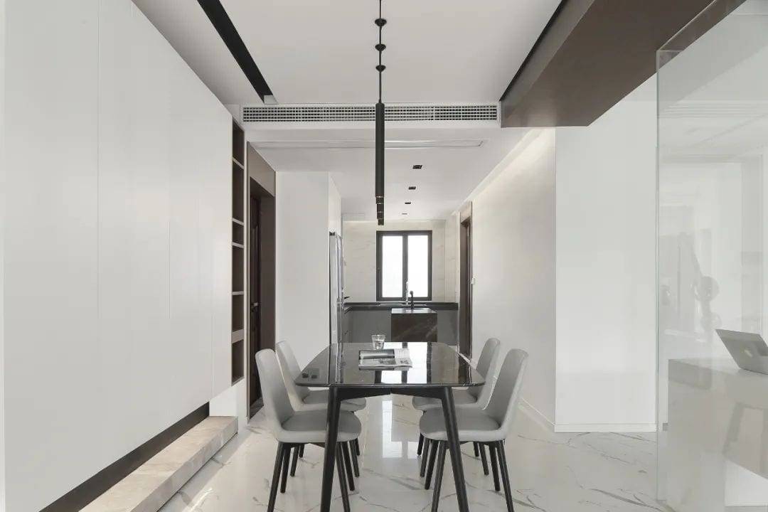
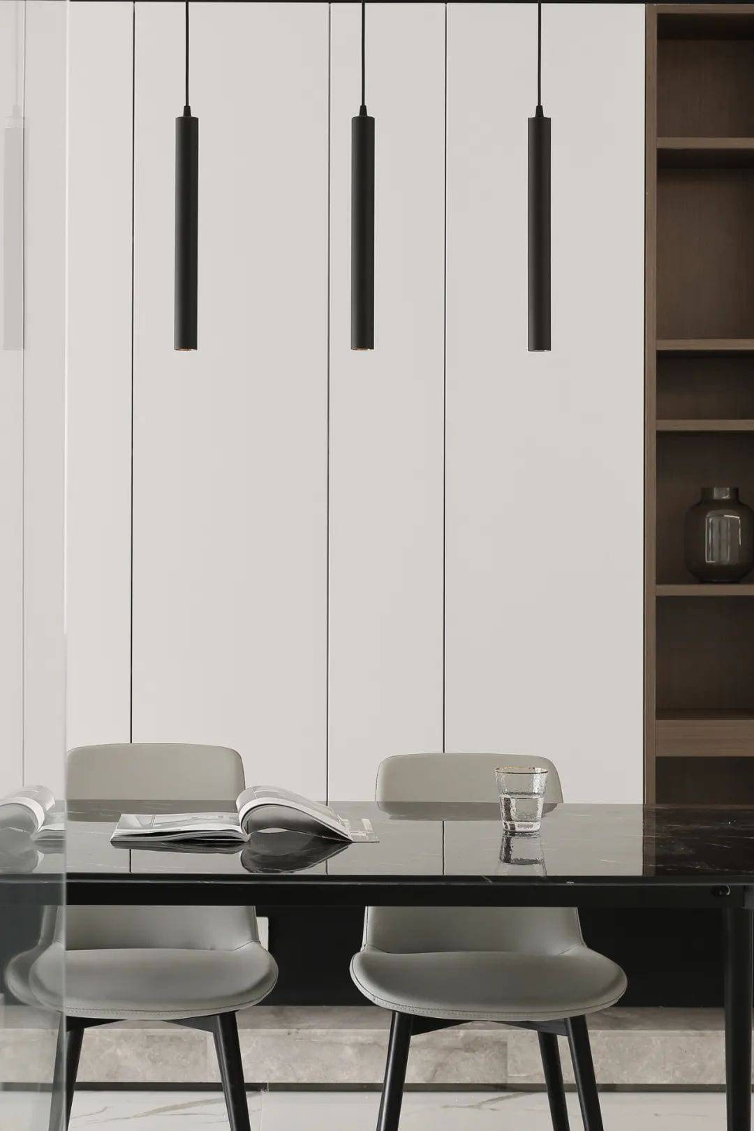
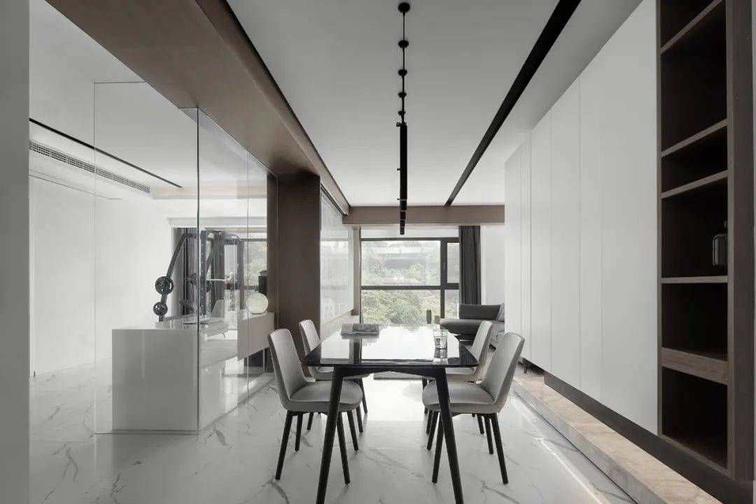
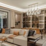
The overall space without the main light, linear chandelier slim sense extends the visual height of the space, but also gives the restaurant area has a different sense of form. Simple and pure shape value, rhythmic slim beauty, no artificial extra decoration, to create a comfortable and cozy dining atmosphere. The space is a container of emotion in which people are placed, a touch of free flowing in the shallow time, providing an introspective and quiet natural temperament.
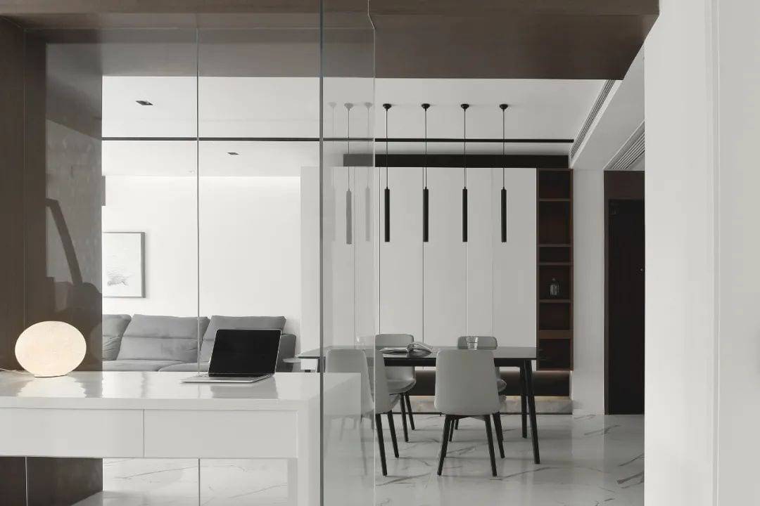
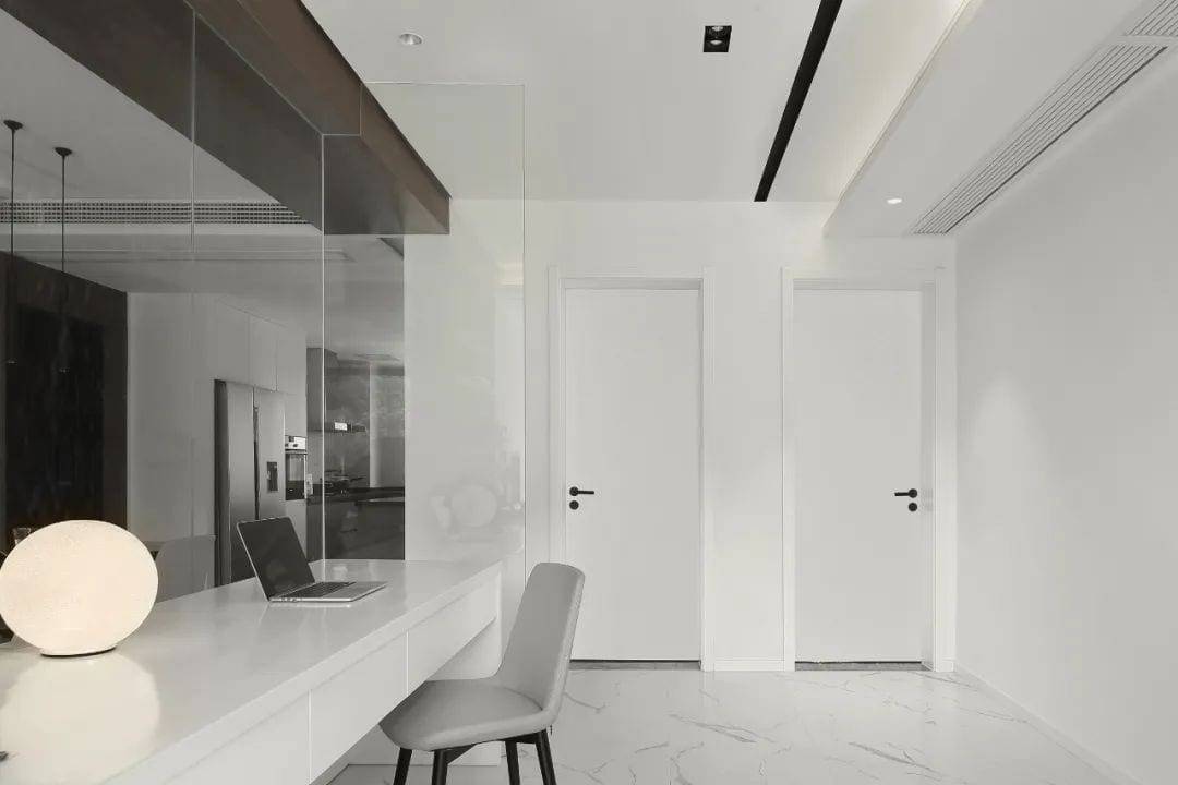
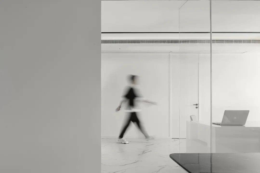
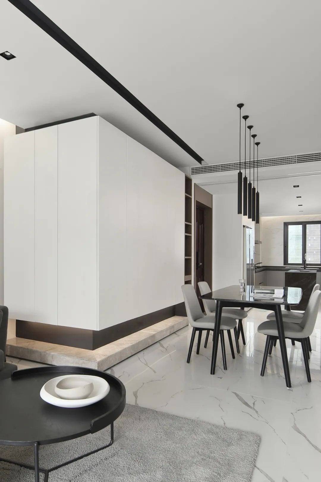
The L-shaped design of the entry shoe cabinet and living room storage cabinet has a large storage capacity, and the overhanging form reduces the congestion of space, while the concealed light band and marble floor increase the sense of depth and lightness of space. The handleless design of the closed door makes the visual more clean, and the design of the open shelf makes it easy to take and put bags and keys when entering the house, which ensures the visual effect and clear division of function at the same time.
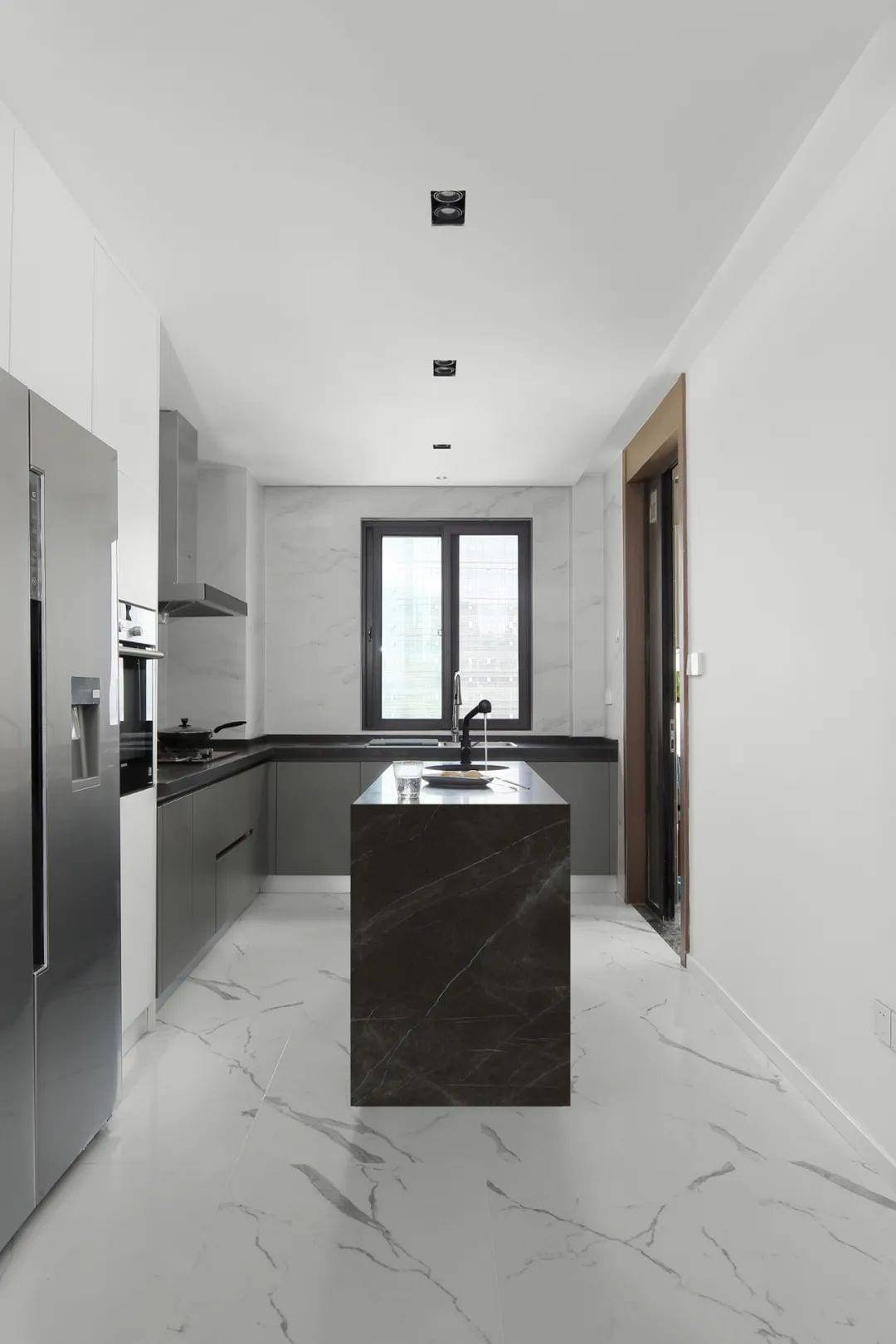
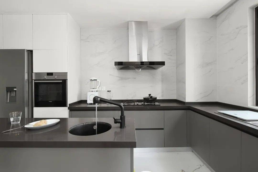
The design of the island in the kitchen is very modern, extending the operating space and also increasing the storage function. The jazz white wall and floor with senior gray cabinet, the contrast between gray and white, visual more three-dimensional. Refrigerator, steam oven embedded in the cabinet, electrical high cabinet design rational use of kitchen space, but also give more kitchen storage.
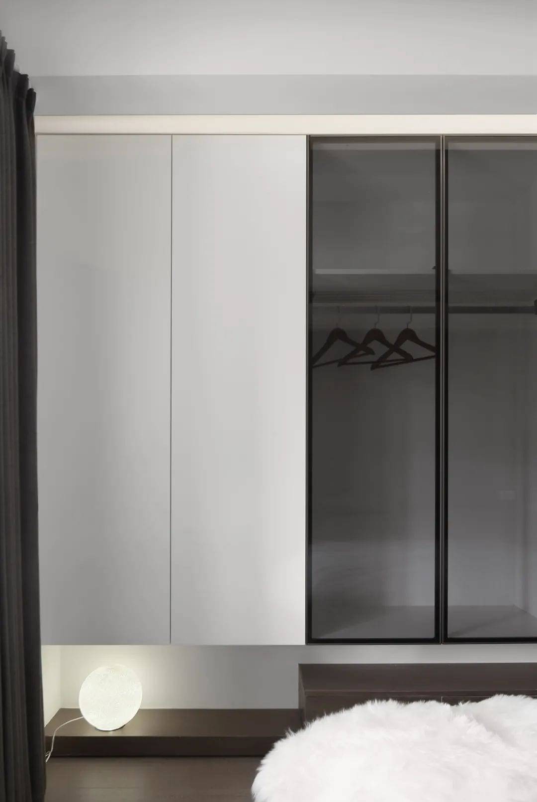
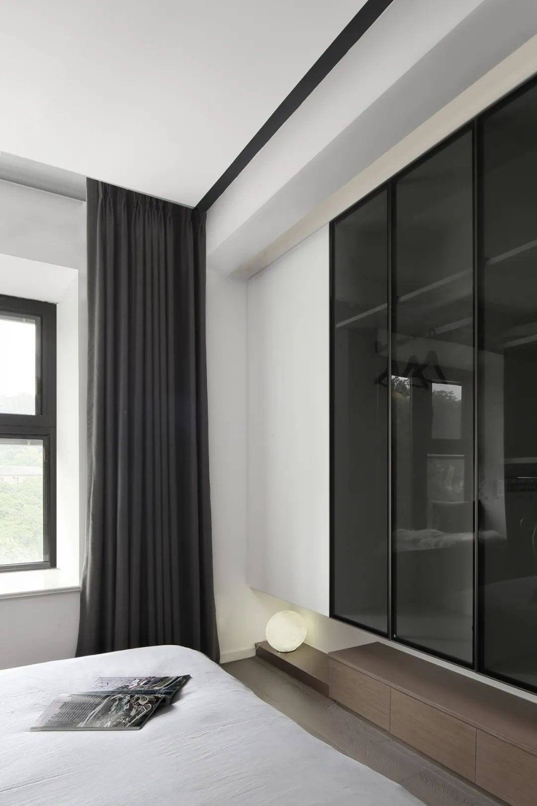
The space is purely clean and simple, but not simple, and holds a trace of romantic poetry in the heart of the homeowner. Abandoned the traditional overhead cabinets, from low to high progressive floor with transparent gray glass cabinet doors, reducing the rigidity of the space, increasing the flexibility of the space. The high floor with practical drawer design, seemingly simple lines and material structure, but the combination of function and aesthetics.
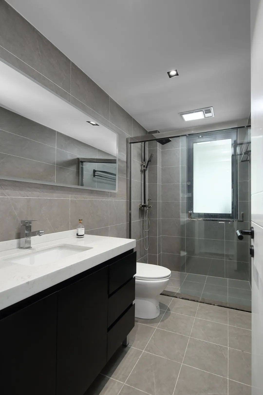
It is also a good idea to use a new design for the wall and floor tiles to make the space more pure and natural.
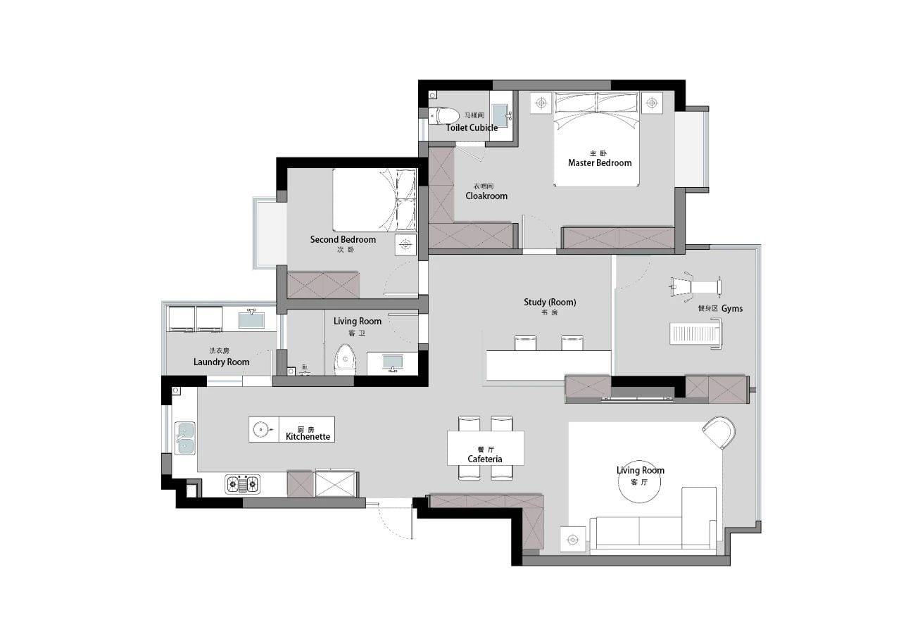
▲Floor plan
Huizhu Space Design is a professional interior design, construction, and soft furnishing service provider for high-quality living spaces. Since its inception, the main team has always followed the design philosophy of “functional aesthetics/home”, interpreted personalities and preferences with great care, insisted on the perfect integration of functional design of living and aesthetic enjoyment of life, and used the artistic language and means of expression of architecture, including space, light, proportion, color, etc., to jointly build a comfortable and tasteful interior space. The studio receives a limited number of orders per month, please make an appointment in advance.
Honors and Awards:
2019 Jintang Award China Interior Design Annual Outstanding Works
2019 China Private Residence Design Annual Ranking Cities Nanjing Top 10
2019 China Private Residence Design Annual 100 Outstanding Private Residence Design Agencies
2019 Builders Awards East China Sub-region Annual Glory
2019 Mango Awards China Humanities Design Competition Finalist Award
2019-2020 Shanghai International Design Week Rising Star China Design Award
2019-2020 Extreme Home Interior Design (Living) Space Example
2018 China Better Living Space Design Competition TOP 100
2018 Builders Awards Mid-Home Design of the Year Award
 WOWOW Faucets
您好!Please sign in