Xiao Bei Interior Design Alliance

Love is the only thing that holds the dark at bay.

As we move through the hectic pace of the day, there is a greater need to hear the sound of purity in a simple environment. It comes from a comfortable sofa, a clean wall, and the sleeping breath of a child.
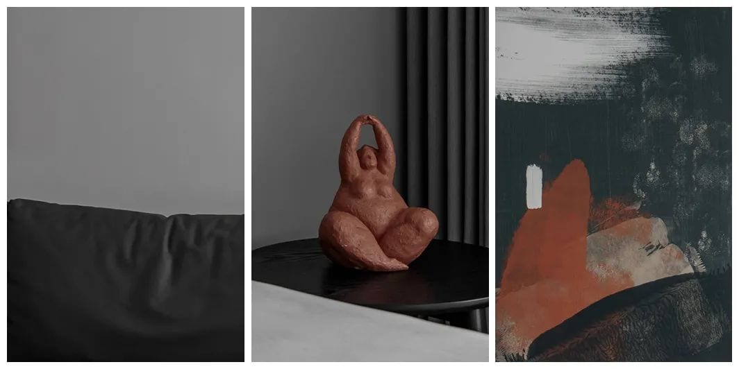
The owner of this project, who works in “teaching and technology,” came home after a long day at work and wanted to really relax and enjoy a moment with her family as a threesome. So, we chose a low-saturation color palette to create a clean, simple atmosphere.
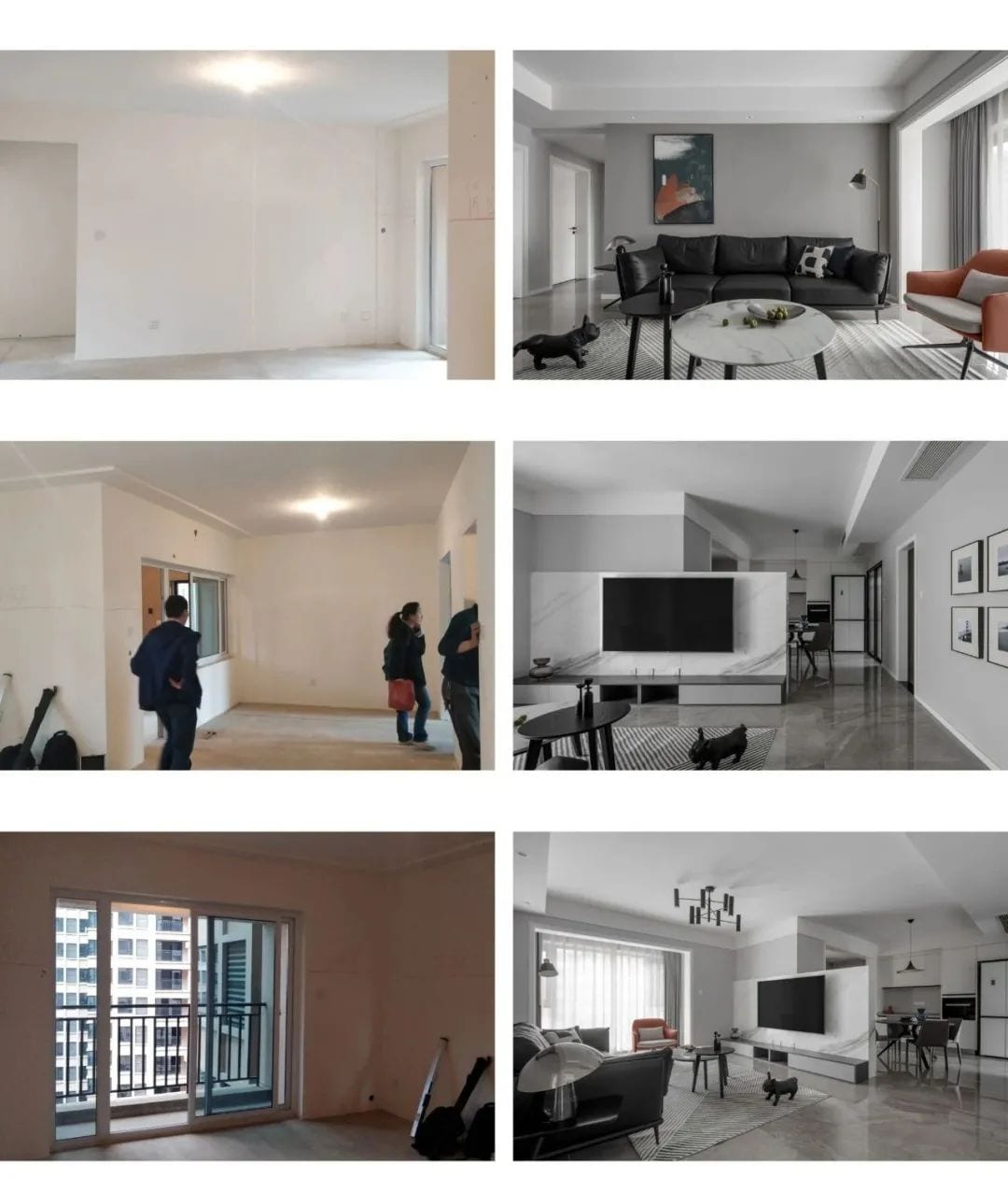
Grey latex paint, jazz white stone, and grey marble tiles give a clean and simple overall sense of space. We removed the partition wall of the entrance and merged it with the dining room to form a whole space. The TV wall is designed as a half-wall for partition, and the entrance, dining room and living room form a complete migratory line, creating an interesting open activity area with independent functions and close spaces.
Hallway
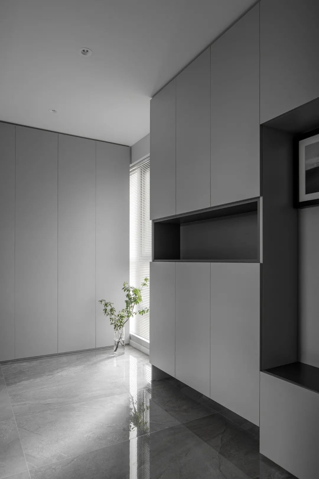
After satisfying the foundation of the three-person storage function, without any excessive modification. The pure sunlight and simple, minimalist gray feeling start to extend inward in the entrance.
Living Room
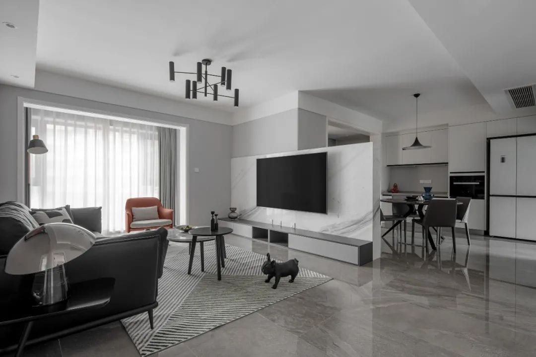
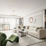
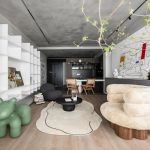
The light gray and jazz white present a simple and bright sense of space. The original public space with unobstructed view is cleverly separated by a half-wall TV wall, and the quiet entry of “cover and open” creates the illusion of perspective and divides the original boring space into interesting shapes.
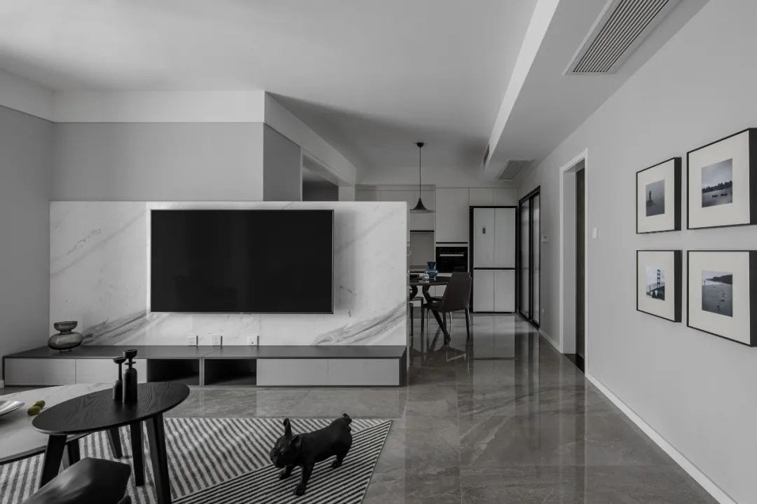
After the division, the functional partition is clearer, and at the same time, the wide view keeps the space and space with close interaction, so that the family atmosphere is more intense. The lines of ink painting on the TV wall seem to jump and flow in time, making the space shine.
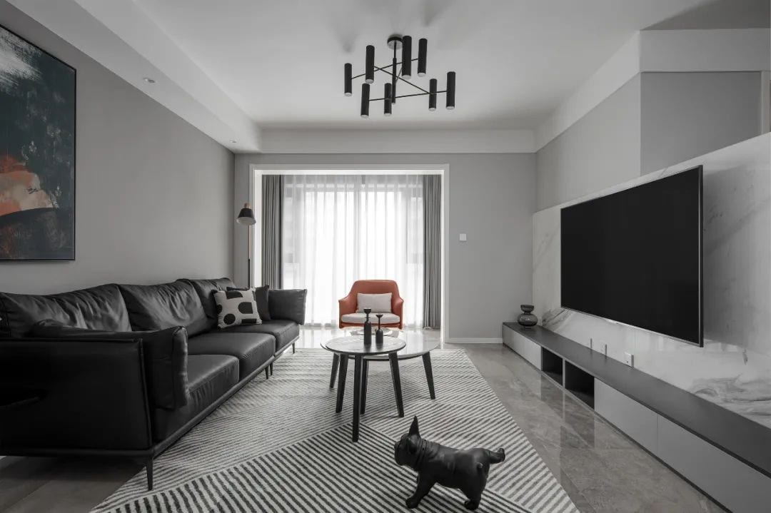
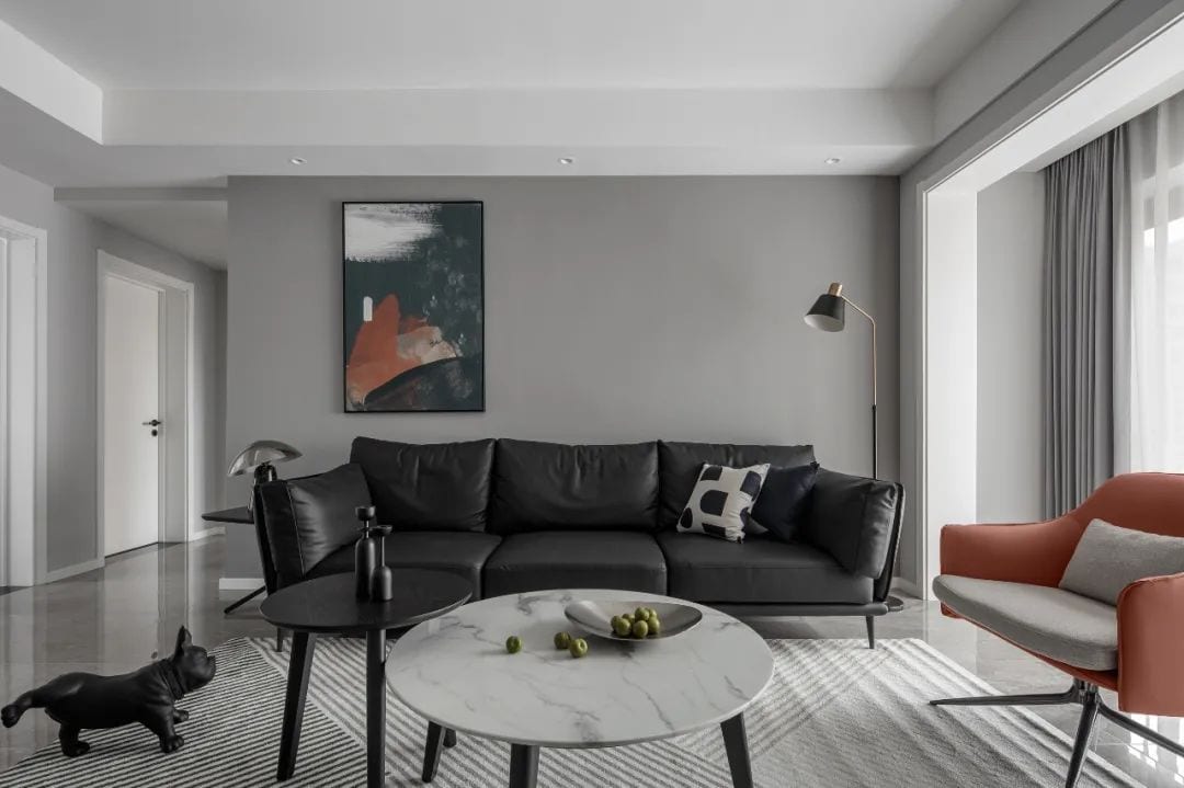
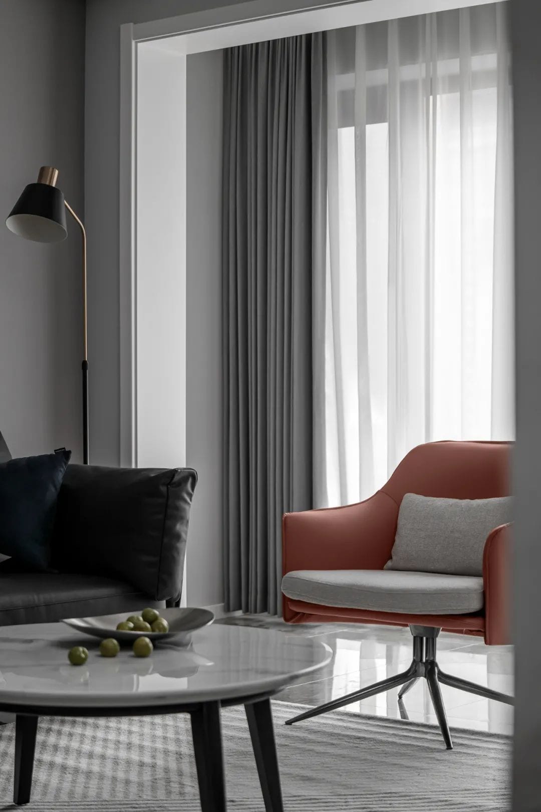
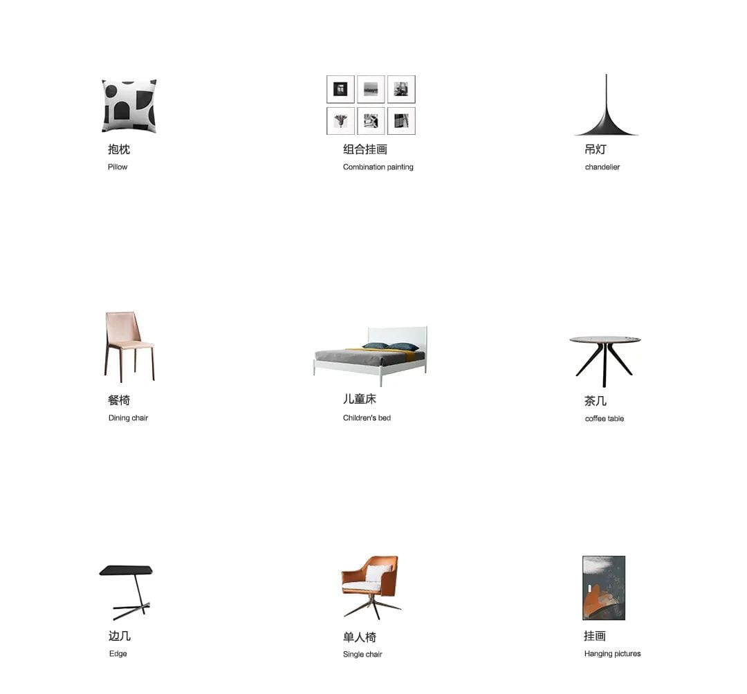
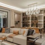
The black leather sofa in the living room balances the coherent flow of the living and dining space, with orange single chairs, using a scattered layout to create a simple aesthetics of life. The concrete sense of the overall home below sight level, enhance the height of the space while ensuring the safety of children usually play in the area.
Dining Room
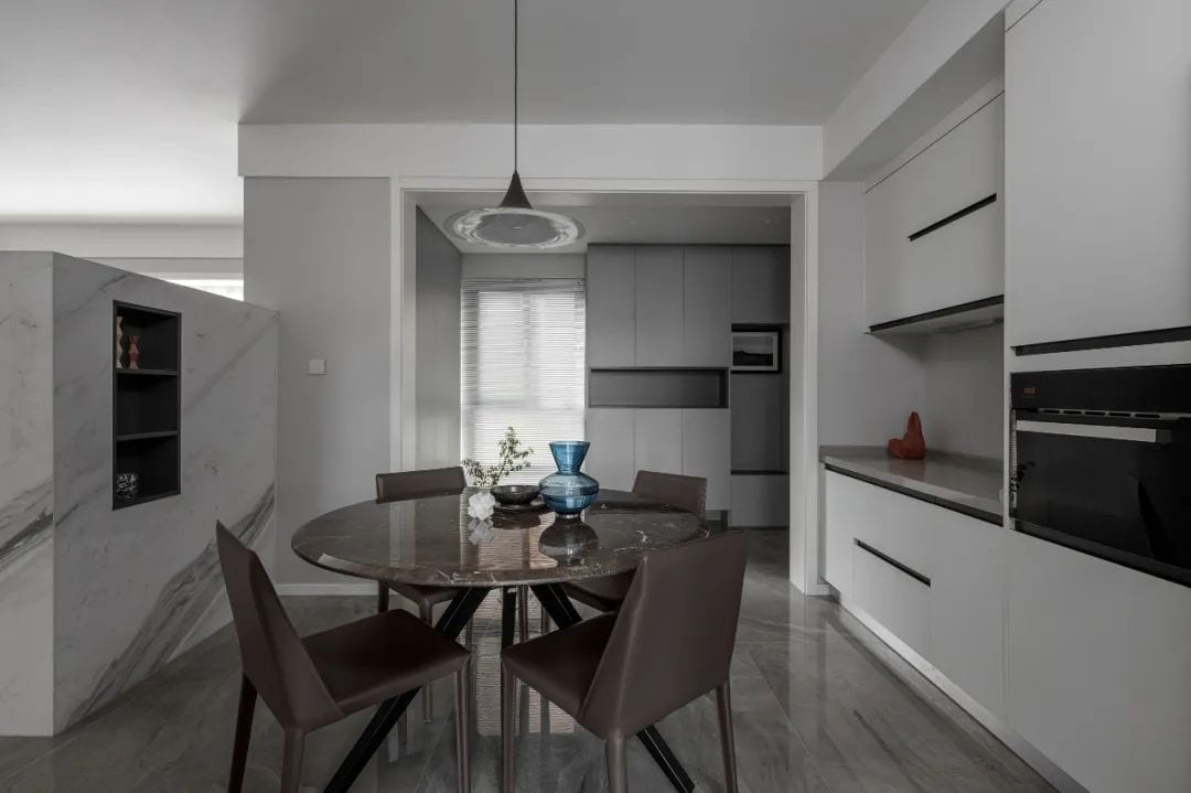
Entering through the entrance, the first thing that opens the door is the dining area, where the calm and simple color block brings a relaxed and comfortable space feeling. The round table with simple small chandelier makes the atmosphere feel very family-like, and the family of three is more focused on company and food during meal times.
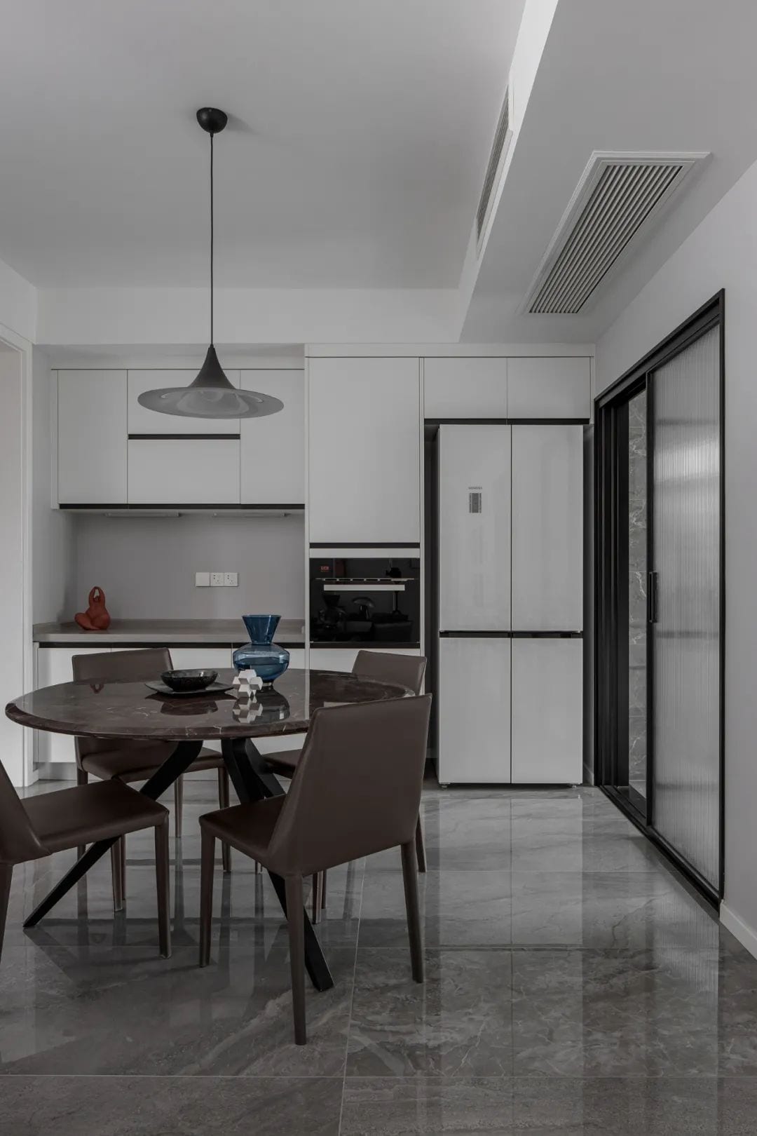
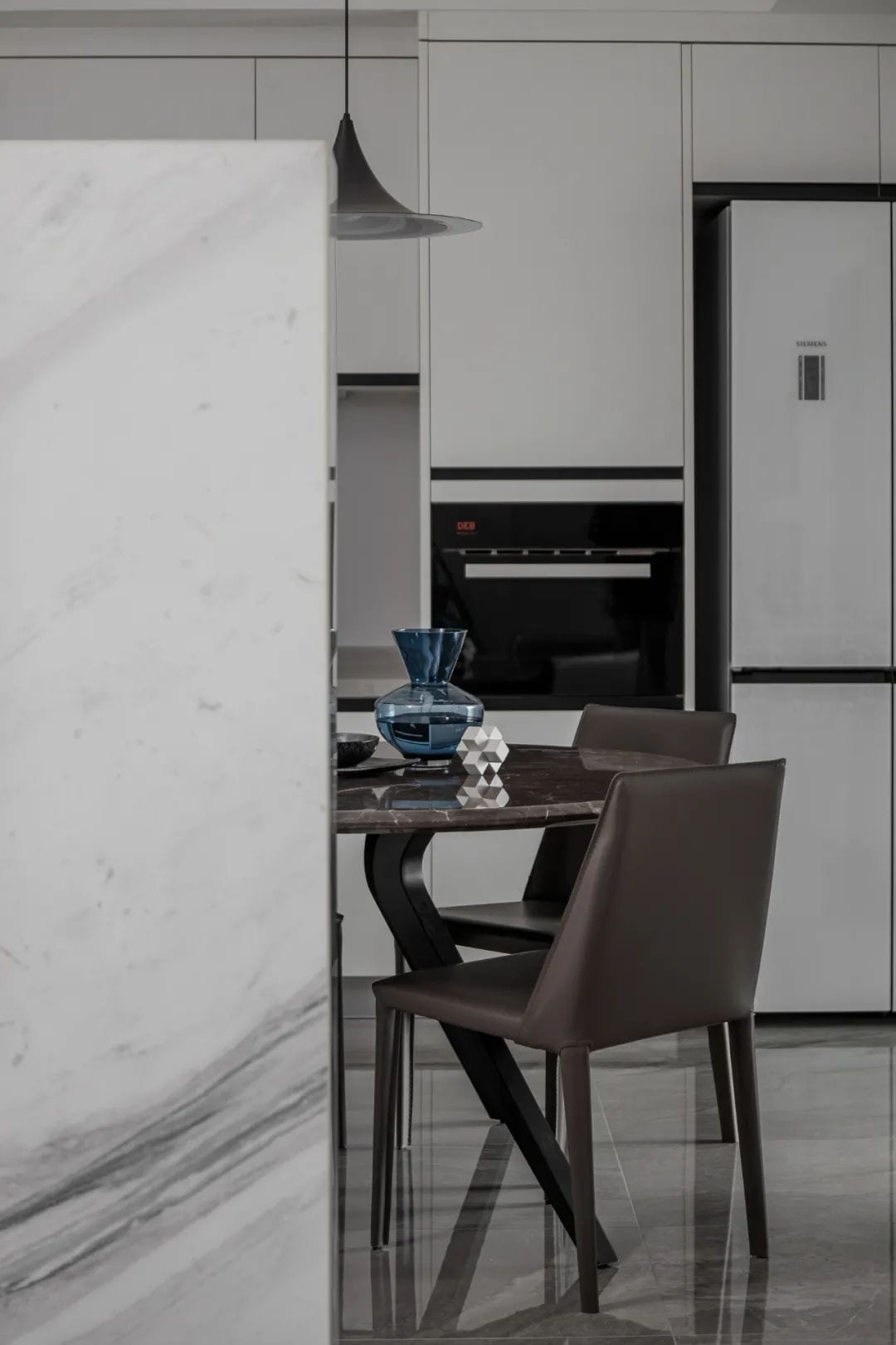
Since the kitchen area is a bit too small, we added a row of storage cabinets and a western kitchen in the dining area to store the refrigerator, oven and other sundries, greatly reducing the pressure on the kitchen and making the common areas more interactive at the same time.
Master Bedroom
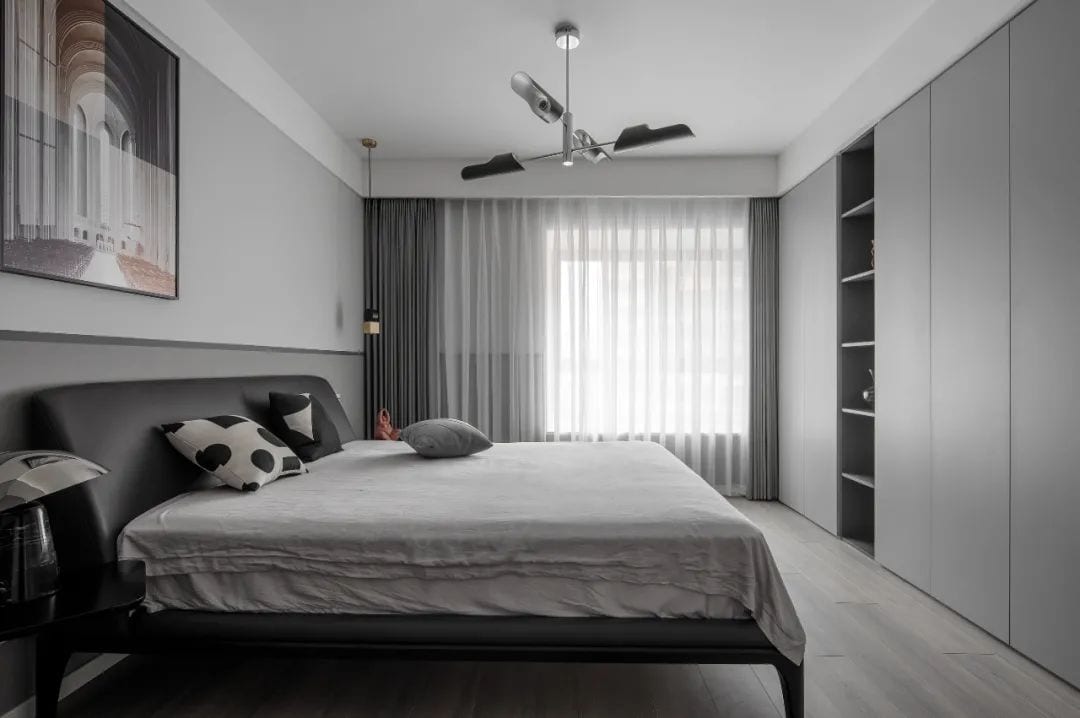
Considering the lack of storage area in the master bedroom, we removed the sofa background wall and moved forward 15cm to expand the wardrobe storage area. The overall style of the continuation of the external space of black, white and gray system, bringing functionality and comfort deep space feeling.
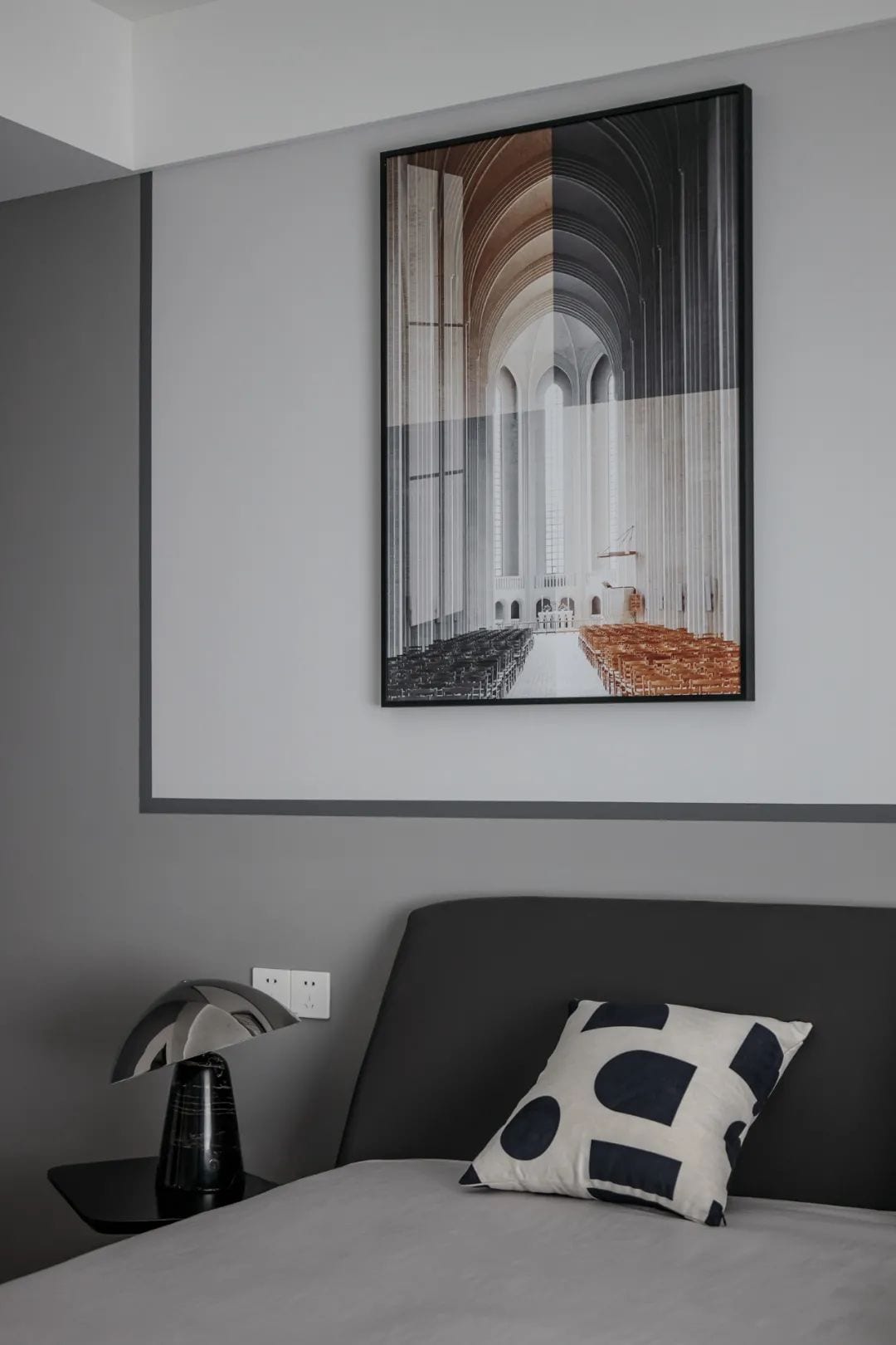
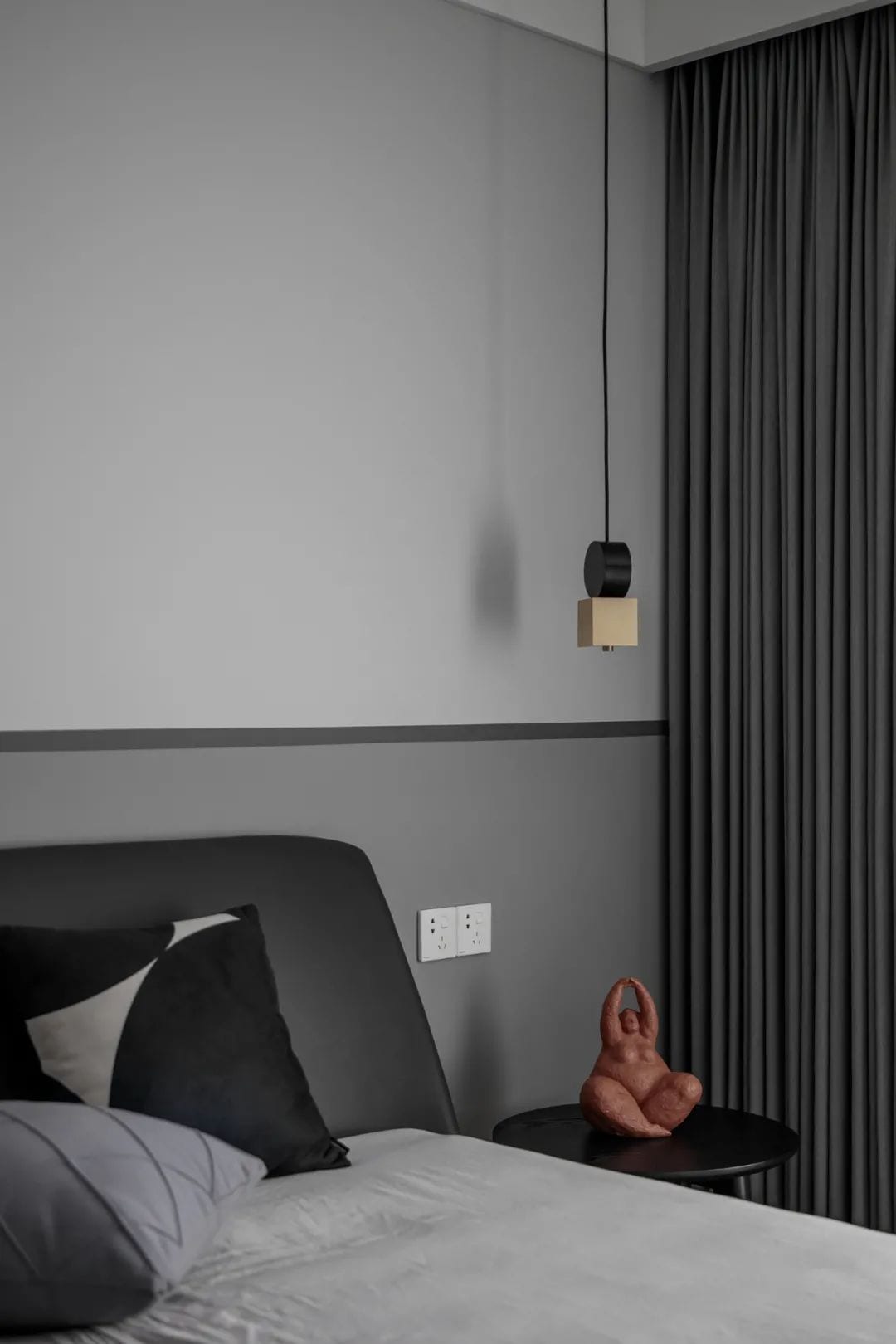
The wall color separation design, glacier gray and elephant gray with, highlighting the sense of hierarchy, but also perfect harmony to become a stage set. The space is not overly decorated with soft furnishings, with a more simple and spacious atmosphere that allows the sleeper to pay more attention to their own inner world.
Children’s Room
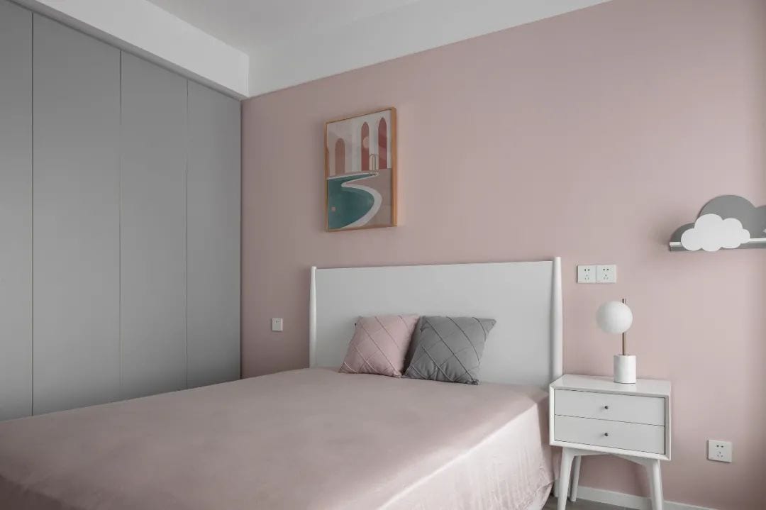
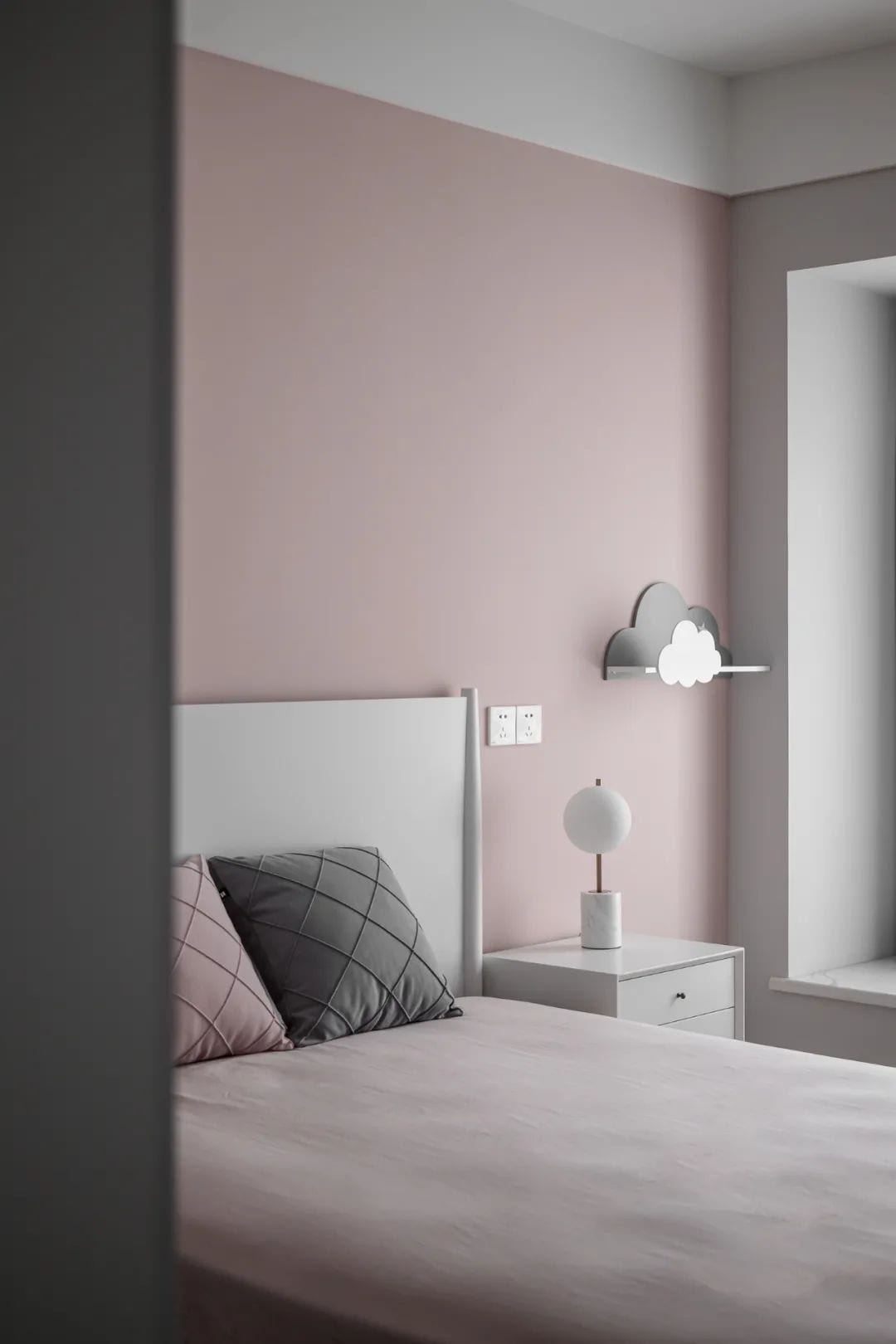
Focusing on children’s visuals, coral pink is a favorite color of my daughter. With pure white and glacier grey for an integrated style fusion, a fairy tale atmosphere is outlined.
Bathroom
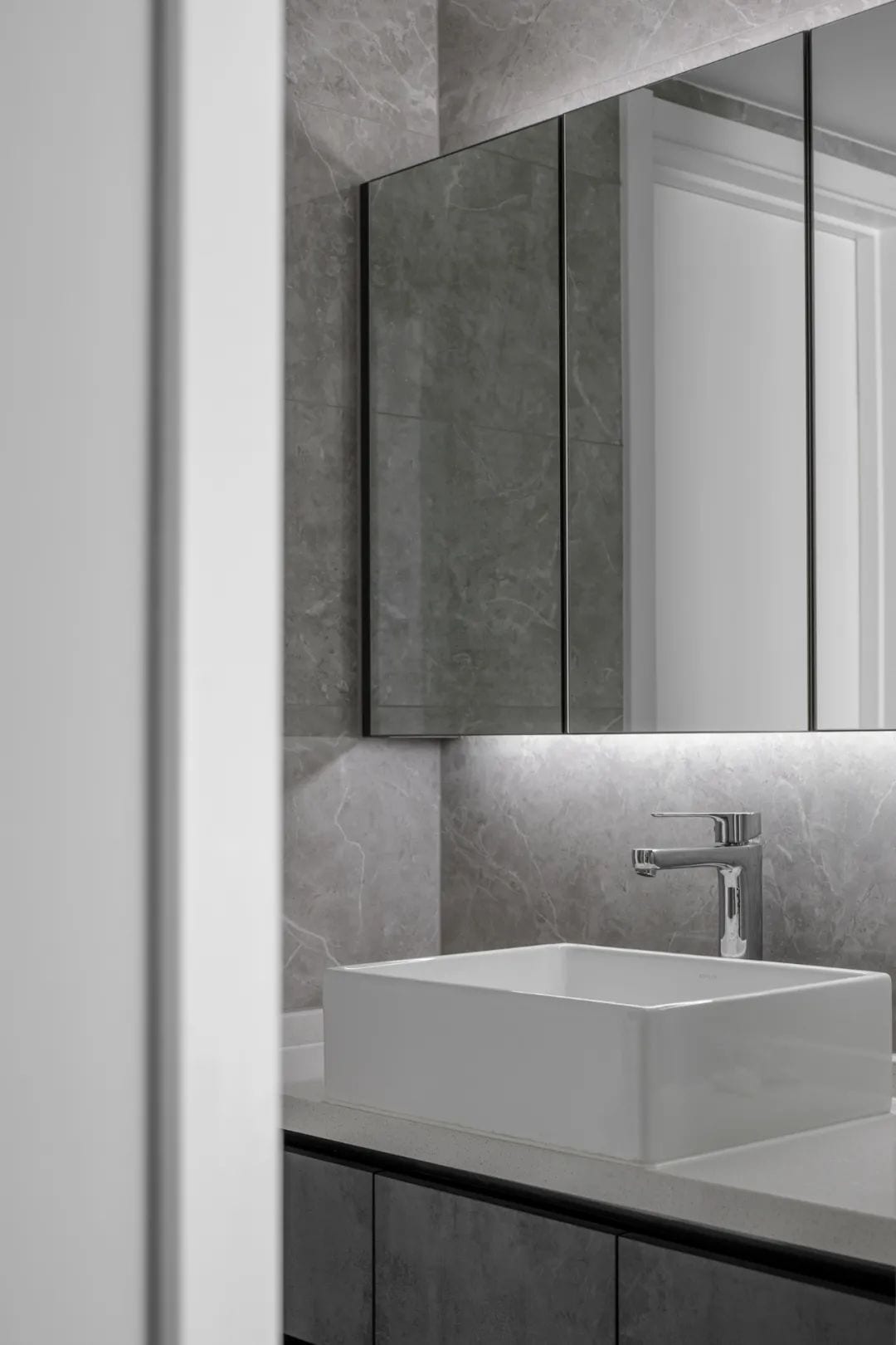 The design of the light source between the gaps in the bathroom cabinet makes the space more layered, giving people a low-key comfortable experience.
The design of the mirror is to show the meaning of the three people’s life together and their preferences in every detail.
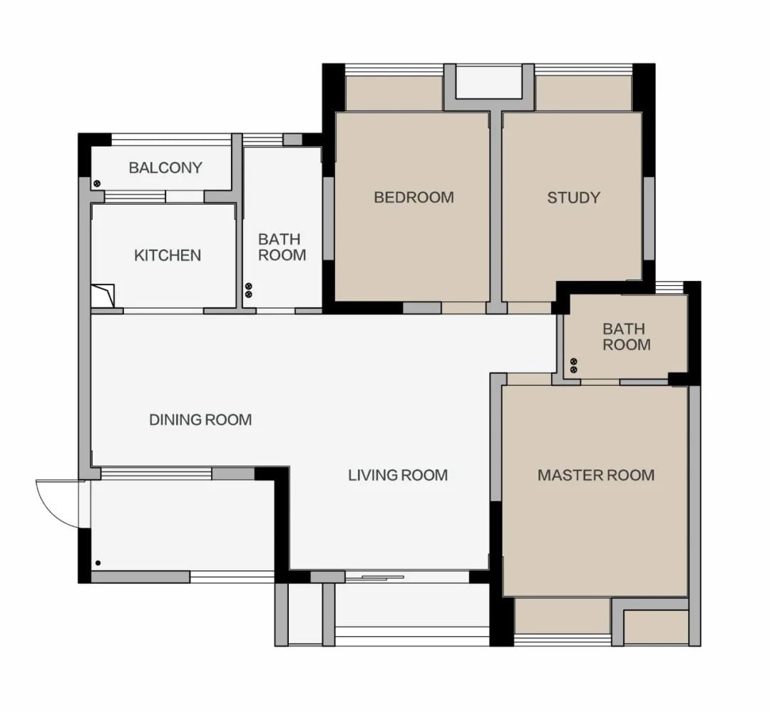
The original floor plan
Original House Type Analysis
If the entrance area is closed, there is poor lighting.
❷ The kitchen is too small to meet the needs of use
❸ Unreasonable layout of the master bedroom with little storage space.
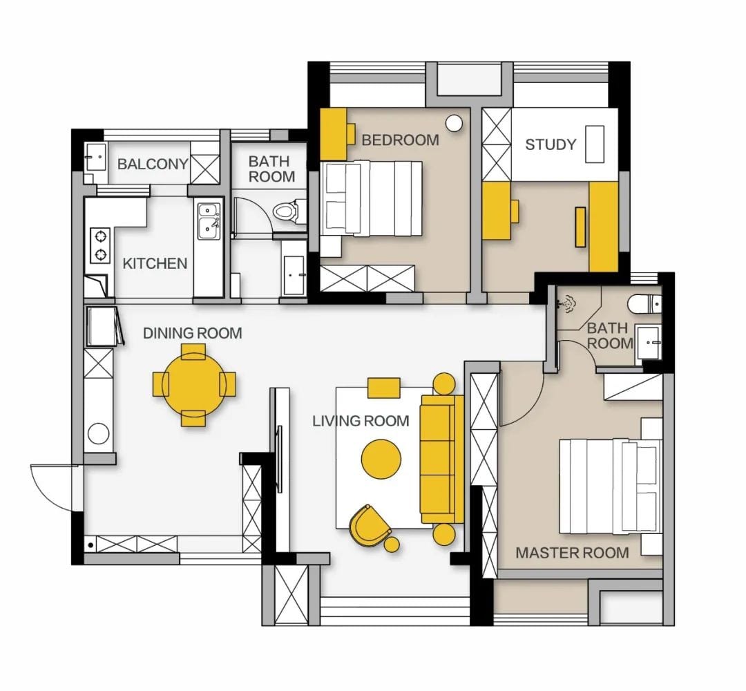
Floor plan
Explanation Of Reconstruction Points
Remove the partition wall in the entrance and combine it with the dining room to create an integrated space.
❷ Add storage cabinets in the dining room and move the kitchen refrigerator out of the kitchen to create a western kitchen area to relieve pressure in the kitchen
❸ The whole doorway of the master bedroom is shifted to the right, and the master bathroom wall is receded inside, creating a whole row of wardrobes for the end of the bed, increasing storage space.


Editor-in-Chief | Dull
Writer | SanSan
Plane – Segment
Videos | Paragraphs
Area:120m²
Style:Modern
House Type:Three rooms and two halls
Price:30w
Chief Designer:Chen Roku
Service Pattern:The whole design
Project Address:Chengdu. West Bank Lakeview
Completion:2020
Design Agency:Chengdu Hongfu Besam Space Design
 WOWOW Faucets
您好!Please sign in