Interior Design Alliance
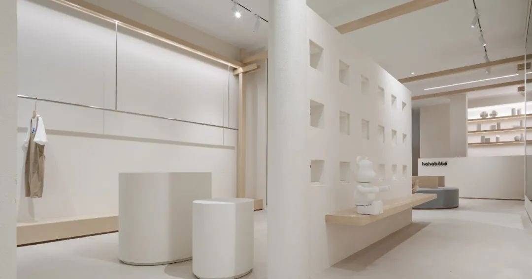
The project is located in the Gulou District of Nanjing, an upscale residential area along the street shops, the business format is positioned as a high-end children’s clothing retail. We hope that through the fusion of spatial aesthetics and artistic aesthetics, we can bring the brand image to the client, so as to explore the deep commercial value of the brand and create a space full of imagination and creativity.
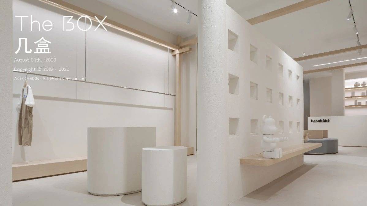
Break
“Breaking Through The Old Limitations And Restrictions”
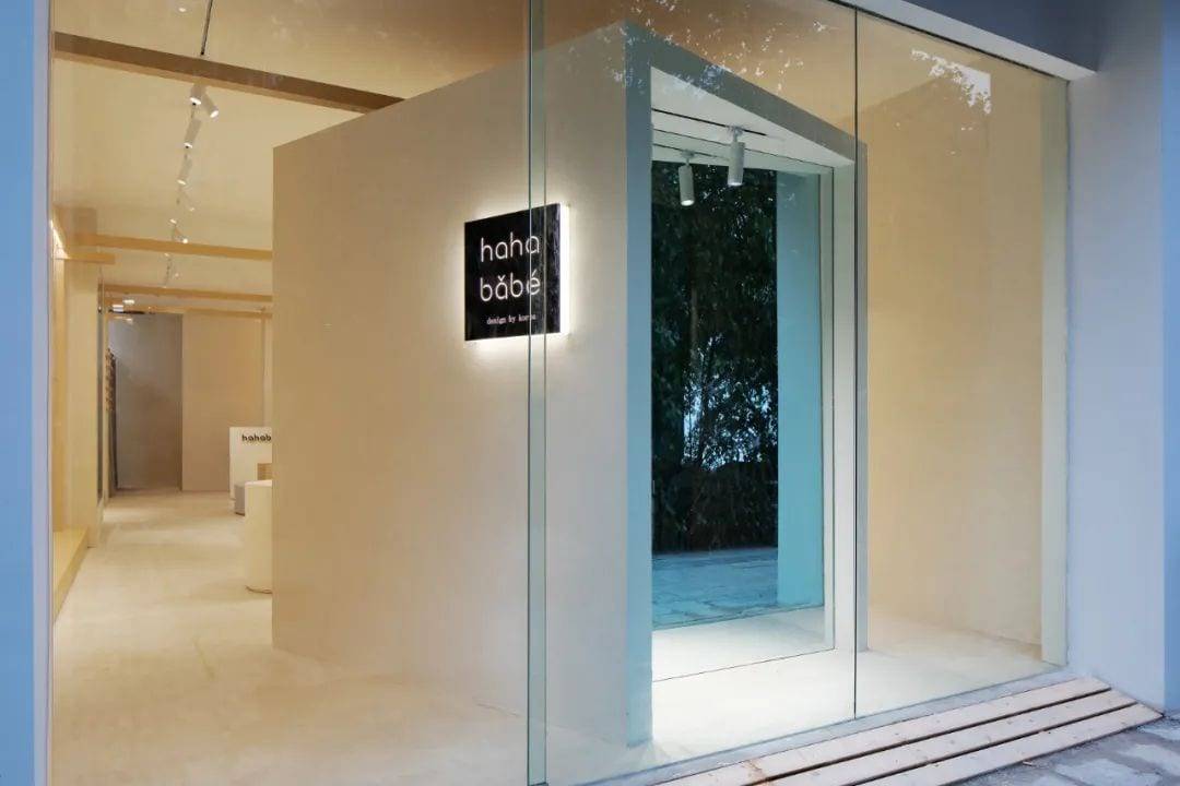
We’ve been thinking about what people imagine the children’s clothing retail space should look like. The positioning of the business determines the attributes of the groups served by the space, so we use the child’s way of thinking as the entry point to break the traditional order of commercial retail space unitization. Using the concept of decomposition, we emphasize breaking, superimposing and reorganizing. We focus on the individuals within the space, the installation itself, and oppose the overall unity to create a sense of unpredictability and uncertainty, thus creating an individual fashion that is as unconventional as a child’s. The window area is a break from the norm.
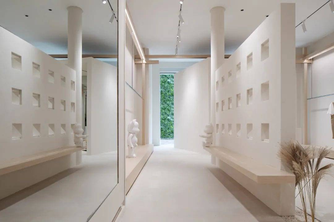
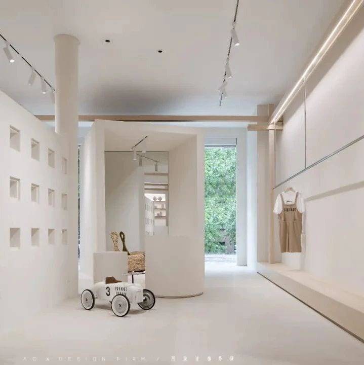
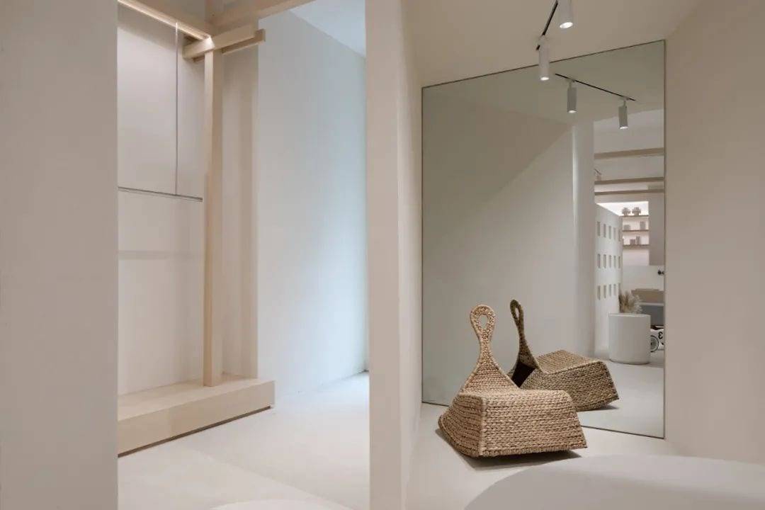
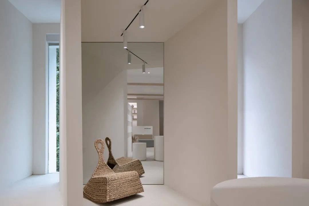
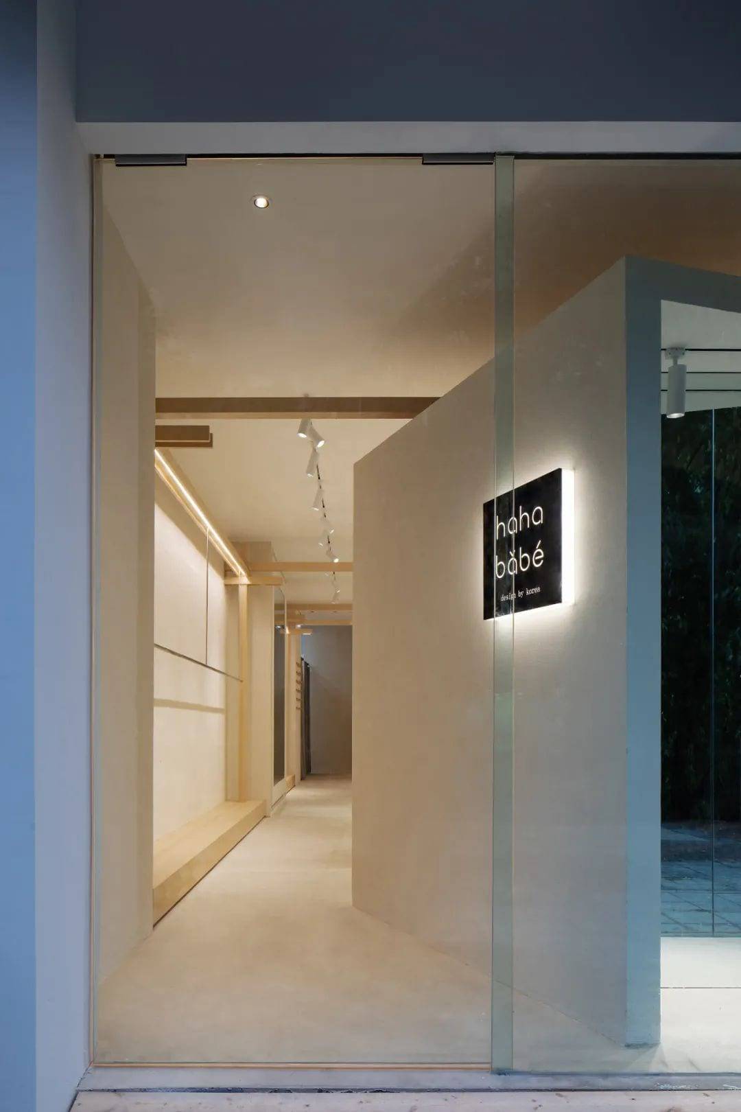
The window area is divided into three spaces: entrance, display and scene by using a BOX, which has its own plane, oblique and faceted morphological features and also expands and extends the visual effect of the façade.
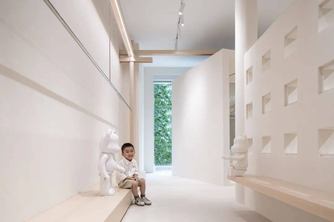
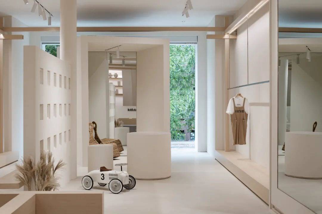
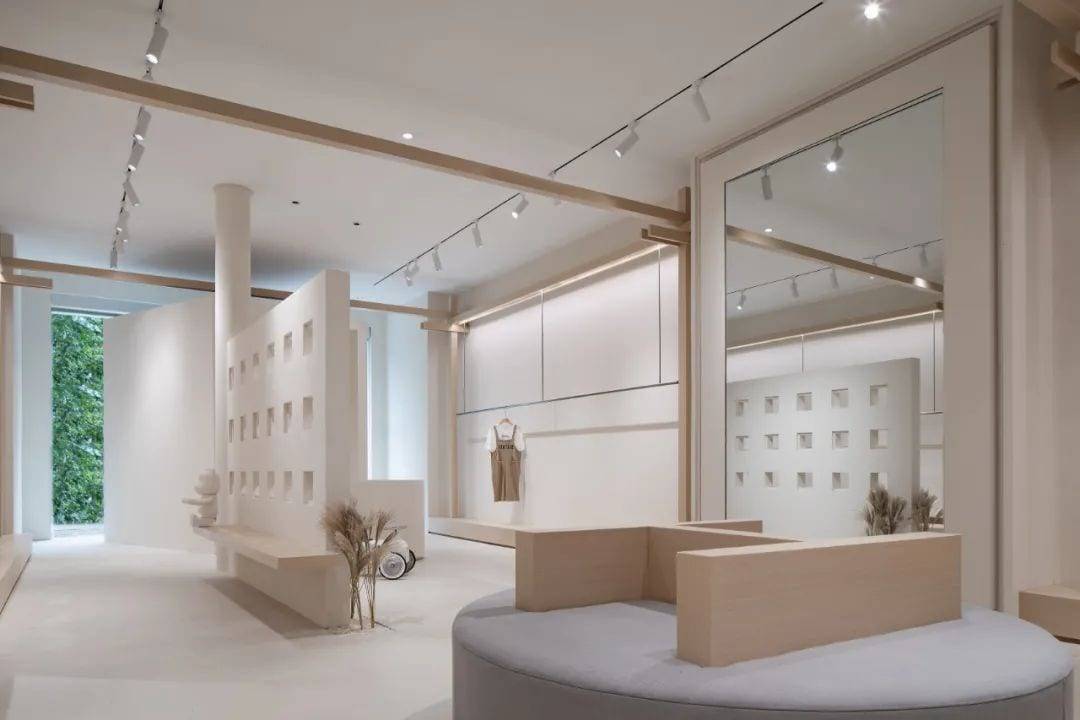
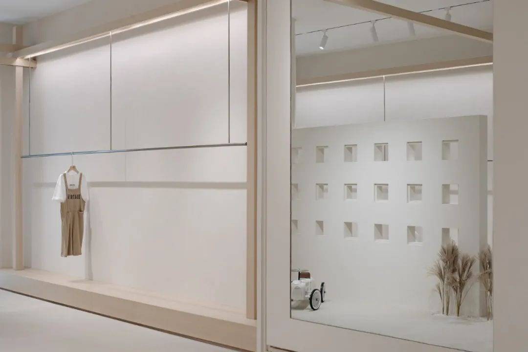
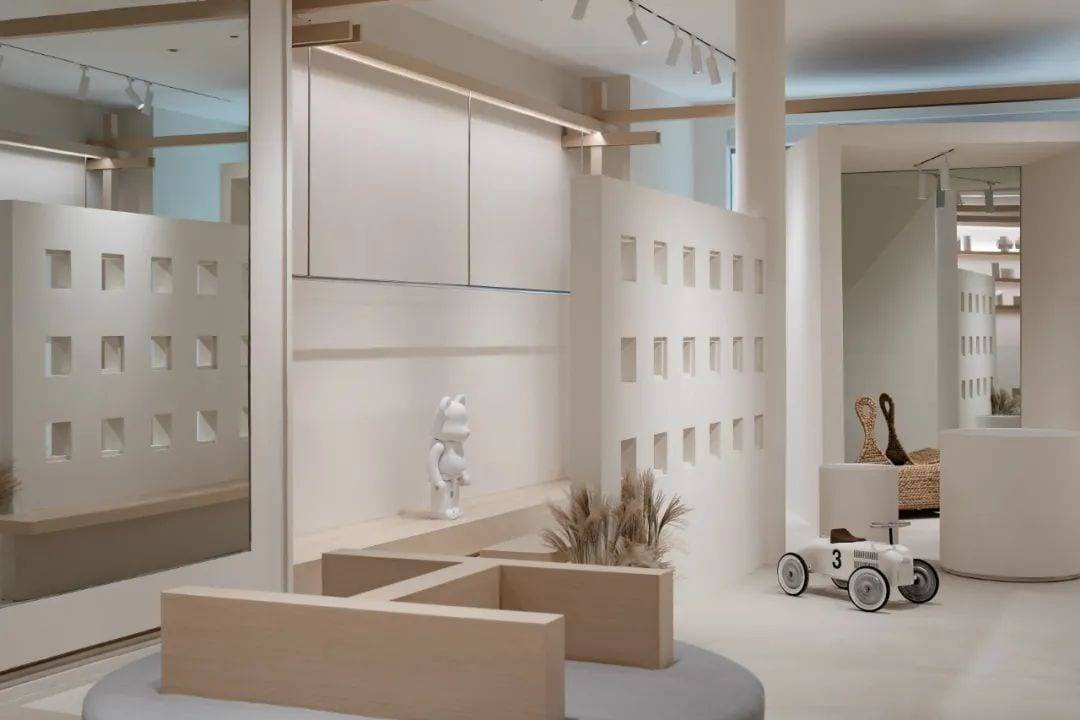
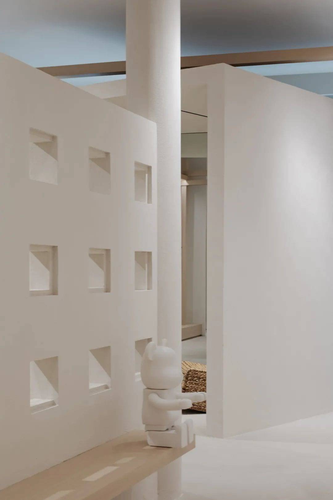
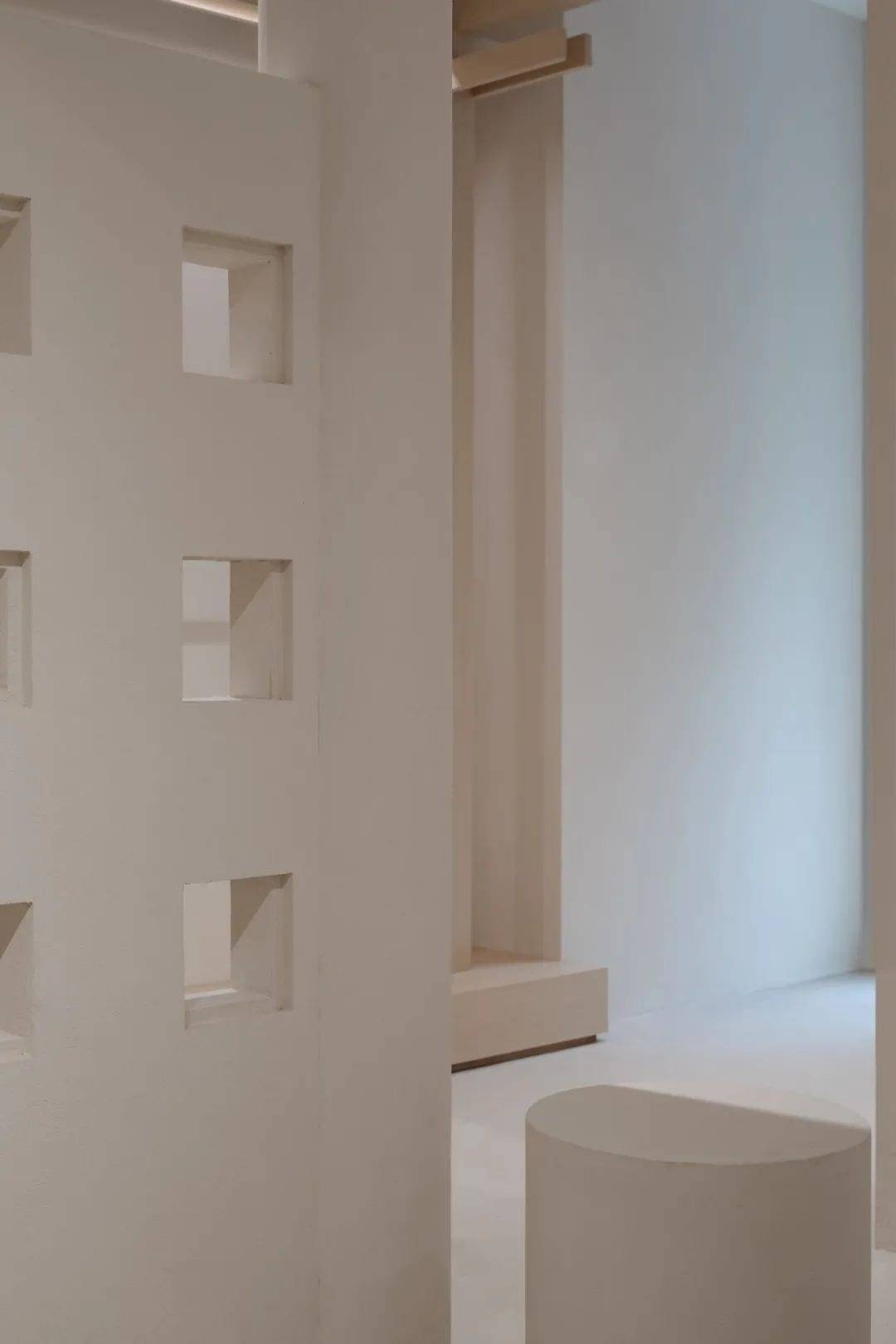
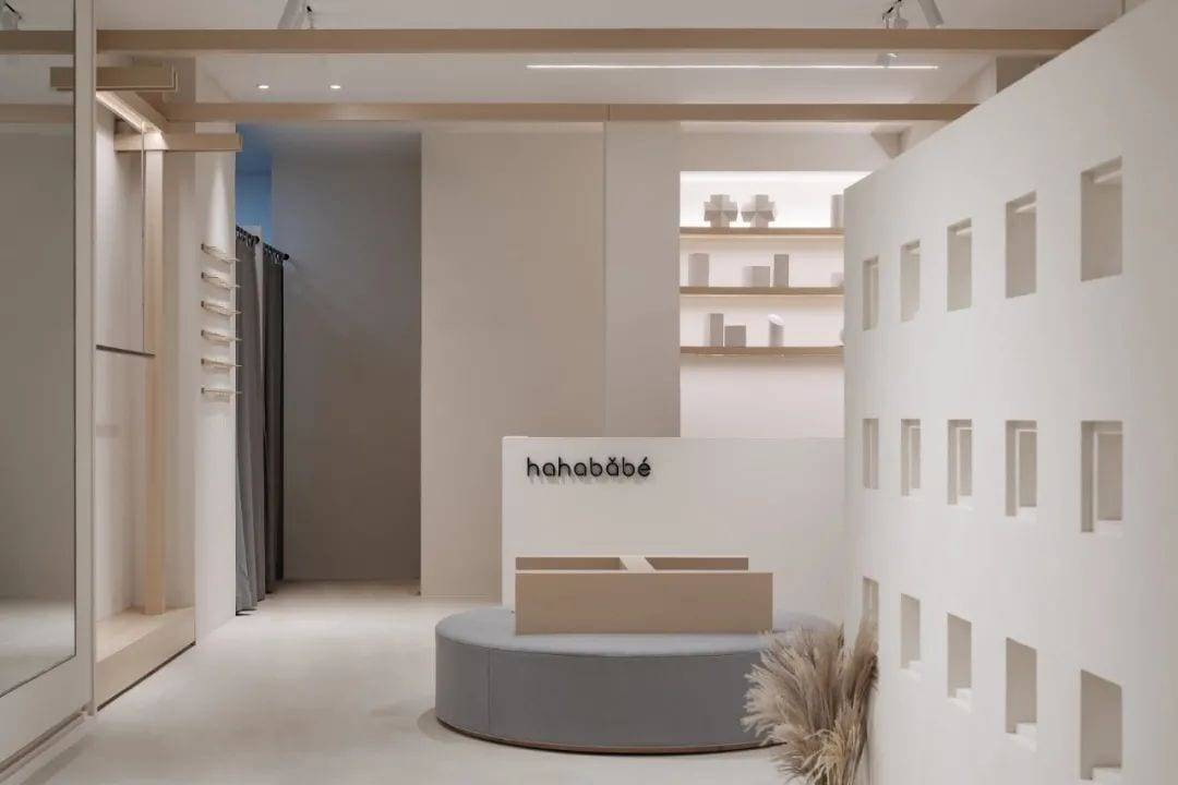
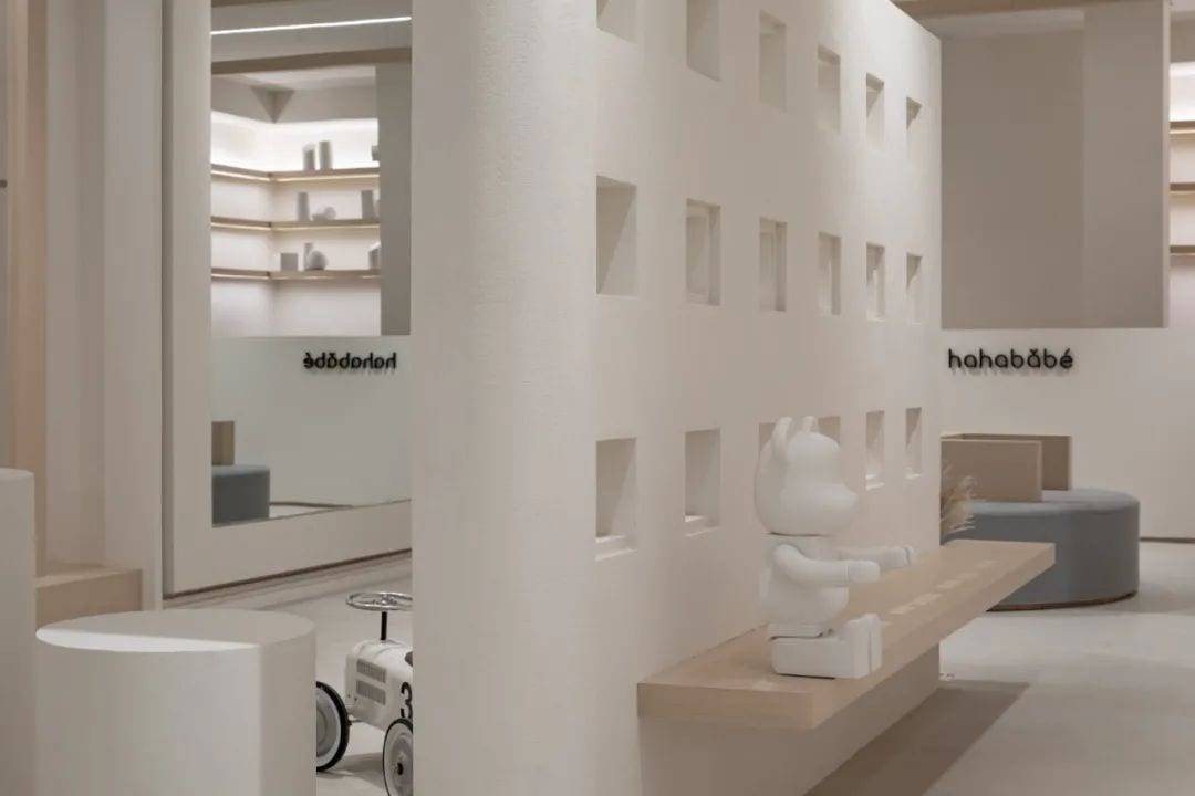
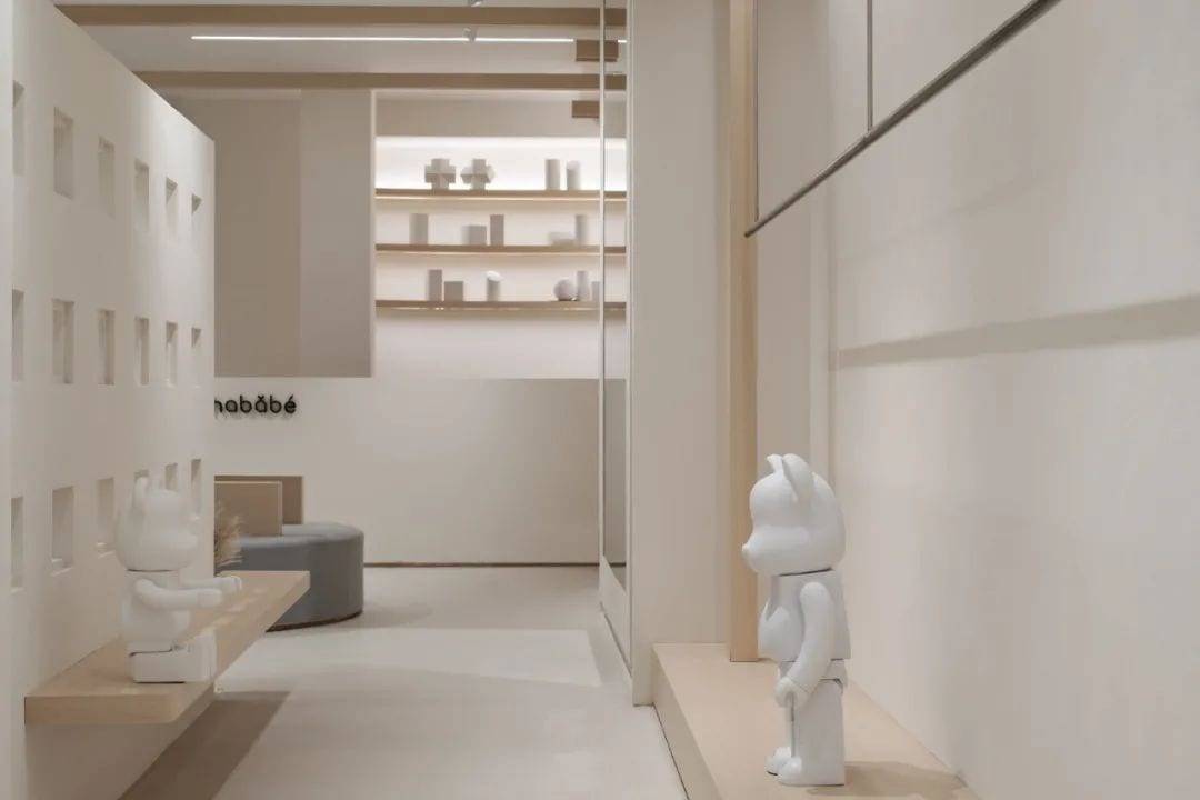
The partition walls covered with viewports break away from the traditional way of dividing space. The wall is no longer the basic element of the space, but becomes an art installation endowed with emotions.
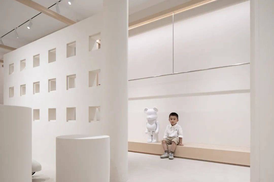
The pure white color makes the space easy to imagine and thought-provoking, and the unadorned white wall adds a bit of psychological purity.
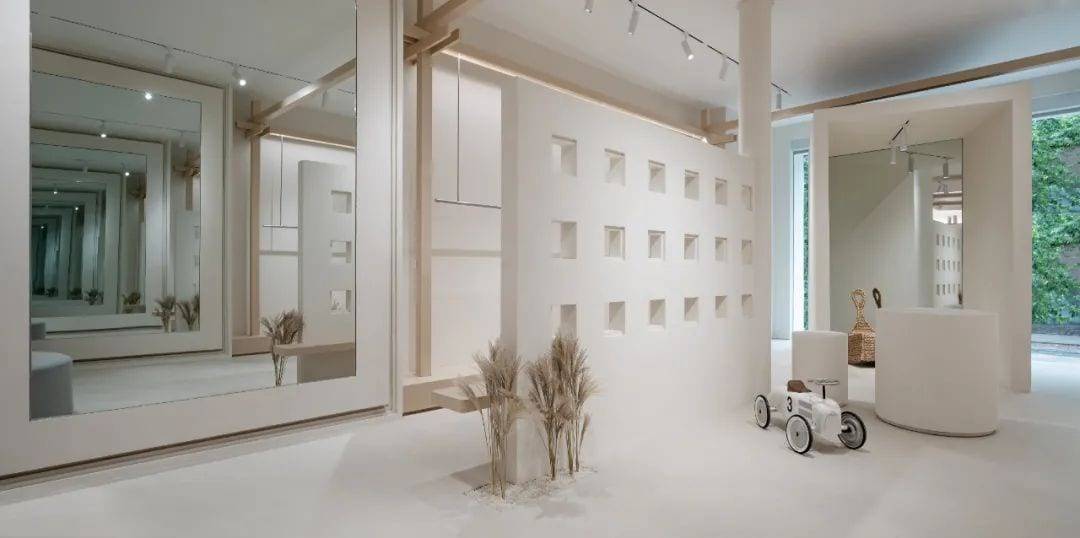
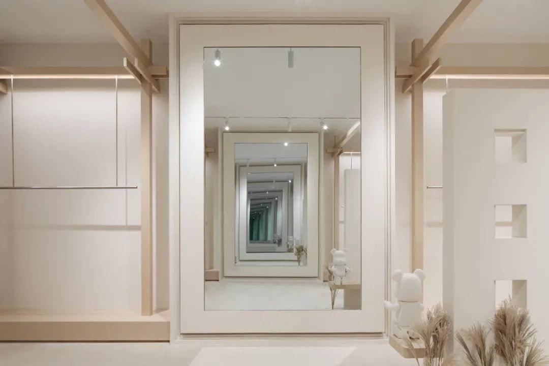
The infinitely extending mirror breaks down the original space barrier and inspires the imaginative and creative qualities of the space. These qualities often bring people unparalleled visual impact and psychological feelings.
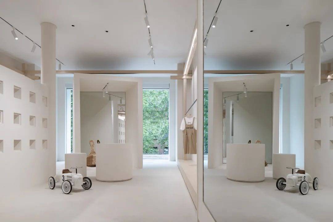
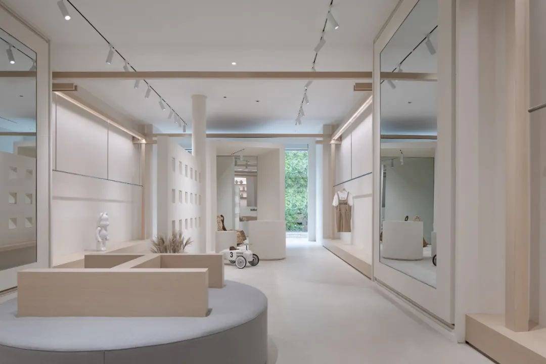
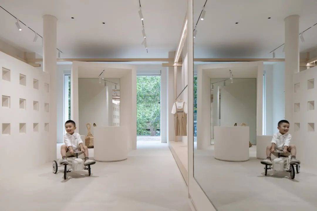
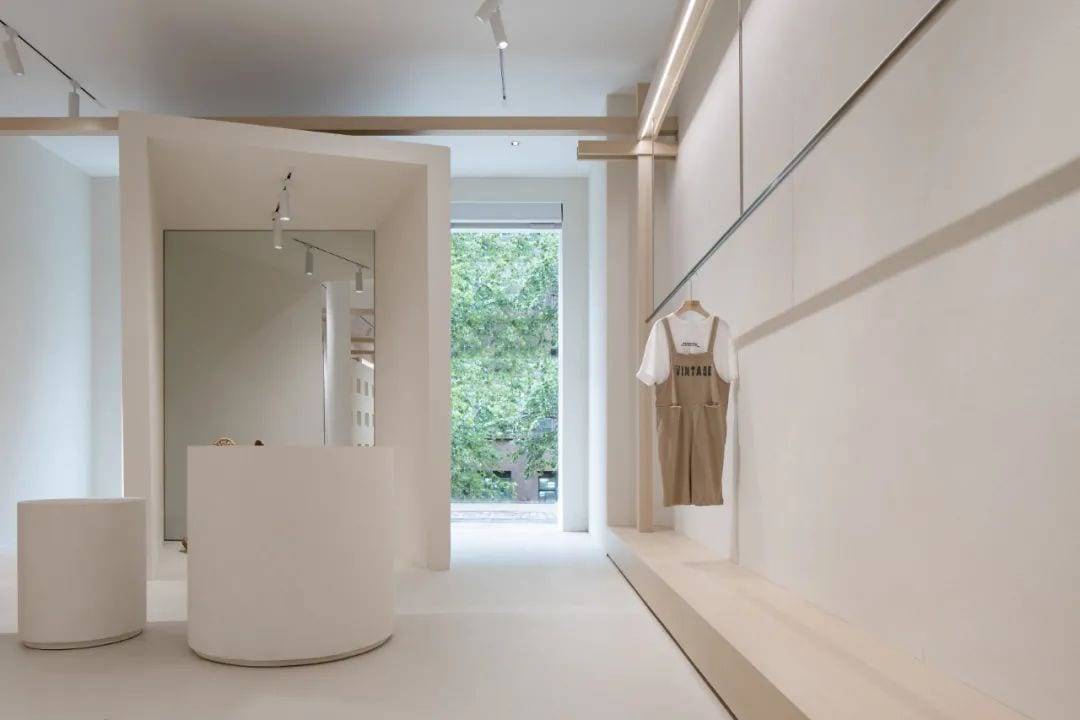
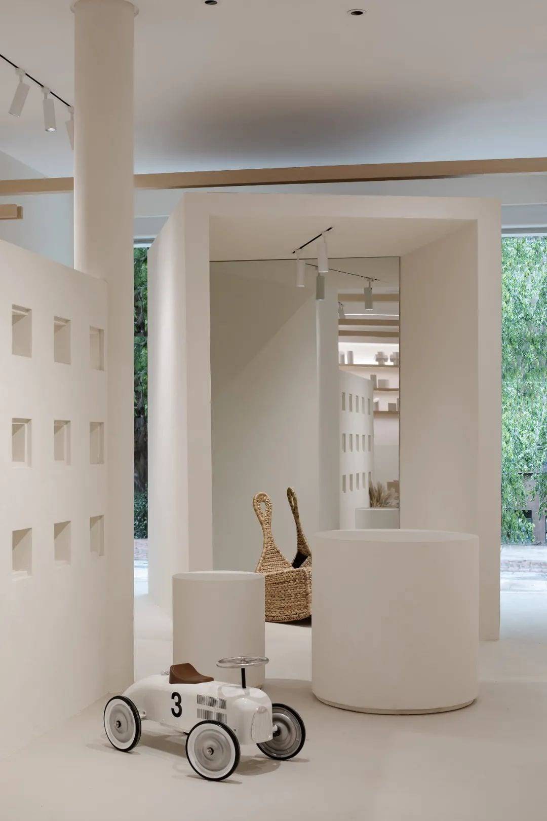
BOX space is not only a subversion of traditional space treatment, but also a response to the demand for functionality.

Break Reconstruction
“Reconfiguration To Constitute A New Order”
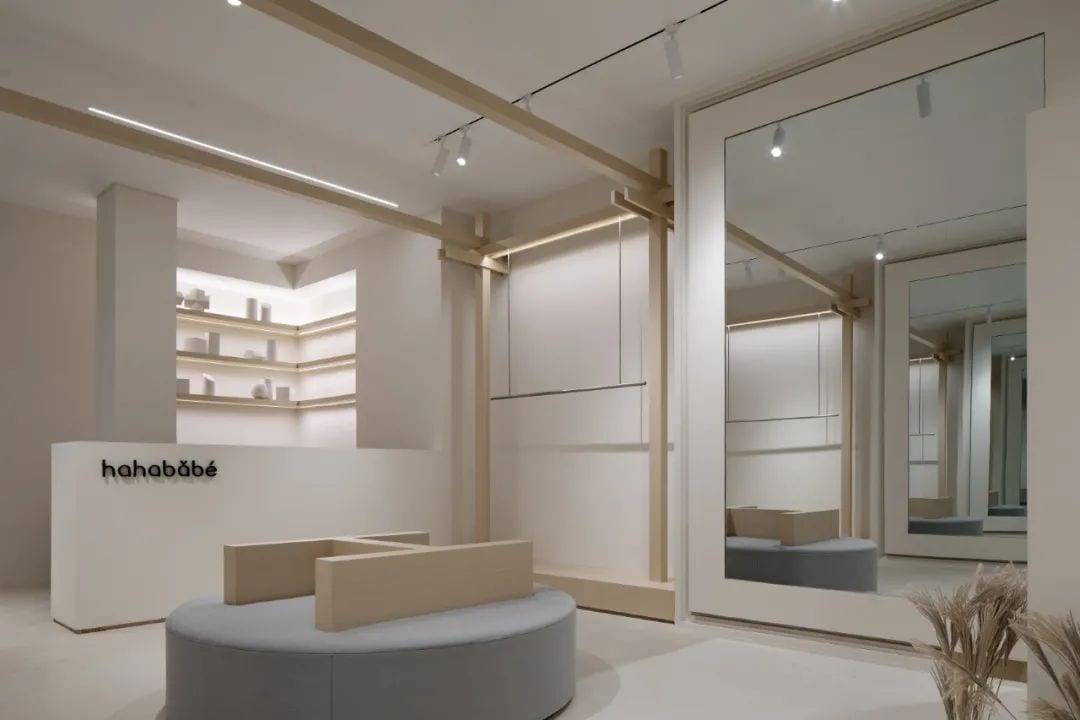
After breaking down, we reorganize and constitute. By breaking, separating, stretching, deforming and reorganizing the original properties of space, we break the shackles of traditional space properties on space itself. The reconstructed space is, in a sense, more like a kind of art than just space itself. The mix of chance, absurd combinations, random piles and other subversive methods give the traditional space a strong artistic atmosphere that it cannot have.

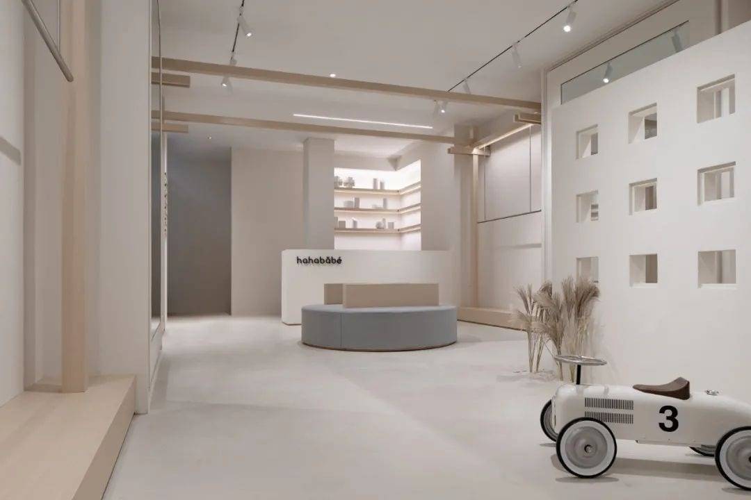
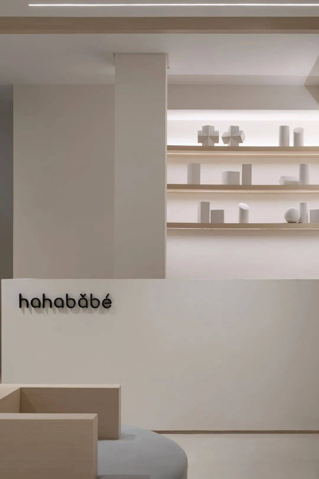
The layout of the entire space, its blocks and structural decoration are all based on the splitting and extraction of the square and circle elements in geometry, and then interspersed with points, lines and surfaces to form new combinations, thus constituting a three-dimensional aesthetic retail space that combines the virtual with the real.
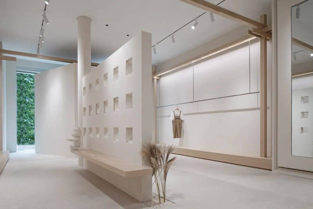
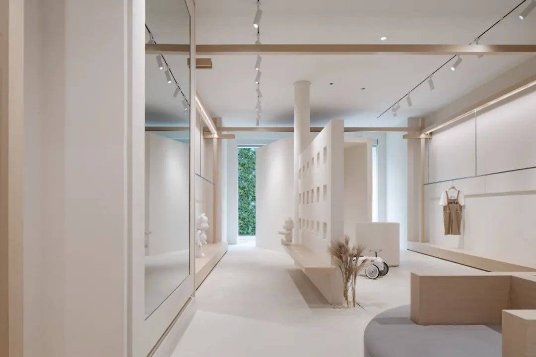
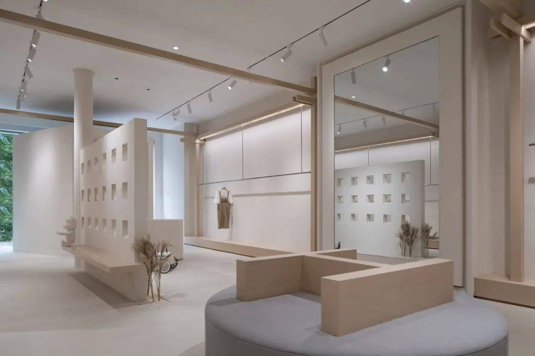
The framework within the space, while retaining the original spatial attributes, forms the new hanging display area.
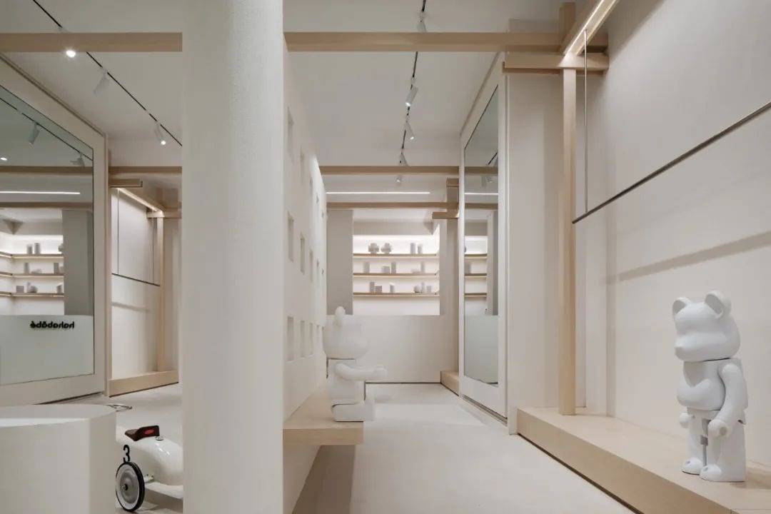
The raised part of the floor, in addition to satisfying the division of functional space, is also given more possibilities for stacking, display and leisure.
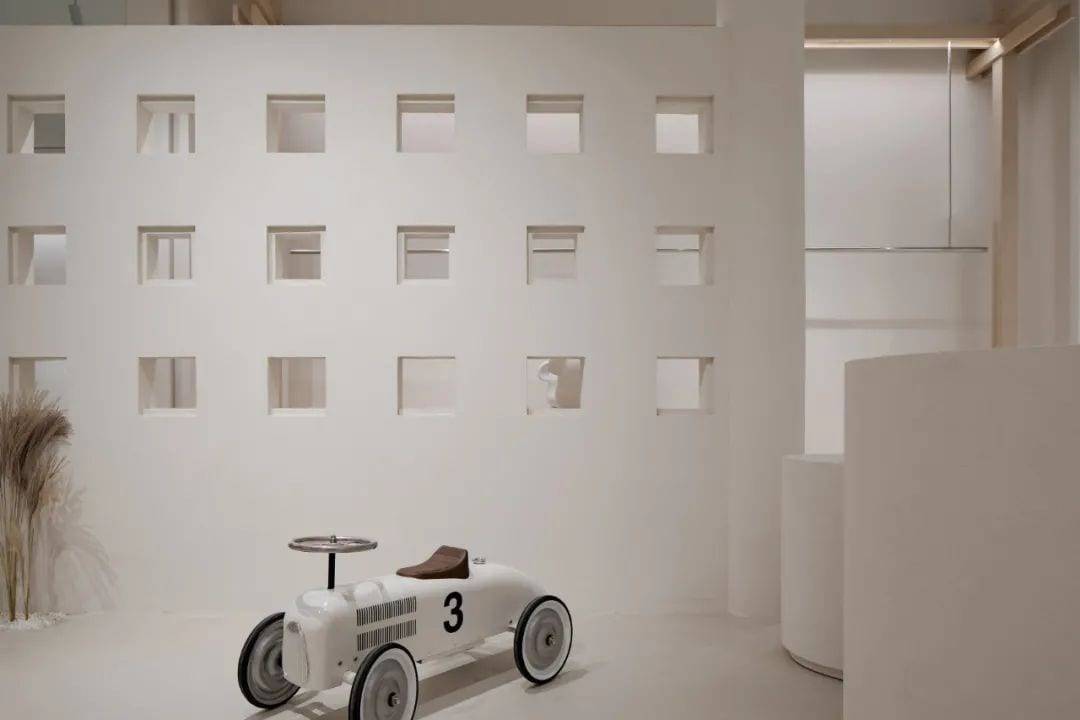
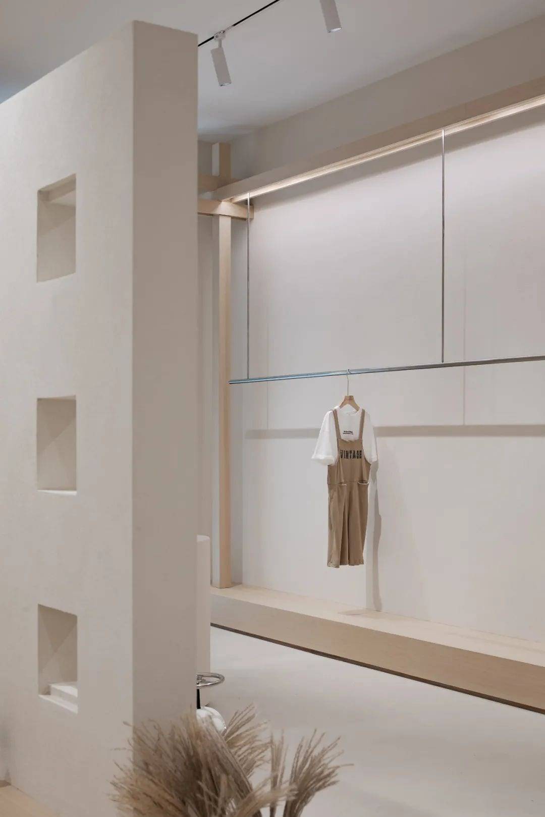
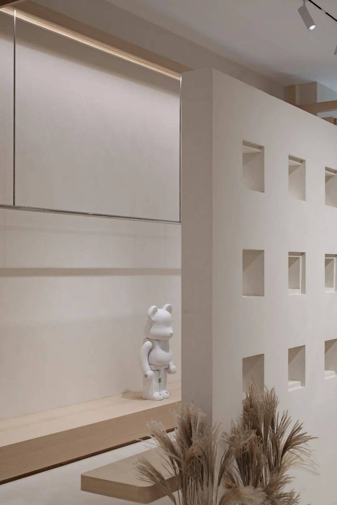
The partition walls covered with viewports form a spatial wandering and interspersed, which deepens the connection between people and space, space and products, and products and people.
As for the lighting design, we use imported light source with Ra>90 to improve the color reproduction of the garment materials, and at the same time, we use different methods of decorative lighting, line auxiliary lighting and surface accent lighting to enrich the space.
Order
“A State Of Stability And Continuity”
Everything forms a new order when it is broken and reconstructed. For this space, the order in spatial form, the order in spatial layout, the order in color and light, the order in functional series, and even the business logic changed for this purpose can be interpreted as order. This kind of order we understand as another manifestation of brand power and brand recognition.
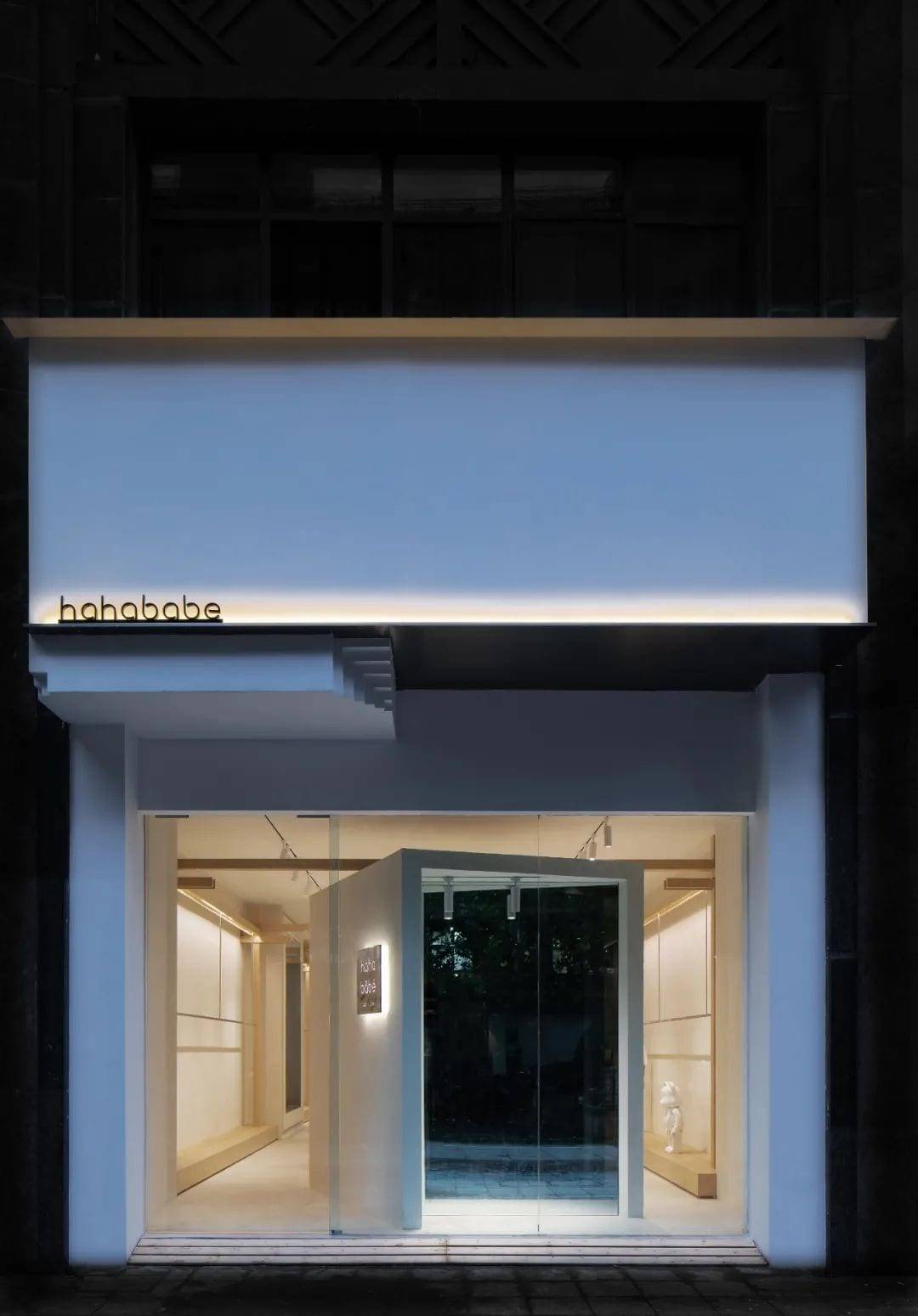
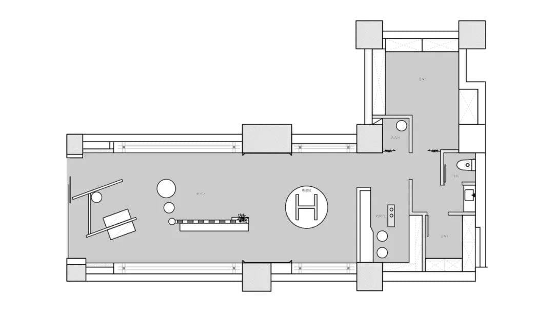
▲Planning Layout
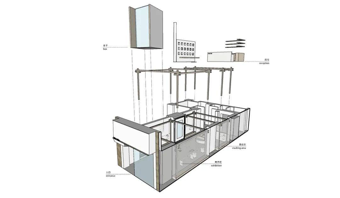
▲Space Display
Project information
Project name: several boxes
Project Address: Area West Fenghuang Street, Gulou District, Nanjing, Nanjing, 100㎡ Project Area
Design agency: Au Design Office
Project photography by EMMA
Video Clip: One Shot Vision
Copywriter: Au Design Office

As a highly innovative design company, Au Design is composed of a group of young people with outstanding creativity, and we are committed to bringing unique space experiences and concepts to people through design.
To us, design is not an end in itself, but a means for people to confirm their own lifestyles. The form, space and appearance of design should not only be logical, but also have the power to speak directly to the heart. Therefore, with “people and space” as the core, we emphasize the transformative application of logic, emotion and thinking in time and space, and strive to improve the balance between people and space so as to make our own interpretation of contemporary human space.
Some honors:
2020 Aite Award for Excellence in Commercial Space Design
2019 Tenth China Real Estate Design Competition Top 10
2019 Aite Award for Best Villa Design
2019 Aite Award for Best Apartment Design
2019 Mango Award China Residential Winner
2019 Mango Awards Outstanding Commercial Space
2018 Golden Hall Awards for Outstanding Villa Design of the Year
2018 Golden Hall Awards for Outstanding Residential Apartment Design of the Year
2018 Ten Square China Real Design Competition City Excellence Award
2018 Mango Awards & Ten Square China Villa Creativity Awards
2018 Mango Awards & Ten Square Urban Youth Design Leaders
 WOWOW Faucets
您好!Please sign in