Interior Design Alliance
01.
Time
The river of time
Washing away the clutter and pretense
We looked up
Only the pure visible.
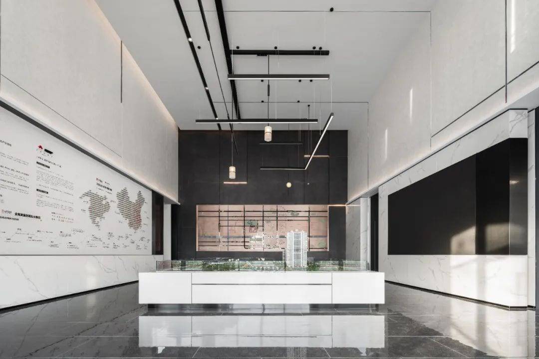
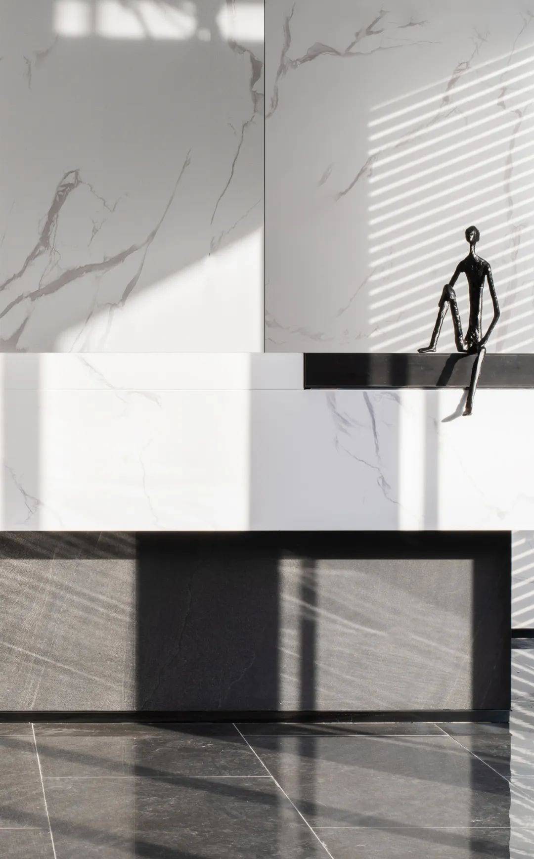
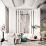
The basic color of black and white creates a sense of stability, calm and rational texture. The iron lines are clean and simple, the texture is simple, and the space returns to its essence. The simple geometric shapes are enlarged and extended into a spiritual symbol of space, which is integrated into the environment.
02.
Deconstruction
If the soul is free
Why is space a constraint?
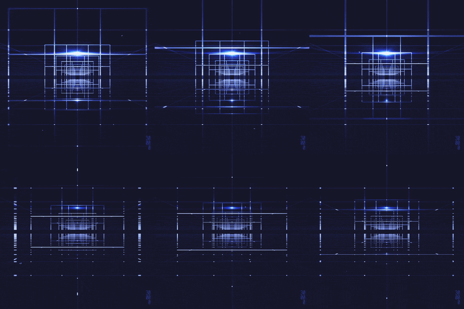
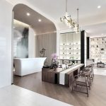
The spatial effect of flowing, penetrating and separating without separating avoids the combination of isolated and static volumes. The combination of continuity and discontinuity, and the orderly arrangement of points, lines and surfaces, creates the illusion of a time tunnel.
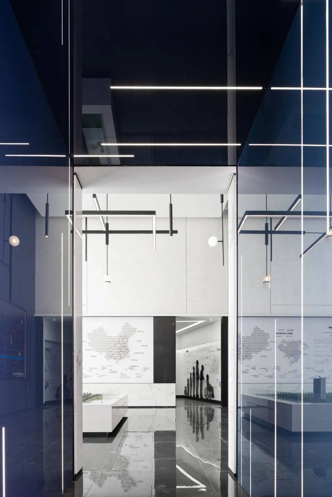
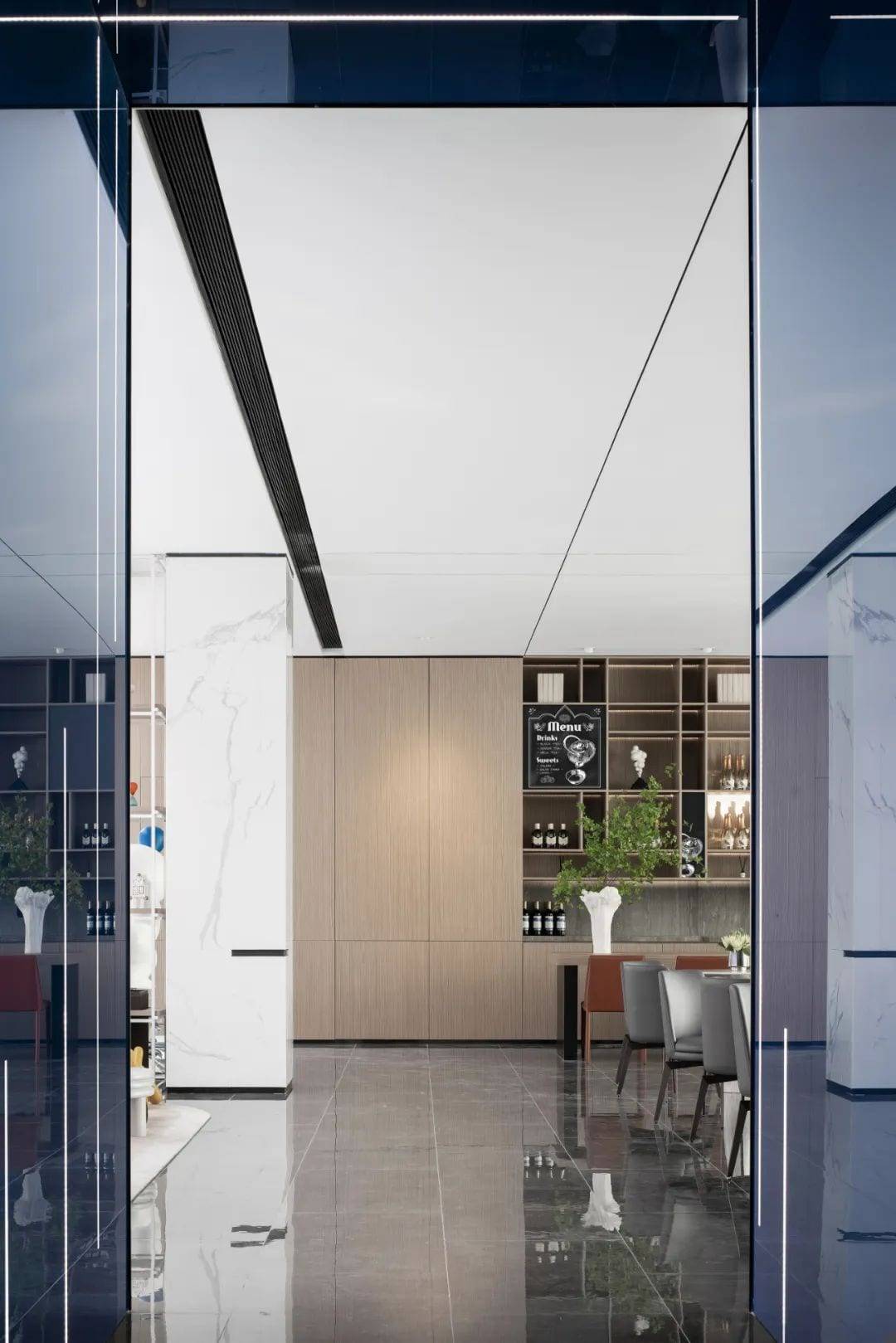
The pure material to the extreme, with a sense of futuristic and interesting, increasing the sense of scale and freedom of space. Simplicity, agility, warmth, time flows, we will always meet.
03.
Line
One by one, the dots of light form a line
No going backwards
And don’t stand still
The length of the extension is the years.
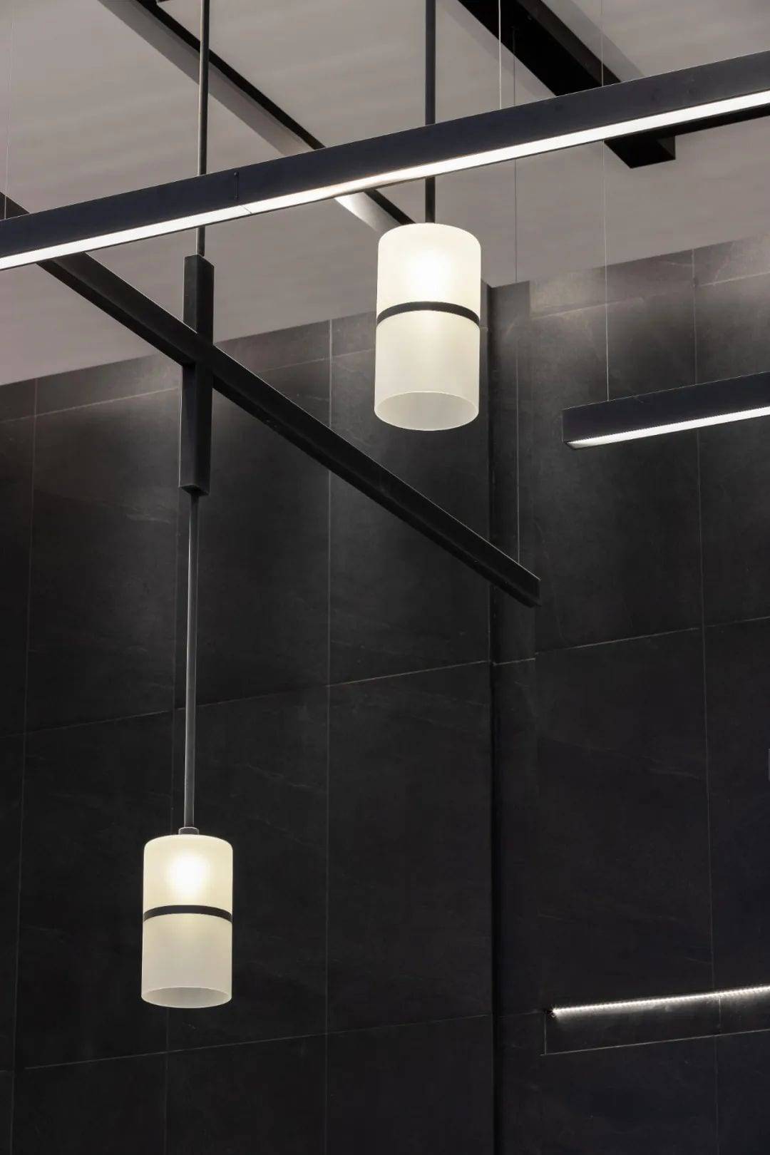
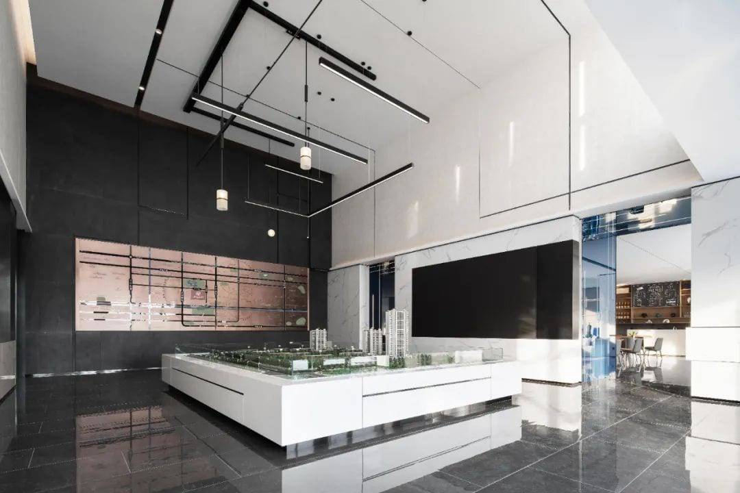
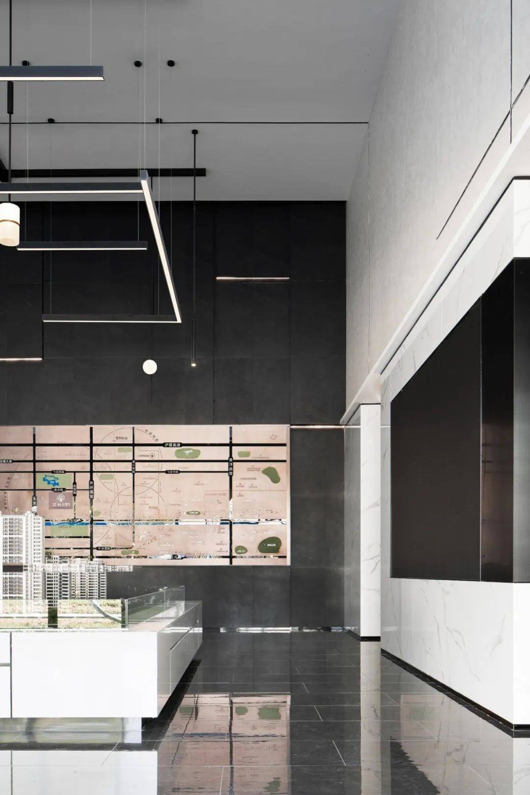
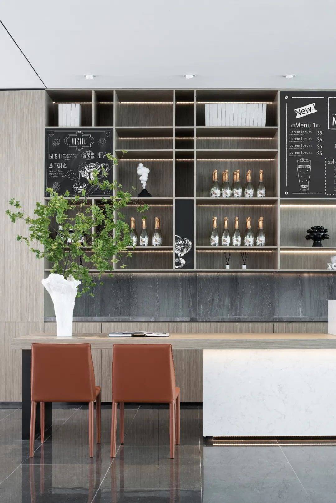
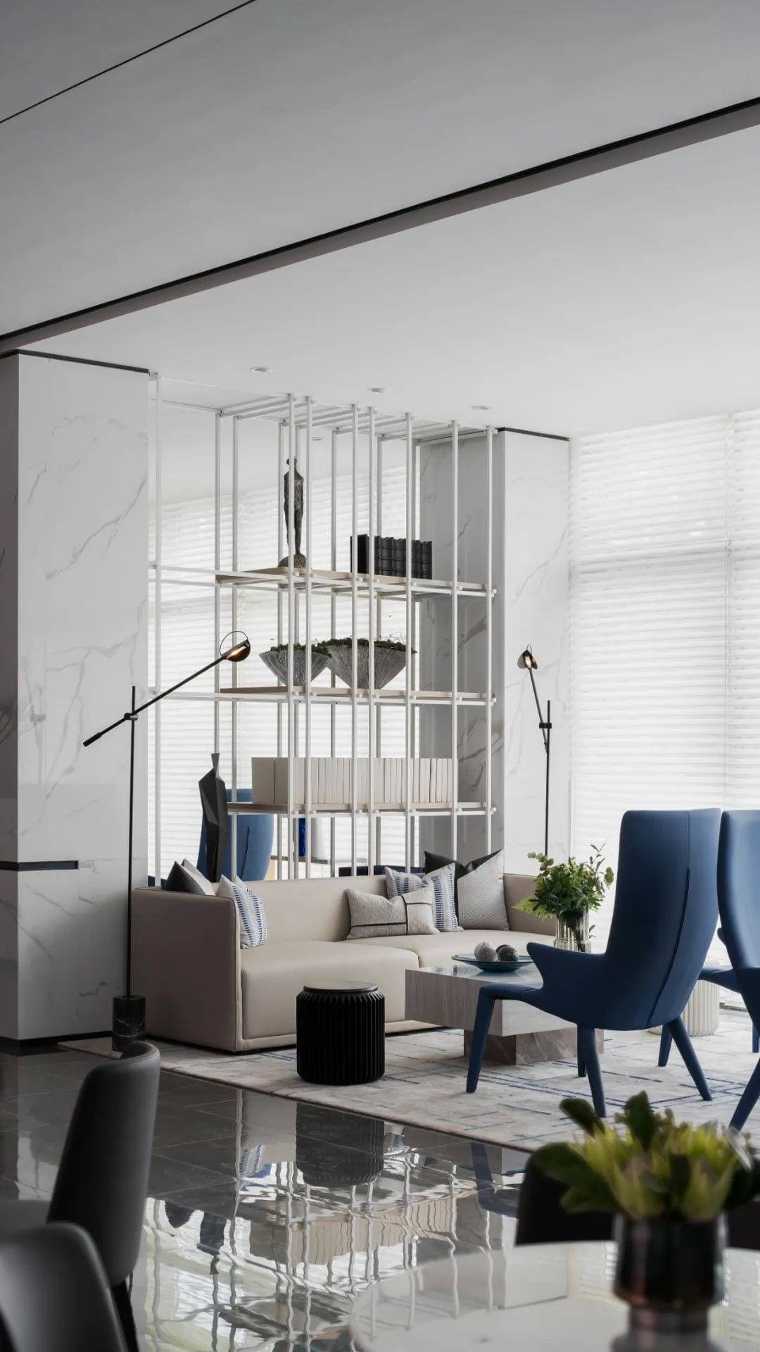
By using simple engineering methods, the spatial lines are reorganized from the three dimensions of point, line and surface, breaking the traditional partition space. The technological elements of the light trough design and lighting arrangement render a sense of the future, and the multiple scenes are connected, extended and transformed by the light troughs on the ceiling, giving the simple space a rich and multi-dimensional feeling.
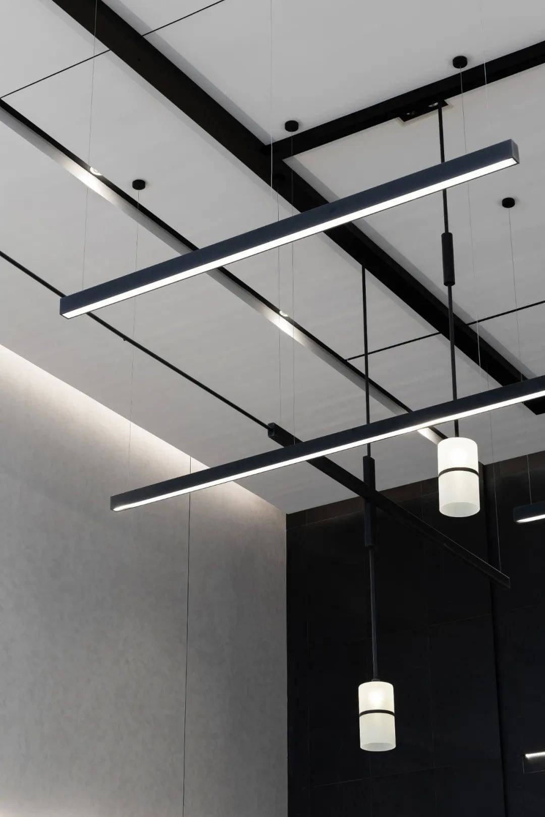
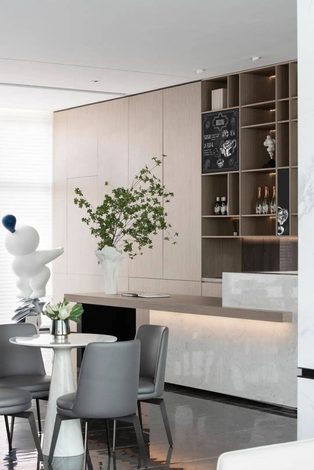
Minimizing the number of decorative items and not consuming excessive indoor space, the simple “empty” reflects the rich spirit within, and under the reflection of minimalist lighting, the flow of space tells the sense of order and rhythm to bring freedom and tranquility.
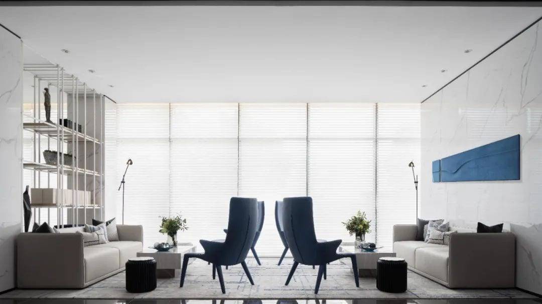
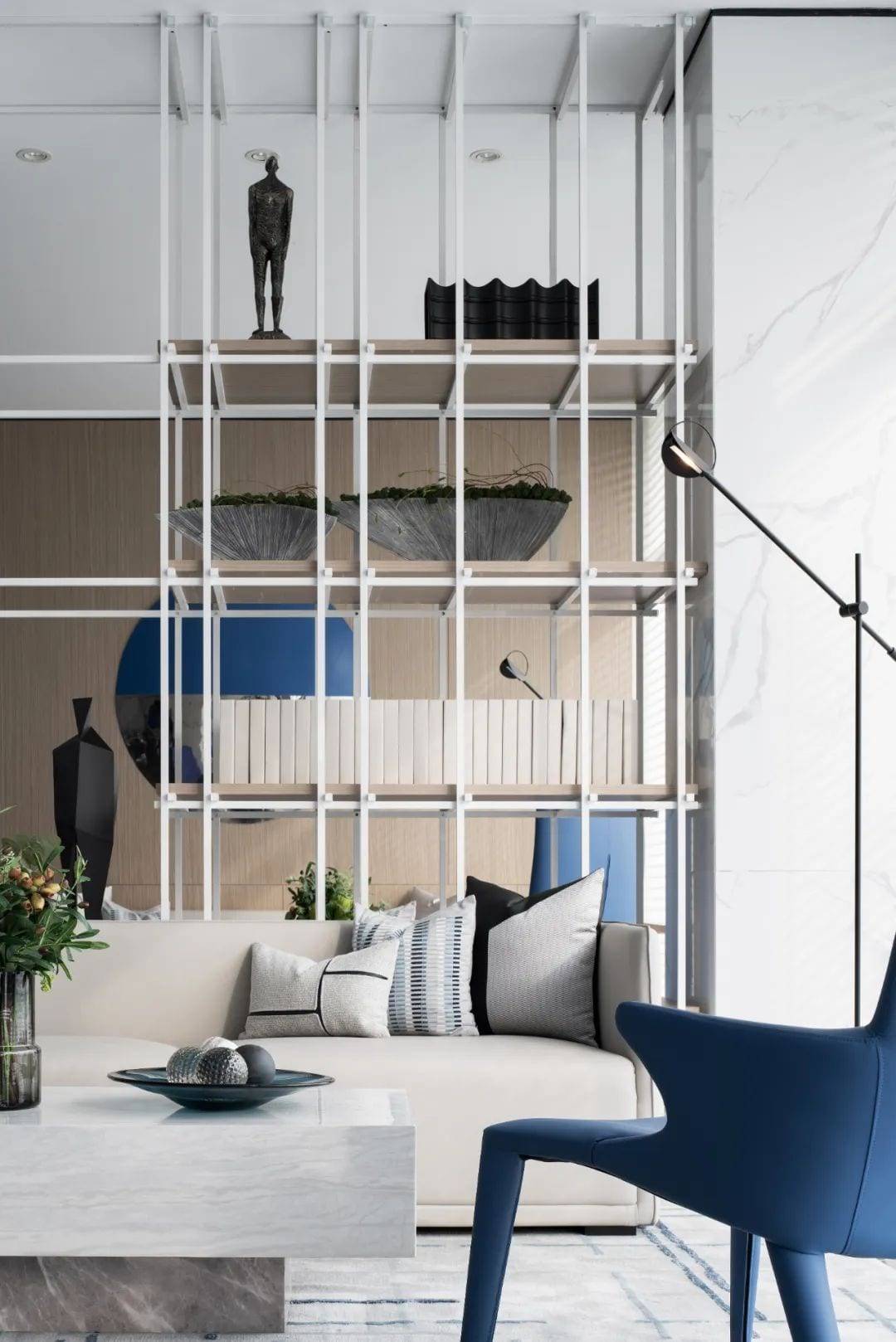
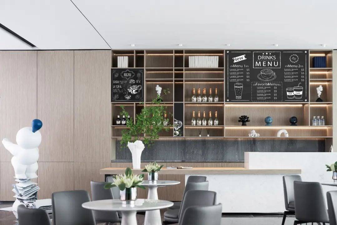
There is always a lot of blue in the human imagination of the future.
The purest colors evoke the strongest spiritual feelings, and the strong impact of “Klein Blue” and its clear, empty visual system is mesmerizing. Blue is freedom, life, and the most essential color of the universe, swimming in black and white space, like a precious fragment of memory in time.
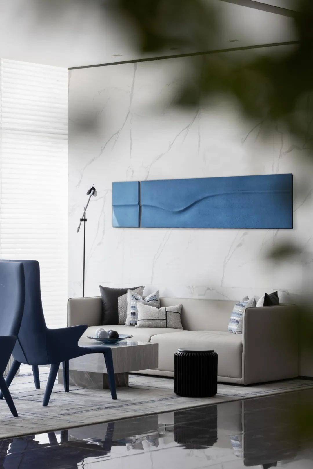
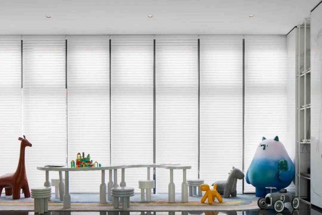
The blocks are stacked, cut and misplaced.
The lines are interspersed with each other to form a magical relationship.
04.
Analysis
“Less is more.
Mies van der Rohe’s architectural philosophy is “less is more”.
A new concept of flowing space is advocated in the treatment approach
A small number of partitions are used to separate and summarize the whole space, incorporating Mies’ design concept of “less is more” into the layout of the marketing center.
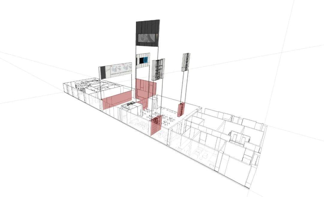
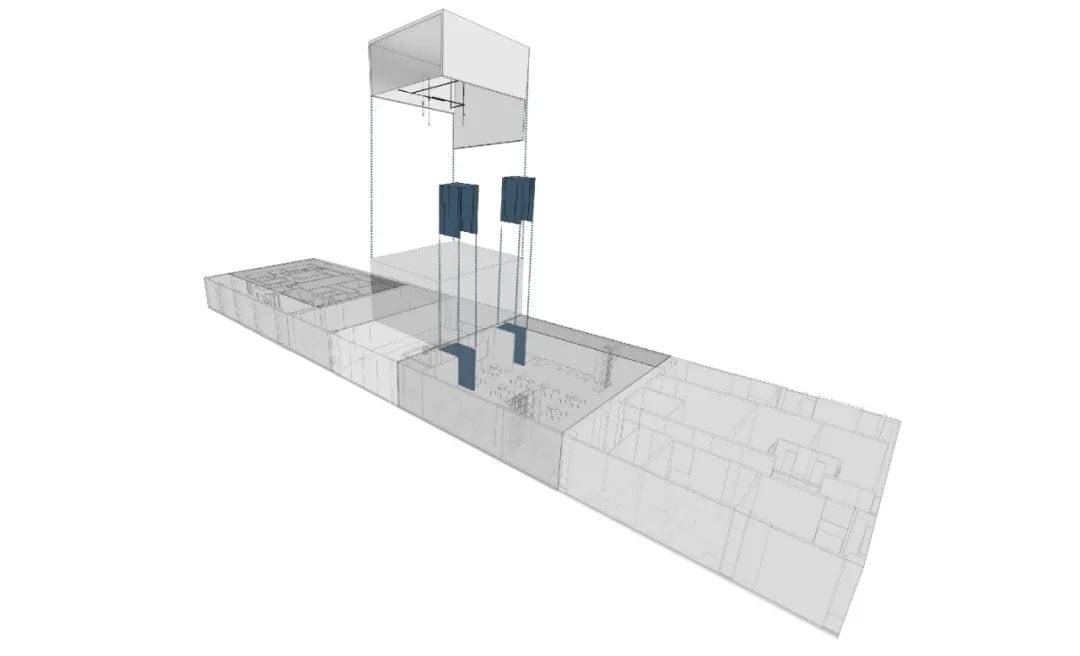
The scale of time and space is the widest, and we do not pursue too much decoration in the limited space. The design of the building is based on the concept of “the design of the space”, which is the pursuit of simple art.

▲Floor Plan
Project information
Project Name – Contemporary-Guangming Zhiguangli
Project A – Contemporary Real Estate & Bright Real Estate
Project management personnel of Party A | Yu Haiyang, Peng Yihua, Wang Jiawei
Project Type | Sales Center
Project Location – Changzhou, Jiangsu
Project Area | 884㎡
Hardware cost | 2500/m²
Project Completion – May 2020
HARDWARE DESIGN | Weber Shine Design – Shanghai
Hardcover Designer | Gao Wei
Hardcover Design Team | Yuyu Feng, Zheng Kong
Project Photographer – Xiang Xiao

Gao Wei
Founder and Chief Designer of Weyko Shing
We are adept at integrating nature, art and life into the space. With rigorous conception, profound knowledge and ingenious design techniques, he has devoted himself to real estate and hotel design for more than ten years and has been widely recognized and praised in the industry.
 WOWOW Faucets
您好!Please sign in